
The checkout process is a crucial part of an e-commerce site’s user journey. In order for an e-commerce site to be effective in converting users to customers, it needs to have a fluid and easy-to-use shopping cart and an even more effective checkout process.

An unoptimized checkout process is one reason behind high dropped carts and other issues you may face with your e-commerce site, particularly issues related to low conversion rate. To help you deal with those issues, here are the five optimization tips you need to keep in mind.
Start with Good Design
A good user interface or UI is half the battle. Users need to feel right at home – in a pleasant way – throughout the site, including when they reach the checkout process. This means incorporating tactile (satisfying) animations and using web elements with a purpose.
If you are not sure about how to best design your checkout process – and the e-commerce site – consider investing in a good web design service. Snap Agency, a leading Minneapolis web design company, regularly helps top clients optimize every detail of their checkout process to perfection.
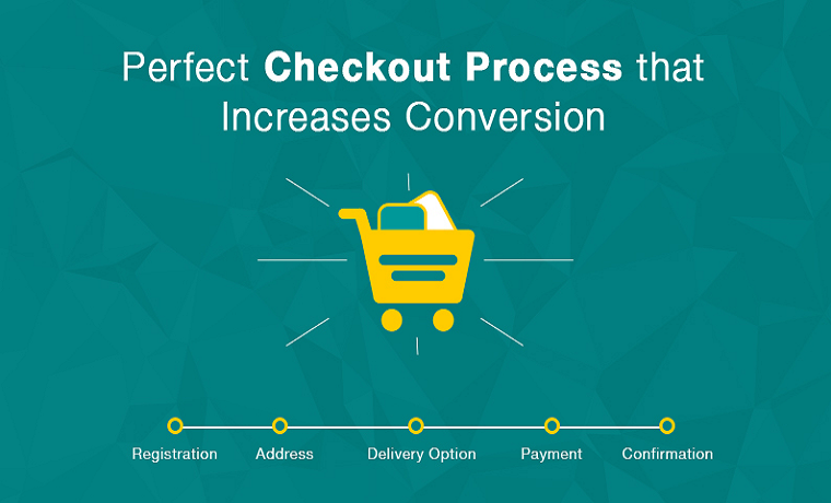
Reduce the Steps
Next, you want to reduce the steps required to complete the checkout process to a minimum. A one-step checkout is ideal, but a two-step process is also acceptable. In fact, many of the bigger e-commerce sites now aim for a two-step checkout to keep users happy.
Anything more than that is a nuisance. Users don’t want the extra-long checkout forms, especially when those forms don’t really bring added benefit or a better user experience. Forget about trying to get as many user details as you can and make sure users can make their purchases quickly.
Be Transparent
You also want to make sure that users always know how much they need to pay to complete the purchase. This means displaying not only the prices of the products in the shopping carts but other cost elements as well.
The shipping and handling fees, taxes, and any additional charge must be displayed in a clear and transparent way throughout the checkout process. This allows users to know how much the purchase will cost them from the moment they hit the Checkout button.
Go Easy on the Offers
The checkout process is the perfect time to offer users relevant products they might be interested in; there is nothing wrong with trying to sell more products. What you don’t want to do is disrupt the flow of the checkout process for the sake of selling more products.
A popup in the middle of the checkout process or an added step just for the sake of offering more products is not the way to go. Instead, you want to display the products you are trying to cross-sell in a seamless way; as part of the UI.
There is also the option to engage the customers after they made their purchases, especially now that you have email marketing and other tools at your disposal. In the meantime, use these tips to optimize your checkout process and boost your site’s conversion to a whole new level.
About Author
Eyden Haze
Eyden Haze is a digital marketer, a web designer and technology fanatic from Sydney, Australia. With over 7 years of experience in web industry, he has helped his clients to launch their marketing campaigns successfully. He also likes to explore various online tools and share that knowledge by writing useful blog posts.