
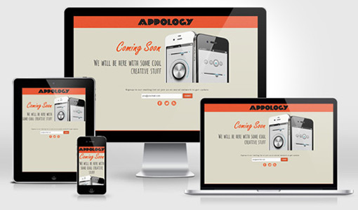
With the arrival of responsive design, testing efforts also need to be increased. With the usage of mobile devices continually rising across the world, the need to deliver a tailored experience on the web also increases. To offer quality web experience across all platforms, it is essential to make your website responsive. Many a people nowadays use mobile phones to access websites so testing a responsive web design becomes important when it comes to offering an incredible user experience. Listed below are a few testing tools for responsive web design which can be used to assess whether a site is mobile-friendly or not.
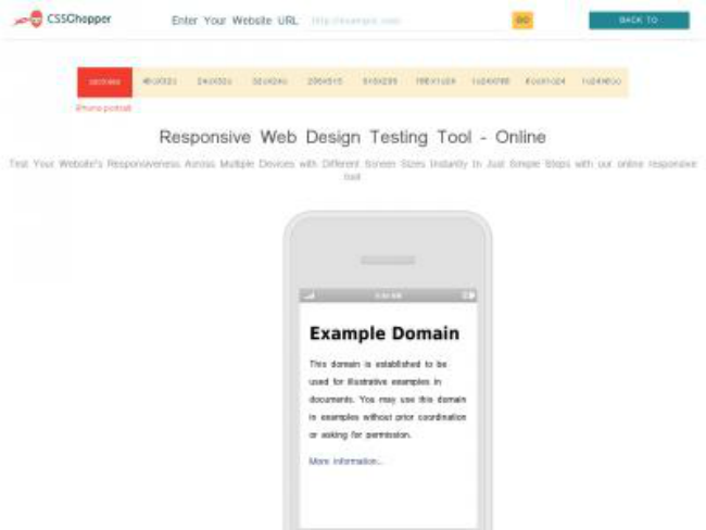
Responsive Web Design Testing Tool has been built to offer multiple device sizes as well as just pixel dimensions. You can enter your website’s URL into the address bar at the top to test a specific page. This tool does not offer user agent testing but it’s still a nice option for all those who do not have different types of mobile devices. Compatibility with iPhone, iPad, tablet, desktop and laptop makes it, even more, a preferred pick. The steps to check compatibility using this tool comprise-
- Entering URL of the page
- Then Press “Enter” to check how a website appears on multiple devices
The tool has been designed with the aim of providing real-time experiences on multiple screen resolutions. Featuring the varied dimensions, this tool allows users to select a particular dimension in order to view different elements.
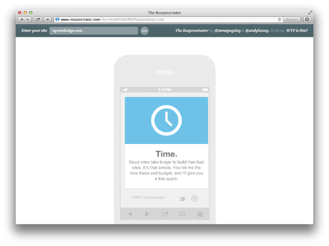
The tool being quick, easy and well-designed gives an idea of how a website will look in various devices. The devices which can be used for testing the feature of mobile friendliness are iPhone 5, iPhone 6 and iPad along with some Android devices. A free tool, Responsinator allows users to enter a URL for the website leading to which it will display an overview about its being responsive in landscape and portrait modes. Available with a bookmarklet, this tool can be configured to view and hide scroll bars and allows you to check any website with just one click.
Features:
- Compatible with iPhone, iPad, Android and Kindle free resolutions
- Loads webpages into different screen resolutions
- Tests resolution-independence of your website design
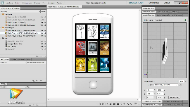
This tool simplifies the production of innovative and engaging content for mobile phones, tablets, and other mobile devices. It allows the website designer to execute, assess and test user-engaging experience and deliver them practically to anyone, irrespective of the device being used. Some of the unique features of this tool include the online library of device profiles, advanced device emulation, and HTML5 support. Other functions include modifying color balance, re scaling graphics, tuning graphic designs. It is also featured with geolocation and accelerometer along with multi-touch capabilities.
4. Screenfly
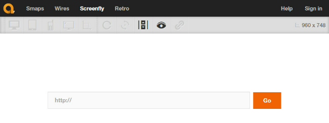
Screenfly permits you to have a look of your website’s appearance on a PC, Tablet, or mobile. To use this software, type the URL of your website in the appropriate field and click on Go. Once the page is loaded, select the device of your choice. The tool uses a simple iFrame embedded technique to display your site in different dimensions. The tool breaks down the screen resolutions by the device so you can clearly associate screen resolution with a common device. Additionally, it works with query strings, which means that you can copy the URL from the address bar of your browser and demonstrate how the site will look at a specific resolution.
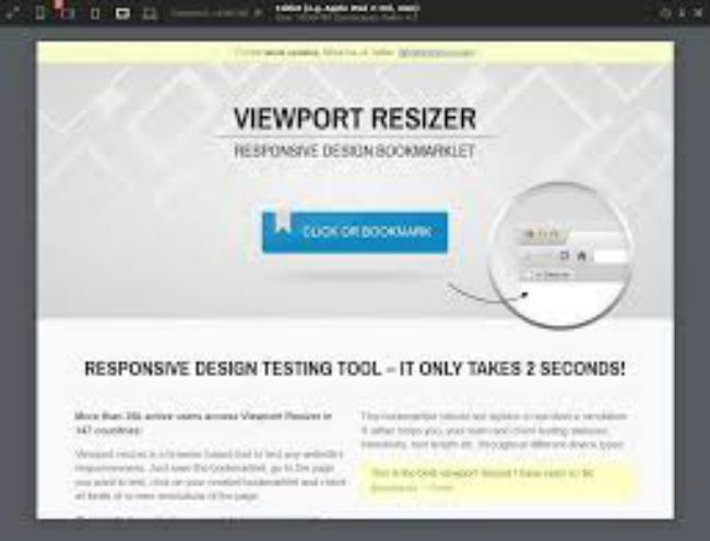
A browser-based tool, Viewport Resizer tests any website’s responsiveness with different display resolutions. The tool comes as a browser bookmarklet which allows it to be used with any modern browser. Using this tool, custom sizes can be created that show you a website in a default screen size. You simply need to drag the tool to the bookmarks bar. The first version of this tool brings numerous resolutions for smartphones, tablets, and several apple devices. The tool is ideal for responsive design testing and allows users to see how their site would appear on a smartphone, tablet or traditional display, allowing for live customization according to the existing code.
Similar to the ones given above, there are many other responsive design testing tools available which offer a unique approach to testing your design for existing and upcoming devices. Testing websites using these tools is a key to staying ahead of your competitors in the online market.
Author Bio: Bryan Lazaris is a senior responsive website developer at HireWebDeveloper. He specializes in mobile and web applications testing. In addition to being a mobile app developer, he is a passionate blogger by heart who loves to write about latest technologies worked upon.
About Author
Founder
David Watson is the founder of DesignDrizzle and is a professional website designer for over 10 years. He has competence in creating visually appealing and user-friendly websites for all the clients. He likes to explore new and creative ideas for designing, photography effects and other inspirational subjects
I have noticed some tools listed here are really useful for testing the responsiveness of the website.
We are using Responsinator from long time now and are happy with how it works.