
Are you sure if your UX patterns are up to the mark? These design solutions deliberately become the reason of a website’s success paving the ease of user’s access, smoother conversion and performance. Redundant patterns could be a hitch in a designer’s creativity. Users often feel it scratchy when UX designs turn hard and do the opposite of what they are meant to do. This article will give you hints on how you could improve UX patterns that are getting on your users’ nerves.
1. POPUPS
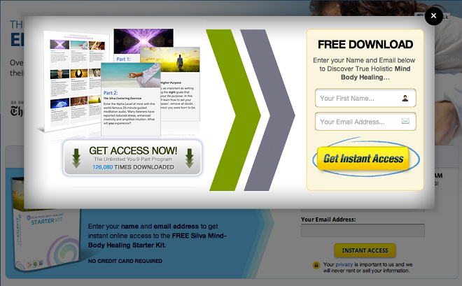
Never can this fact be denied. Popups are like uninvited guests; when you wish to scan the content of an important link and have barely finished half of it, interruption by huge overlays pleading for your personal details would just be the wrong time to upset your day. Yes, the link does lead us to important content but what’s with those queries ruining the UX eventually.
As a replacement for the irrational approach above, simply let the users enjoy the content first. Let them dwell in their own perspectives in lieu of barging in like that. Popups are undesirable irrespective of when they appear, be it a subtle popup after the user gets done with the page or beforehand.
2. Infinite Scrolling

This UX pattern has its cons outweighing the pros. It did heal retention issues but it created more of the others. Imagine a situation where you need to get your hands on an important page that is positioned near the footer and auto-infinite scrolling is activated. Motive gone for good. Again, if you’ve been rolling down the page for a while and accidently end up on a different page, getting back to your checkpoint is an absolute mess.
We did solve the ‘Mega menus’ problem efficiently. Likewise this one just needs your patience. Incorporate traditional pagination and give the user an option to either continue scrolling or resolve with an action: the footer is now within the user’s reach. A change in URL when the user accesses a different page could solve the issue of the user losing track of the previous page.
3. Mega Menus
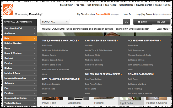
Though many of you may consider this point as a solution to classify your pages as part of enhancing user-accessibility but trust me, it’s not. Tuning your site could sometimes counter its impact on the users, negatively. Users don’t appreciate the frustration caused by maze-like sites and this hinders their interest in the same, caused by the burden of navigation.
Save your site from the horror of gigantic menus. Split those links and arrange them into sections. One smart way to crack a healthy code here to use imagery as a replacement for text links to create a pleasant user-experience. Of all that you need, hover-activated drop down must not get counted on your to-do list.
4. Page Preloaders
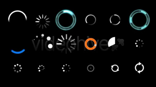
Let’s face it; the performance of any website deteriorates the moment it takes a long time to buffer. As we move further eyeing the merits of technology, impatience is something out of hand. Speed is the first and foremost element designers must focus on, owing to the fact that it is inversely proportional to the size of your content. Building a web application involves the consideration of the role of every single element.
Lighter elements like Navigation could be prioritized, if you have trouble with loading times. A loader, for instance a cute animation, could handy in dealing with the user’s impatience if your site contains heavier content. This could pacify the user and convey them the message that you have not put them on hold.
5. Social Integration
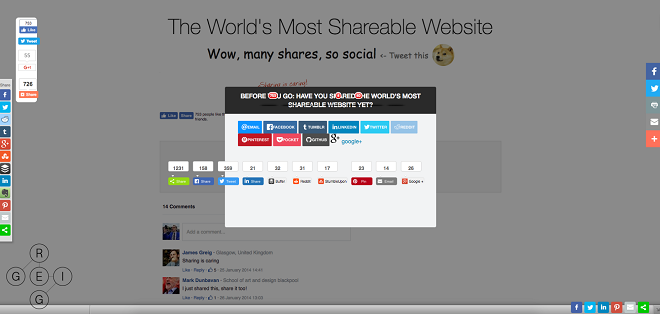
Socializing is the key to everything today. Sharing is fun and helpful. It redefines business and is known as the most cost-effective way to attract more and more customers to your website. However, here the complications include needless social widgets. Use them as frugally as possible. They social buttons only create eagerness besides drowning your precious content.
Naturally, social integration is a must to any website. Bearing in mind that the user is not forced to click these widgets, it would all be worth it. The more you force the user to share your content, the more they’d feel to skip the action. Use a casual tone in putting your ink at the end of the page, limiting your widgets, politely asking them to let you know how they felt your content was and retweet it if they want to give it a thumbs-up.
WRAPPING UP
Do pay heed to this disclaimer before you judge their score. The aforesaid UX patterns do create chaos, putting it vaguely, nevertheless, if one completely keeps all the critical viewpoints into consideration, and when the site requirements urge him to use these patterns, he might as well use them anyway. But do think twice before you kill your site’s performance. In the end, the user must be satisfied like never before.
About Author
Founder
David Watson is the founder of DesignDrizzle and is a professional website designer for over 10 years. He has competence in creating visually appealing and user-friendly websites for all the clients. He likes to explore new and creative ideas for designing, photography effects and other inspirational subjects