
Whether advertising your business through a business card, flyer, advert or banner, the most important purpose is for the advert to get the viewer’s attention, which is often achieved through visually stunning and creative design which wows the viewer and intrigues them to learn more. Below are some examples of where creative design has been used to advertise business, where interesting designs have been used to help viewer’s identify with the company.
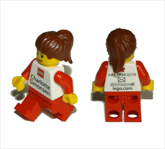
Lego Woman!
To the left is a very clever ‘business card’ which every viewer will be able to identify with. This is a unique card, one which you could only expect an employee of Lego to demonstrate effectively.
Immediately the viewer will be able to relate this figure to the Lego Company, as a perfect visual portrayal of what the company represents. This design is incredibly creative, and once handed to people would most likely be kept by those who are amazed and impressed with its unique nature. Another clever aspect is the nostalgic element, which will most likely take people back to a happy time, thus creating an association between those feelings of joy and the Lego figure, which will hopefully resonate to the woman’s contact details. This is very clever as a design, containing the number and email address of the employee on the back, which you’d be certain to view in astonishment. Whether you contact Charlotte, you’d certainly show your friends the figure at minimum.
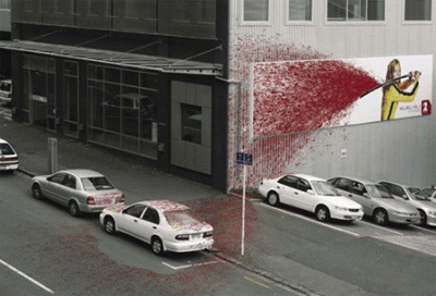
Kill Bill Vol. Blood
To the right is a shock advertising campaign for Kill Bill, which utilises the quite dramatic effect of fake blood to gain notoriety. Anyone who viewed this advert would be visually stunned by how far the fake blood has spread, even across to a car which is parked on the road! Whether this has been set up or not, either way the campaign is incredibly creative. Anyone passing would be sure to notice the poster, with the use of a bright red colour to draw people’s attention. Blood is visually stimulating and certainly gets people’s attention, sparking off a reaction within the brain which leads to the incidence of remembering a campaign in one way or another. For the blood to seemingly squirt that far creates an impression of how gruesome the movie is, which was used as one of the biggest marketing points for the film. The contrasts colour in the design boast a splattered blood effect which is very creative, and ultimately was successful in promoting the nature of the movie.
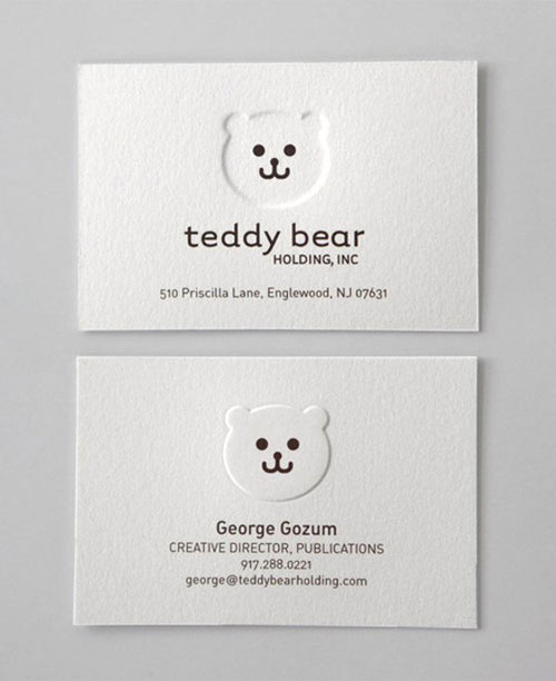
Teddy Bear
To the left is a business card which uses a very simple yet effective design. It is laid out using a crisp shade of white, with contrasting black writing to convey the necessary details. The guy has also used clever imagery with the Teddy Bear, an image which is mainly associated with good things, such as nostalgia and the view that Teddy Bears are cuddly and warm. In terms of design this card struck me as particularly concise and effective in conveying its purpose. The use of indents to slightly elevate the Teddy Bear add another dimension, and most importantly this card stresses the importance of not over complicating your business card, rather going with a sleek and effective, yet simplistic design.
About Author
Founder
David Watson is the founder of DesignDrizzle and is a professional website designer for over 10 years. He has competence in creating visually appealing and user-friendly websites for all the clients. He likes to explore new and creative ideas for designing, photography effects and other inspirational subjects