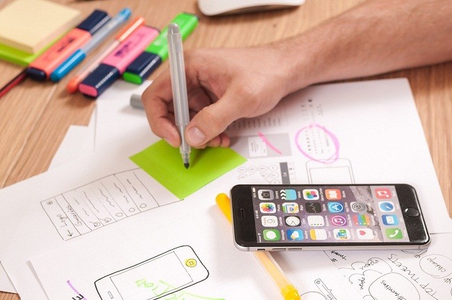
Codenamed as Quantum Paper, Material Design is a design language from Google. Material Design makes grid- based layouts more liberal. It turns transitions and animations more responsively with depth effects including shadows and lighting. It is gradually spread out through Google’s products and web services. It provides a consistent and smooth user experience across all web apps and platforms.
Goals & Objectives
- The main aim of Material Design is to generate a visual language with the ability to synthesize standard principles of unique design with optimized prospects of science and technology.
- To develop an underlying system that offers a unified user experience across various smart devices of different sizes and different platforms.
Principles of Material Design

Material is the Metaphor:Study of Material design is inspired by the study of ‘Paper & Ink’. Undoubtedly, it is magically advanced with optimized technologies.
- It strictly obeys the rules of Physics as the fundamental theories associated to light, movement and surface is the key element to reflect how objects interact, move and exists in space.
- The pragmatic lighting shows divide space and specify the moving parts. The edges and the surface of the object provide visual signals that are actually grounded.
- The comprehensive theory of space as well as the system of motion is unified strategically to retrieve positive outputs.
Graphics & Presentation
The fundamental elements such as the grids, typography, space, color, images, scale etc. guides the visual presentation of the print- based design. These design elements makes the animations appear just perfect with more attractive looks that are worth watching. A hierarchy is made straightaway with more focus towards creation and meaningful features. To create an audacious and responsive user interface, one must consider following attributes:
- Cut edge imagery
- International white space
- Deliberate color selection
- Wide scope typography
Motion Gives Meaning to Design
User is the prime component for any invention or creation. Initial activities or actions of the user are quite unrealistic and cohesive pointsthat are capable to initiate motion and transform complete design.
A single environment is just enough to take out the actions. Even if the elements are reorganized or transformed, users do not have to suffer as the elements are presented without any breakage of user experience throughout the browsing instance.
Motion is undoubtedly and appropriately correct as well as significant. The main aim is to maintain continuity and focus or to gain attention of the audience. As a result, transitions come out more rational and articulate.
In addition, feedback provided is more straight-forward, restrained or subtle, yet appears clear. Some focused; normal or pressed elements possess clear and responsive elevation.
Android & Beyond
Material Design transforms the appearance of the entire Android platform. Google have defined a set of rules that influence Android app right from its appearance to the color palette. Google also sets up standard grids that control spacing of apps across all devices to make them more readable; irrespective of the size of the device. The graphical layout of the app is standardized and all the complexities are removed. Due to many reasons, Motion is considered as an important aspect when talking about Material Design.
Moreover, Material Design is not just limited to Android and its constantly expanding to other arenas of technology. Presence of Google can be felt everywhere from laptops. From glasses, laptops, robots to TVs and houses; this vision is very much reflected by the latest Material Design language. Material Design is developed and innovated to be uniform across all devices and platforms with the motive to make things simpler.

