

For website designers, the inherent problem of being creative and exploring new possibilities often seems in conflict with sticking to the tried and true website design techniques of creating simple, intuitive navigation. Unfortunately, sometimes the web designers’ creative instincts go too far and the result is a website worthy of admiration, but short on consumer usability.
Finding a compromise between these two seemingly opposite parameters lies in grounding website design techniques into simple, intuitive navigation techniques where virtually anyone can use the site with ease, yet admire the extra effort put into making the website unique.
What follows are tips for a more intuitive website navigation that will hopefully catch those whose creativity may compromise the value of the website to visitors.
Intuitive Navigation
The best, most effective websites have navigation systems that are self-explanatory. This means that the language used will be familiar to the vast majority of users. The more familiar the language, the easier it will be for most people to navigate the website. Drop-down features can be used for more complex descriptions if needed, but the fewer words that are used, the better.
Streamlining
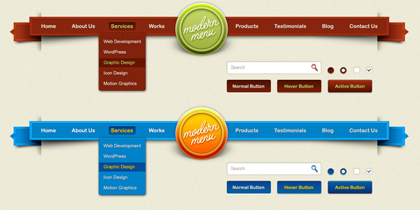
Sometimes less is definitely more. One of the big hurdles that web designers must face is striking the right balance between space and information. For website navigation, the menu bar should be as streamlined as possible using simple, direct words to explain each area of the site such as “About Us”, “Products”, “Contact Us” and so forth with subdivisions of each area being drop-down features. Resist the temptation to use more than one navigation bar or menu per page, it will only serve to confuse users.
Incorporate Navigation into Website Design
Navigation should be at the centerpiece of website design, allowing for greater consistency and understanding. For example, you can coordinate specific colors for your navigation menu that correspond to those associated with the business or organization for which the website is being designed. This helps in making identification easy for the user while further identifying the website with the owner.
Avoid Clutter

One trick is to place your navigation bar, images and all other content on a white background. This allows you to spot anything that is messy or potentially confusing. If you can easily separate all the elements placed on your website using a singular color background like white, then you can better assign the proper colors to highlight the navigation bar, content and so forth.
When in Doubt, Take it Out
This is an old, but vital rule in proper website design. The fewer unnecessary elements you include, the greater the clarity will be. While your website does not have to be stark or simplistic, it does need to be clear and free of any confusing elements. Of course, you can always test your site by having others see it first and let them navigate so they can tell you if anything is confusing.
These tips for a more intuitive website design help create happier users and pleased business owners as well.
About Author: SEO and web designer Vince Wicks is a freelancer for the most part, but he also works for WebDesign.org He is extremely sure that combining in-depth SEO with amazing designs can work wonders.
About Author
Founder
David Watson is the founder of DesignDrizzle and is a professional website designer for over 10 years. He has competence in creating visually appealing and user-friendly websites for all the clients. He likes to explore new and creative ideas for designing, photography effects and other inspirational subjects