

Mobile e-commerce (a.k.a M-commerce) is expanding at a fast pace as more users make purchases through mobile devices. In fact, according to the 3rd annual Mobile Path-to-Purchase report, nearly 60% of consumers use their handheld device to make purchase decisions in different categories like restaurant, auto, etc. And so, leveraging m-commerce for your retail business can help extend your reach to a large consumer base, thereby increasing the chances of significant revenue gains.
Bringing your e-commerce site to a mobile platform, or creating a mobile e-commerce website from scratch can help you make profit from the fast-growing m-commerce sector.
Through this post, I’ll provide some key facts to help you understand why you should consider building a mobile e-commerce site. In addition, I’ll be covering a few tips that you should take into account for turning your m-commerce website into a successful venture.
Why You Should Build a Mobile Ecommerce Website?
The widespread adoption of mobile devices into everyday life, especially for making purchases on-the-go, has made it a lot more important than ever to have an e-commerce solution that help address the shoppers’ needs. Perhaps, you may consider building an e-commerce website to deliver an enhanced online shopping experience to your consumers. After all, the e-commerce market is continuously growing and having an e-commerce website increases the possibility of raising revenue.
But, did you know that mobile e-commerce is growing at even more fast pace compared to e-commerce market? It is expected that global mobile e-commerce growth will increase from $204 billion to $626 billion in 2018. Thus, failing to provide your mobile users with an enhanced shopping experience will put you at a disadvantage. Creating a mobile ecommerce website can help make your business’ shopping experience perfectly-suited to small screen displays.
Factors to Consider When Building a Mobile Ecommerce Website
One of the most effective strategy to build a killer m-commerce site is to consider factors that affect how mobile shoppers browse an e-commerce site. Some of those factors are:
1. Main Navigation Menu
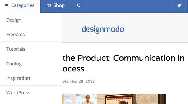
Unlike desktop computers, mobile devices have less screen space. And so, we can’t afford the luxury of adding mega-menus to help users browse through the multilevel categories on our m-commerce website. A viable alternative is to prioritize the most important features and content that influence purchasing decisions. In addition to this, your m-commerce site must contain a search box placed in a consistent location, so as to make it easily accessible.
You can have plenty of breathing room to handle lengthy or complex navigation structure by adopting off-canvas navigation. For example: Desigmodo website new website layout provides off-canvas navigation, a search drop-down box, and an instant shopping cart option – all within a small space. Furthermore, the location of all those options remains consistent throughout the website, providing mobile users’s with an optimal browsing experience.
2. Add Captivating Images
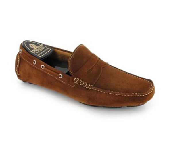
It’s a well-known fact that product images play a crucial role in enhancing or spoiling a website’s look and feel. Moreover, captivating images can encourage consumers to make a purchase. In order to make your website images attention-grabbing, you need to become familiar with different photography shots as listed below:
a) The “Individual Shot” that show your product against a white background at its best angle, as you can see in the screen shot below:
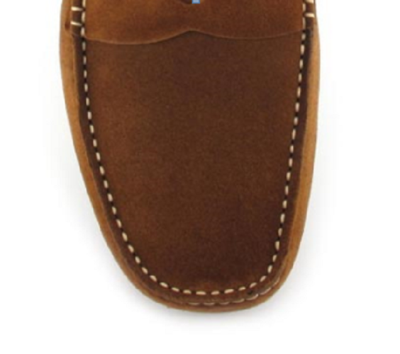
b) Also, you should consider showcasing your product design in detail that help your customers understand the special features of the product. This can be done by displaying your product image using the “Detail Shot”, as follows:
c) “360° Shot” is an excellent way to show your product in the form of an animated set of images – that help in making your product highly interactive.

Image source: DIYPhotography
In a nutshell, product photography can inspire a customer to make a decision regarding viewing and purchasing your m-commerce website products.
3. Responsive Typography
Often times, to make text legible on a mobile phone, users are provided with zoom in option. This can annoy your customers and website visitors. Thus, it is recommended that you should focus more on improving the typography to make your text easy to understand and readable for users. Ideally, you should consider following techniques that for making your m-commerce site responsive. Simply put, use techniques that help achieve responsive typography.
But, remember that creating a responsive type on the web isn’t just limited to resizing your text’s container. There are two important key aspects you’ll have to consider to creating a truly responsive text, such as:
- Select a Font-face That is Easy to Read: Keep in mind that not all of the fonts are suitable to be used as body type or headlines, and can make reading the text difficult for users. Therefore, you should choose font type and style that makes the text easily readable.
- Use Right Font Colors: The color that is used for website content is another major reason that can result in making the text unreadable. Also, when opting for font colors, consider which one will help in making the text readable for users with moderately low-vision.
Some Other Considerations For Mobile Ecommerce Website
- Add call-to-action buttons that prompts users to take instant action.
- Keep your login-in and checkout process simple.
- Adhere to best practices that help in improving your website load time.
- Study other mobile websites such as Amazon, Burton and Nike to name a few to get inspired for creating your own m-commerce site.
Conclusion
Wondering whether you should create a m-commerce website or not? Reading this post will definitely help in making the right decision. Also, you’ll get to know about important factors that will enable you to make your own mobile e-commerce website in the most efficient manner possible.
Author Biography:
Jack Calder is a extensive web developer in Markupcloud Ltd – a psd to html company. Jack has so much interest in writing various type of articles on ecommerce, website design and development. He has shared a nice article above on mobile ecommerce website.
About Author
Eyden Haze
Eyden Haze is a digital marketer, a web designer and technology fanatic from Sydney, Australia. With over 7 years of experience in web industry, he has helped his clients to launch their marketing campaigns successfully. He also likes to explore various online tools and share that knowledge by writing useful blog posts.
Nice post with containing useful information for those who have mobile e commerce website but their site are not more popular.They can use some suggestions from here to do site more popular.