

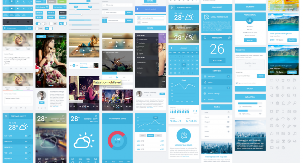
Flat design is undoubtedly the next big thing in the web design arena, and we told you so in while predicting the top design trends that’ll 2015. The first example of flat design appeared on the scene with Windows 8, the biggest interface ever to go flat. However, with the launch of iOS 7 in 2013, even Windows was left behind.
Flat design indeed looks very stylish and trendy. But not everyone thinks alike. Some industry experts, and users alike, believe that this is just a passing fad and there is nothing great about its final aesthetical output. Jakob Nielson, a noted name in the world of UX and web design, finds it to be a ‘fashionable design’ which is hurting companies and users around the world. People feel that flat design is becoming regular and dreary.
The need of the hour is to look into the matter and evaluate the reasons leading to criticism of this design pattern. Designers who work in the field of user interface and user experience must be thoughtful while incorporating this technique into any of their projects. But this doesn’t mean that they simply drop the trend and move onto something entirely new.
While flat design is receiving some bad reviews, there is a lot more good attached to it. Therefore, we must find out a midway. In this article we attempt to highlight the issues people generally face while using a flat design interface and how can designers overcome these challenges to render user-friendly designs. Let’s take a look.
How Minimal is too Minimal?
The basic driver of Flat Design technique is the ‘Swiss Style’ of design. The basic concept behind this is to keep everything as minimal as possible. There is nothing wrong with minimalism, especially when it can render clean and straightforward websites. Moreover, minimalistic designs reduce the load time of a website when run on any and every device. And this is one of the reasons which prompts designers to cross the line and go to the extent where minimalism becomes boring.
Let’s take the example of a website yaronschoen.com. As you enter this site you expect the person to showcase his user interface experience with a portfolio or at least some images. But you find an ultra-minimal design which lacks creativity. There is a plain font, simple colors and site just mentions what the person does.
It serves the purpose right but doesn’t speak high about talent. Point: too much of minimalism can give an impression of non-creativity.
Is Creativity on the Verge of Extinction?
With flat design receiving much appreciation, everyone wants to employ this trend not wanting to be left behind. In fact, the trend is so much in vogue that if a website isn’t using flat design it is deemed to be called ‘old fashioned’. Thus it comes as no surprise that everyone wants to develop their sites and applications as per flat design.
Designers have stopped taking risks and seem to have become comfortable with using the same style as everyone else. This is, undoubtedly, shaking the core concepts of innovation and creativity. The scope of creativity diminishes where everybody is happy with the same flat design. Creativity, which once was a major driver of website design, is being hurt.
From Mobile First to Mobile Only
The most promising feature of flat design is its responsive nature. The technique works well with mobiles and other hand held devices. Since around 30% of the traffic is now routed via mobile handsets, it is obvious that designers would like to come up with responsive websites. Focusing on this they design minimal websites keeping those elements out which might not be relevant for mobile users. However, amidst all this responsive rush designers tend to forget that majority of people still access the web through PCs.
Let’s take the example of Windows 8. Microsoft wanted to design a standard experience for all devices. However, it is no secret that the ‘Metro’ interface performed exceptionally well on mobiles and tablets than on desktops. Reason: Most of its features were inclined to respond to touch than a mouse click.
Most designers are following the same suit as Windows 8, but unfortunately the designs turn out to be ‘mobile only’ than ‘mobile first’.
What’s the Solution?
Flat design undoubtedly provides a more pleasant user experience. But too much of minimalism or lack of visual clues can hinder usability. Thus, the need is to come up with an interface which is flat enough but at the same time has visual cues to help users understand which elements are clickable. Designers can take a cue from the improvements made in Windows 8.1.
Flat design isn’t hard to practice. All designers need to do is to keep the above mentioned factors in mind while applying this technique to their designs.
About Author
Founder
David Watson is the founder of DesignDrizzle and is a professional website designer for over 10 years. He has competence in creating visually appealing and user-friendly websites for all the clients. He likes to explore new and creative ideas for designing, photography effects and other inspirational subjects