
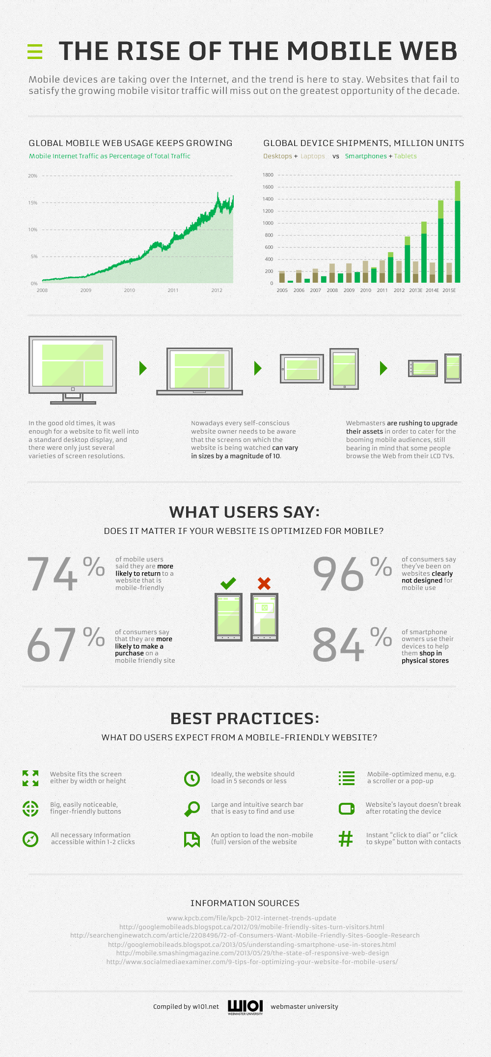
The growth in popularity of smart phones and tablets has completely changed the web experience. The chances are that today, you have viewed a webpage on a mobile device such as a smart phone or tablet. You are not alone. In 2011, the total global purchases of mobile devices for the first time surpassed the purchase of the more traditional laptops and desktops. Today, more users are now opting to use the web using mobile devices, as opposed to desktop and laptop computers. These devices are completely revolutionized the way we use the Internet. Rather than experiencing the web with a more formal setup being sat at a desk, now users can experience the Internet in a more relaxed setting, even walking on the street or commuting. That experience is also a challenge for web designers now having to create websites that look great on smaller screens. This is often achieved through mobile optimized websites by applying best practices and taking into account the specifics of the handheld device interface. Going mobile may get tough at times, yet those who ignore this growing market may find themselves left out from the global innovation flow.

The Rise of the Mobile Web[Infographic]
About Author
Founder
David Watson is the founder of DesignDrizzle and is a professional website designer for over 10 years. He has competence in creating visually appealing and user-friendly websites for all the clients. He likes to explore new and creative ideas for designing, photography effects and other inspirational subjects