
A simple design has loads of expectations. We sketch different ideas in our mind and expect them to come as they were imagined but rarely does the result match those ideas. As a logo designer, it is our sole duty to live up to every single word the client uses to describe his project. Be it simple or modern, classic or minimalistic, these expectations are only relaxed after the investment of an untiring effort, after which, if the client it not satisfied we need to start over.
A tough job indeed. For all we see from their perspective, they get cornered and go blank. Hence, we have gathered some trends in designing logos that have conquered their spots in 2017 which could be of great assistance before you pass you hop over your next project.
1. Less Is More

The minimal the design, the simple it is and the memorable it stays. These days, viewers have become fans of such designs that convey your brand story to the targeted audience. Therefore, try including as minimal elements as possible to make your logo design practical and purposeful.
These types of designs influence the audience. How? They understand the logo designs well and remember them for a long time. Furthermore, they go well with everything and can be used both on websites and stationery designs.
2. Hand-Drawn
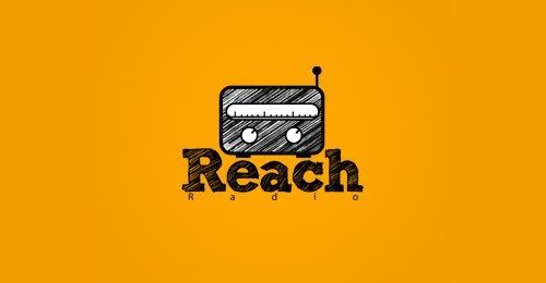
2016 experienced the introduction of simple and elegant designs which were hand-drawn and later these gained its admirers steeply in 2017. A humanly touch is the X-factor here, drawing more attention towards its unique style and contemporary idea.
Food and drink industry has seen the significance of these designs. Though these are difficult to plan on digital platforms, they leave an impression on their audience and if your project is worth the determined effort, try giving it a fresh look through this technique.
3. Line Art
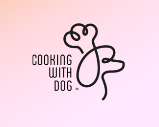
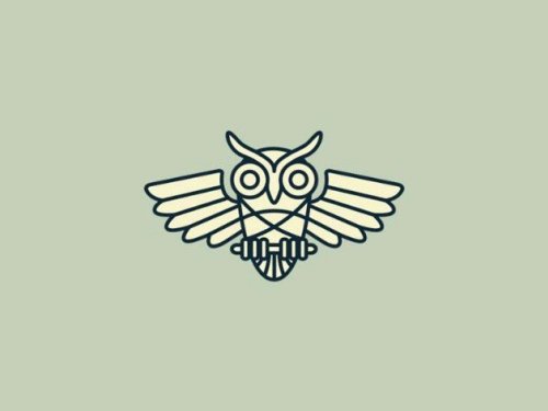
Line art has been the dominating effect used by most of the graphic designers today. When you are out of providing sufficient space to your design, you could adopt this creative technique and efficiently utilize the limited space.
A single colour is used to draw lines of even thickness to create a sophisticated, sleek but simple design. You could use text as well to conveniently display brand message.
4. Letter-Stacking
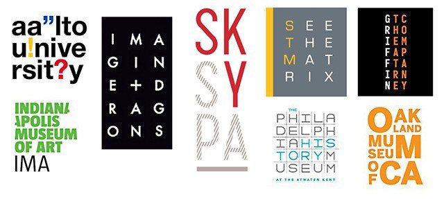
This technique could also be implemented when you have negative space. This design greatly functions as an attention grabber, tempting the viewer to hold on and appreciate the elegance of the design and observe the brand message. The more the audience is involved with the design, the more are they amazed and the more it stays memorable. Use this method when you have longer texts but lesser space. Efficiently portray your idea with an appropriate font chosen wisely with a bold look.
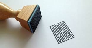
5. Broken letters
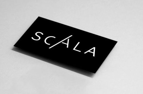
Another trendy technique this year has cherished is the usage of broken fonts to parade an exclusive idea with a fresh feel. Broken letters give a different look to your logo and when the cracks are legit, your clients would no doubt stay startled.
You will need a design that was never used before by any other firm. Uniqueness must be the basic requirement and out-of-the-box ideas must be your blue-print to create a stunning design. When you design a logo, you represent the brand image and reputation. Make sure you use your best tools to satisfy your client’s expectations.
About Author
Founder
David Watson is the founder of DesignDrizzle and is a professional website designer for over 10 years. He has competence in creating visually appealing and user-friendly websites for all the clients. He likes to explore new and creative ideas for designing, photography effects and other inspirational subjects