
For much of European history, the majority of the populace was illiterate – which meant that something as commonplace as the name of a shop on a sign would have incomprehensible to most. The obvious solution then was to have a depiction of the object or service being offered: a bottle of wine hung outside a wine seller’s, a horseshoe could often be found outside a blacksmith’s and so on. Visiting old parts of cities like Prague or Salzburg one can see these signs today, and many older companies’ logos evolved from these medieval symbols.
The entire concept of brand recognition employees the same principles that were at play in illiterate societies. MacDonald’s golden arches, for example, can be recognised by anyone across the world, regardless of whether they can read. In a joint study conducted by the University of Malaya and University of Manchester, it was found that colour plays a major role in brand recognition and even in customers returning to the company. Beyond being unique, brand images and logos have to convey the appropriate feeling, often through colour.
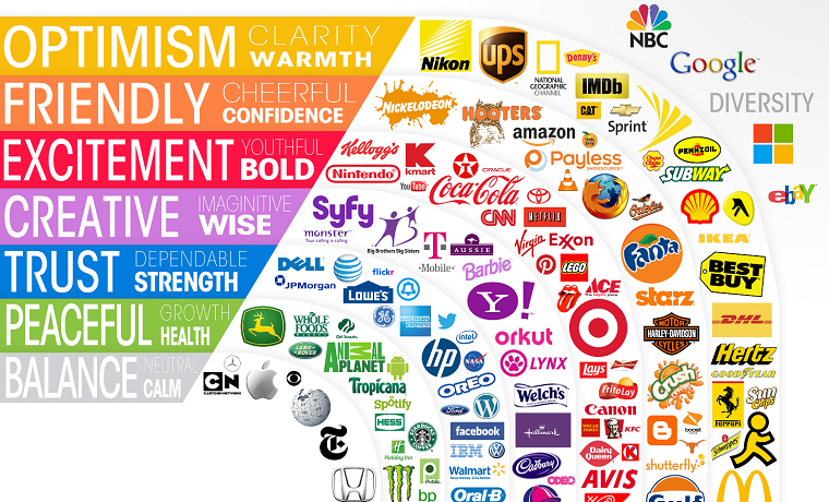
Let’s take an in-depth look at how brands use these colours and logos to relay their marketing messages and brand identity to their audience. This will help you see the effect of colour on audiences and make more informed choices when designing and choosing colour palettes.
GREEN
Green is a colour used most often by companies wishing to convey a sense of calm and relaxation, and for obvious reasons, green is associated with nature and by extension health and growth. American supermarket chain Whole Foods utilizes this colour and look well to convey a positive, Earth-friendly vibe. Green is also used well and to great effect by coffee chain Starbucks, who capitalise on the calming and social aspects of coffee-drinking through the use of green to imply a cosy environment and a natural product.
RED AND ORANGE
For companies wishing to go in the opposite direction, reds and oranges tend to be exciting. Being the colour of blood, some people have a visceral response to red – it’s associated with excitement, and perhaps just a soupcon of danger. Netflix, Nintendo and even the Rolling Stones’ tongue-and-lip logo use red to stimulate and foster a feeling of excitement. When Netflix adds red to black, the black adds both a sense of class and highlights the exhilaration of the red, perfect for a company that focuses on television and film. Nintendo, on the other hand, pairs their red with a neutral grey, with the logo leading itself to the fun and excitement of the gaming system itself. And where the Rolling Stones are concerned, if one ignores the main associations of their tongue-and-lip logo, it’s the red alone creates a sense of titillation very appropriate for a rock ’n’ roll band.
Although red and orange aren’t far apart on the colour spectrum, the respective feelings associated with them somewhat divergent. Whilst both are stimulating, red highlights thrill and excitement but orange evokes feelings of friendliness and camaraderie. Both companies that focus on bringing people together—one through travel, the other through telecommunications—it’s unsurprising that easyJet and Orange both use orange. The latter so much so that it’s the name of the company. Orange tends also to be associated to cheer, making it a colour that is often used when targeting youthful demographics, as is the case with Fanta, whose entire website is covered in shades of orange. Fanta also highlights the feelings of this colour by using what Douglas Adams might have called “big friendly letters” to imply it’s accessible to all, whereas red, a colour of warning, might unconscious intimidate potential customers.
PINK
Although pink just a lighter shade of red, it’s used very differently and evokes different feelings. For much of the 20th century, pink was associated with girls, women and all things female (although the blue-for-boys and pink-for-girls motif is a very modern associate, the colours having been reversed up until the 1920s), but this is changing. In the world of politics, pink is now being used as a colour of inclusion and calm. Social-democratic parties in France and Portugal both use the colour as well as the Danish Social Liberal Party and Austria’s NEOS party. Politics aside, these parties all want to be seen as being progressive and inclusive and have opted for pink to bring connotations of those qualities. Another successful example of pink is used by Fabulous Bingo, a gaming site, whose choice of pink creates a sense of calm that invites players to stay for hours and enjoy themselves. The brand’s target demographic is females who like luxury and glamour, and choosing pink speaks well to them. At the risk of a cliché, in many ways pink is the new green where calm, acceptance and relaxation are concerned.
Corporate image and branding have come a long way since the days when a wrought-iron arrow hanging above a door indicated a fletcher was peddling his wares inside, but the fact that we react to colour and image on a visceral level remains undeniable.
About Author
Founder
David Watson is the founder of DesignDrizzle and is a professional website designer for over 10 years. He has competence in creating visually appealing and user-friendly websites for all the clients. He likes to explore new and creative ideas for designing, photography effects and other inspirational subjects