
Designing a logo is not as easy as you may think. While designing a logo, the majority of time is spent on ideation. If you have a solid idea, you’ll strike gold in the first instance. However, if the foundation of your idea is not that strong, endless attempts will still not make it correct.
Why do we give so much importance to such a little thing as a logo? Well, we do that as this logo will be the identity of the brand and a brand cannot have multiple identities, just like a person cannot have multiple identities.
![]()
The noise from Current Trends
No matter how tempting it looks, if you are designing a logo, you should always try to steer away from the current trends, or the viral things during the time of designing. This is generally because the Logo is meant to be a permanent identity of the brand.
The oldest logo still in use is the Stella Artois’s logo, designed and launched in 1366 thus proving logos are ageless.
Cluttered Designs
There are times when a brand has a lot to offer and they end up trying to show that through the logo. They try to include a lot of art and at the same time, a lot of colors, too. For the first time, it may look appealing but in the long run, it fails to cast an impact on the minds of the viewers.
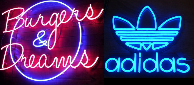
However, over the years you can see other brands like Adidas, Burgers & Dreams and many more coming up with fun and stylish logos in the form of neon signs, which look unique, appealing and really stand out from the crowd.
Using Stock Art elements
Most businesses make this mistake while designing their logo. They tend to rely on getting good design and getting it cheap and fast. Hence, the designers tend to use stock images which creates a lot of problems, when you try to get the logo registered.
A statistic showed that over 50% of small businesses create their own logo, and that is when this problem arises! You may take inspiration from these stocks, but if you really want your logo to make a difference, contact expert logo designers.
Basic Colors
Colors play a very important role when it comes to bringing the emotions out in a logo. These colors have to resonate with the brand offerings, or else, the logo will not fulfill its purpose. A brand like Burger King would never become iconic if the logo did not have the crown.
Hence, little elements like these along with the colors truly make the logo worth remembering. So, when you are doing the brand research, ensure you know the core offerings to get the right color palette for the brand.
Raster Images
One of the biggest blunders that people make is using poor quality graphics when creating a logo. Saving a logo in a raster image format like .JPG or .GIF is a rookie mistake. A logo should be able to look good at any size, and that’s simply not possible with low quality raster images. All logos should be created in a vector format like .SVG so that they can be printed in high quality in any size, from business cards to billboards.
Most logo makers ensure that your logo will be saved in the correct vector format so that your logo will be easily scalable and the digital reproduction on endless media will never harm the quality of the graphics.”
Inappropriate fonts
If you want to do something differently, it does not necessarily mean that you will have to do it in the wrong way. A lot of times, brands fail to stand out as the fonts used are not optimum. Hence, in order to ensure the best fonts, keep in mind that the right fonts are being used to deliver the message.
Two of the most popular font choices to date have to be Helvetica and Univers.
Copying others
The biggest blunder in logo designing is trying to copy a logo of another brand, irrespective of its play in the market. There have been endless lawsuits because of this. In the year of 2010, a lawsuit was filed by the cigarette brand Newport that Nike’s logo resembled their 1957 logo.
Remember there’s a thin line between inspiration and copying. You definitely don’t want to be on the other side of this line.
Now that you are well aware of the blunders, why not try your hands on creating something fresh, beautiful and ageless for your brand.
About Author
Founder
David Watson is the founder of DesignDrizzle and is a professional website designer for over 10 years. He has competence in creating visually appealing and user-friendly websites for all the clients. He likes to explore new and creative ideas for designing, photography effects and other inspirational subjects