
We all know how hard it is to find a product of our choice on an e-Commerce website without filtered navigation. Filtered navigation saves us form the pain of going through thousands of products and help us choose the best one from a specific set of related items instead.
Now that all the giants in the e-Commerce industry like eBay and Amazon are using it to enhance user experience by speeding up search, it is a must have feature for all the upcoming online stores. Following are 8 tips to optimize filtered navigation on your online store and give users a pleasant experience of buying the products they need.
Put it at the right place
It is very common to see the filtered navigation interface on the left sidebar on most of the e-Commerce websites like Amazon, eBay or Flipkart. But that does not mean it the best choice for your online store too.
Studies have shown that 24% of top e-Commerce websites in the US have switched to horizontal filtering and sorting tool because it has significantly outperformed the traditional setup. FabFurnish is a great example to see how they have made a good use of horizontal navigation interface by adding relevant categories with subcategories which would otherwise have been difficult to adjust in the left sidebar.
Add filters that make sense
If e-Commerce giants are using many fancy filters on their website, that doesn’t mean they will work for you too. Relevant navigation filters are important because they bring your customers closer to the product and hence increasing the chances that they’ll buy it from your website.
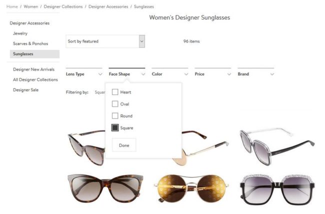
Color, for example, would be a great filter for an online clothing store but very bad for a book store. Hence, choose your filters wisely to avoid confusion for your potential customers.
Nordstrom has given meaningful filters for each category like ‘lens type’, ‘price’, ‘brand’ and hence is able to greatly enhance its user experience.
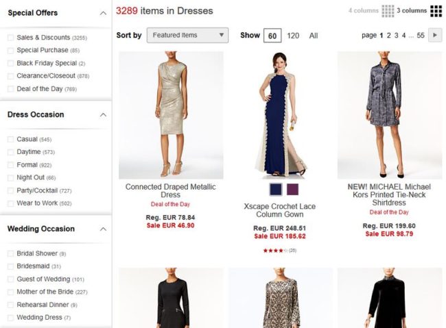
Multiple filter selection is good for users
Even though 70 – 90% of the users visiting your website are just there to browse your site and see what’s new, the rest of them are serious about buying something. It is important to pay special attention to those users and provide them with multiple filters to allow them to reach the product faster.
Hence, allowing users to run multiple queries and filter products based on different filter groups like color, price, material and brand will enhance your business value. Both Amazon and eBay allow this feature as they don’t want their customers to get lost in millions of products that they don’t want.
Let user enter their specific keyword
Although it is a great idea to make the search easy by giving dropdown and check-boxes for users to just click, sometimes they want to filter products in their own way. While some want to search for a specific keyword, others might want to look for products in a specific price range.
eBay, as an example, lets users to select a custom price range by letting them enter the minimum and maximum price manually. This feature lets customer decide what they want.
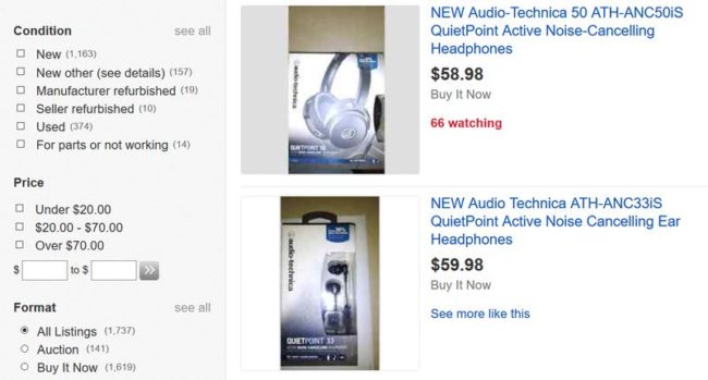
A product counter gives an immediate answer to the customer
Displaying a product counter is very important for a customer to understand if the custom filter that is set by him or her has actually narrowed down the desired search results or is there a further requirement to reach that level.
Every customer when visits your online store, comes with a predefined number of products that s/he will check before actually buying the product. By showing that number to them, you will build a sense of trust with them.
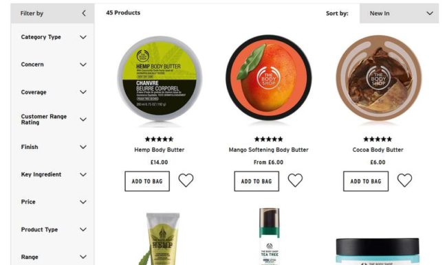
Relevant filter groups enhances the filter performance
A successful e-Commerce website will not only ensure that it provides all the necessary filters to the users but also makes sure that similar and relevant filters are grouped together to help users find the results they are looking for. This is very important feature that lets your filter navigator look clean and meaningful.
The Body Shop is one example where you’ll see many filters but all of them are clubbed together in meaningful groups to enhance user search experience.
Theme based filter is the new ‘in’ thing
Along with the existing strict filters, these theme based filters can take your online store to a whole new level. For example, in a clothing website, what if along with the searching for a specific price set, the user can also search clothes for a specific season like summers or winters or maybe a specific style like casual, formal etc.?
Though they are not always an obvious choice, it is worth analyzing if it can make browsing your website easy for your customers.Macy’s provide an amazing user experience with horizontal filter navigations and theme based filters like ‘Active Wear’ and ‘Resort Wear’.
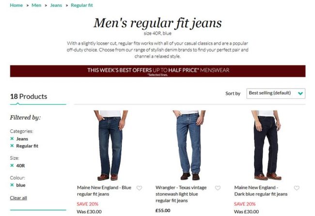
Show applied filter to your users
We humans have a general tendency to forget what we were searching for and hence feel lost. If your navigation interface shows your customers what all filters they have applied for a particular search, it will streamline their thoughts and let them take decision to buy the stuff or modify the filter to find the right product.
Amazon is a great example where it clearly shows you where you are and what all filter have you applied to reach a particular set of results. Debenhems on the other side has gone to a whole new level by separating the selected filters and showing them together so that you can process them faster.
About Author
Eyden Haze
Eyden Haze is a digital marketer, a web designer and technology fanatic from Sydney, Australia. With over 7 years of experience in web industry, he has helped his clients to launch their marketing campaigns successfully. He also likes to explore various online tools and share that knowledge by writing useful blog posts.