
Occasionally, we pay more heed to the content and ignore the appearance of sites and its consequence. Professionally, we tend to keep it simple and neat but eventually, it seems dry. With technology booming and the trends taking over the virtual and the real world, colors significantly affect web designs. Also, the psychological impact of certain colors does leave a decent impression on the user.
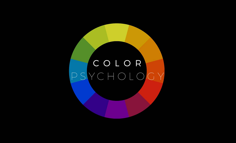
Color Psychology
Technically, there are research documents which have their findings posted on the concept of color psychology. Countless marketing and design professionals closely studied the influence of color which led to the adoption of color schemes in various industries as well.
Influence of Color on Marketing
A research published by Kiss Metrics read that 93 percent of users say visual appearance is the most important factor in attracting any client and making a purchase. An additional 85 percent of the consumers think that color is the chief reason of the purchase of any product.
How Color Psychology Factors Into Design
If you’re well-versed with the elementary principles of color psychology, you could use colors to your assistance as colors impact online shoppers tremendously. Each color signifies an emotion and stands unique. Some of these colors which are used online, more often, are mentioned below with their qualities.
Yellow: Bright as it is, this color is ordinarily related well to optimism and youthfulness. When used thinly, this color could be an attention grabber for purchasers. But make sure you don’t spill much. This could have a counter effect.
Red: This color factually increases the heart-rate and energizes the spectator. Red is used to caution or indicate urgency in various websites.One could highlight important tags in red to attract the reader.
Blue: Blue illustrates or creates a sense of trust. This classy color is common color in the corporate world, predominantly in the financial industry. Use blue when you need to fascinate the readers by depicting stocks or market rates.
Green: Green stimulates relaxation and is easily absorbed by the reader. If you are dealing with something environment-related or natural products/websites, you could use this color.
Orange: This tangy color is powerful, reinforcing a call to action. Orange could be used preferably when immediacy is the topmost concern. You could also use orange to entice the customers to buy your product or subscribe for something instantaneously.
Pink: Commonly allied with romance and femininity, this light color is used to market products for women and young girls.
Black: Black is achic color in case you are dealing with luxury. Often polished and sleek, you could certainly not deflect if you use black for promoting high-end products and services.
Purple: Associated with prestige and royalty, this imperial color gives a soothing effect and leaves the reader all-calm and composed.
White: White is mainly associated with cleanliness and peace. Promoting purity, virtue and stillness, this color is used extensively by the healthcare industry. However, there are numerous business models taking up white as their chief design color too.
Gray: A professionally embraced color which works fascinatingly well across plenty of industries, from eminent luxury brands to big businesses.

About Author
Eyden Haze
Eyden Haze is a digital marketer, a web designer and technology fanatic from Sydney, Australia. With over 7 years of experience in web industry, he has helped his clients to launch their marketing campaigns successfully. He also likes to explore various online tools and share that knowledge by writing useful blog posts.
Such a Great article! I didn’t know before reading this that how colors affect the websites.