Conversion rate is basically a proportion of visitors to a website that will potentially buy from you. In terms of a website it is generally the percentage of people who make an actual purchase. A conversion rate can be measured by the number of potential website visitors who fulfill the desired activities, either it is buying a product or a service of a company, taking part in a survey etc. A lot of organizations focus exclusively on increasing the number of visitors while the real issue is with their website and therefore, such actions do not really help to solve the problem. However, with the right approach high conversion rate can really improve a website bottom line at minimal expense, which brings us to another useful marketing tool – newsletters.
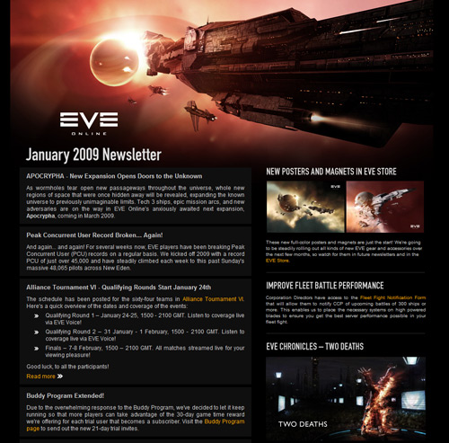
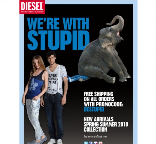
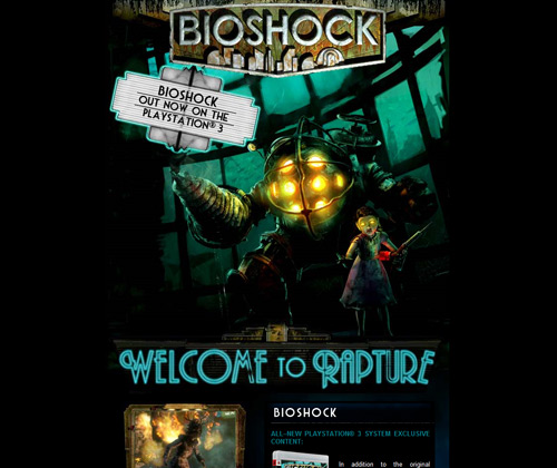
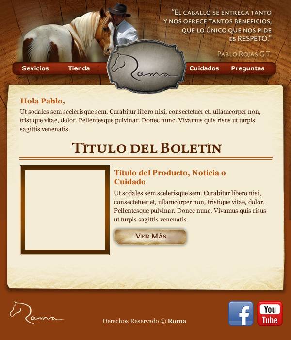
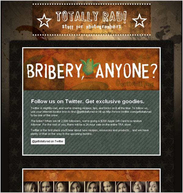
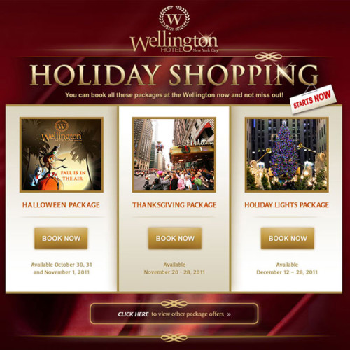
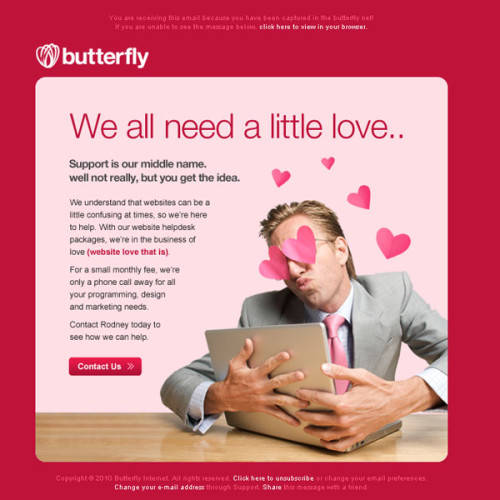
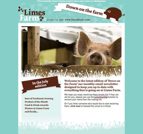
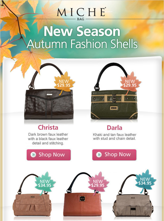
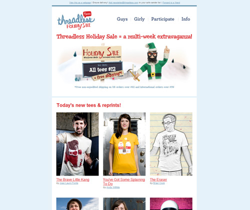
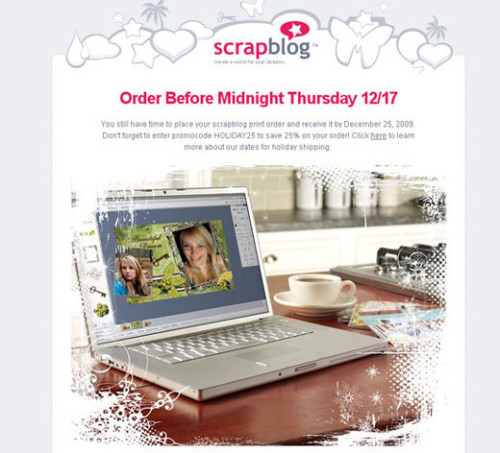
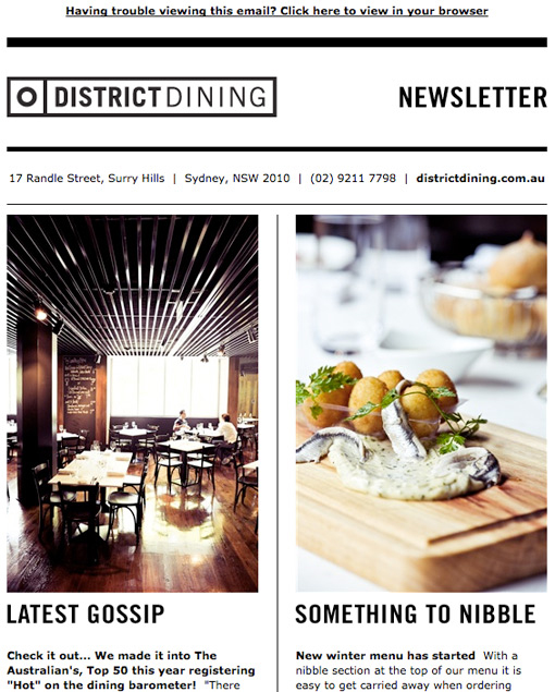
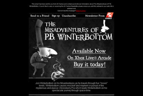
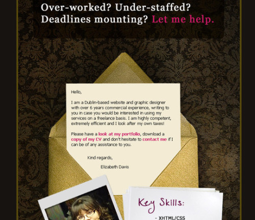
A newsletter is a publication, usually on one subject of interest that is regularly spread among the group of subscribers. Newsletters are most often delivered via e-mail, and therefore initially are called e-Newsletters. A beautiful design with professional touch will impress a common user turning them from a prospective buyer into an actual one. Content matters as well – what you write inside of your newsletter will directly affect your potential customers, so remain on top there too. What makes a good design for the newsletters that in fact bring you more conversion? Check out the following examples of successful newsletters designs and try to learn from them as much as possible:
Author Block:
The article is kindly provided by Zfort Group – web design and development company that specializes in e-commerce outsourcing projects, as well as mobile development, Quality Assurance, etc.

