We see banner advertisements every day; they’re on websites, buses, billboards and plenty of other places too but the thing is, most of them are pretty poor. I’d estimate that around 90% of all banner ad designs are not only poorly designed but also offer no real reason to remember the banner ad or the product/service they’re advertising.
Clearly, if you’re investing in banner advertising for your business (which you may very well be thinking of doing), you need to make sure that your banner ad gets remembered and that it makes an impact on the bottom line of your business (and not a negative one either). Doing this is harder said than done but one of the best ways to capture people’s attention is to create a banner ad that makes people laugh.
If you can make people laugh, they won’t only remember your banner ad but also, likely tell their friends and family about it. So, I thought that in order to inspire you and to get your creative, funny juices flowing, I’d round up some of my all-time favourite banner ads that are sure to make you laugh.
#1 – Hyundai
Source: AdsOfTheWorld
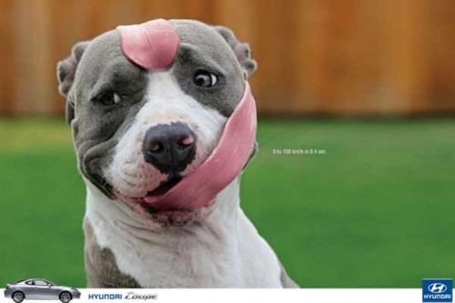
Hyundai is a leading manufacturer and supplier of automobiles around the world and the ad that you see above was created to advertise their Hyundai Coupe model. The unique selling point of this vehicle is that despite it’s ‘coupe’ design, it still performs extremely well on the road. In fact, as you can see on the ad, it’s capable of going from zero to one hundred kilometres per hour in only 8.4 seconds; impressively fast for a coupe to say the least.
However, the true genius of the product in my opinion is the way that Hyundai chose to market it. You can see the cute looking dog with what appears to be his entire tongue wrapped around his head; but what does this have to do with the car?
Well, if you’ve ever had a dog in the car with you, you’ll know that they love nothing more than to stick their head out of the window and feel the breeze, usually with their tongue hanging out. Clearly, the speed of the Hyundai Coupe was a little too much for this dog who appears to have been hit by a speedy gust (thanks to the 8.4. second 0-100 speed).
#2 – Bose
Source: AdsOfTheWorld
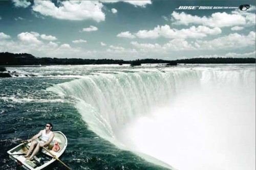
If you haven’t heard of Bose (no pun intended), then maybe this ad will jog your memory. Bose are one of the world’s most well known manufacturers of audio and listening equipment (e.g. headphones, hi-fi’s etc). This incredibly funny and clever banner ad was created by the company in order to advertise their latest noise reducing headphones and as you can see, they’re making a pretty bold claim as to how well they function.
You can see in the ad that a guy seems to be having the time of his life rowing down a stunning river. This experience seems to be being enhanced by his Bose noise reducing headphones but perhaps, a little too much. You can see that despite the huge amount of noise that is likely emanating from the waterfall he’s about to row directly into, he appears none the wiser.
It must be because his headphones are doing such a great job. The moral of the story; don’t combine Bose headphones and rowing (as if you were going to anyway!).
#3 – Discount Banner Printing
Source: www.discountbannerprinting.co.uk
At this stage, you’re probably thinking that this is all well and good, but you don’t have the huge marketing budgets that Bose and Hyundai have for your company, so how are you ever going to compete?
Well, if you take a look at this banner ad from the UK printing company, Discount Banner Printing, you’ll see that you don’t always have to rely on a huge marketing budget to make something extremely creative. Compared with the likes of Hyundai and Bose, DBP are a very small company, yet their ad rivals the big guys in terms of its amusement.
I’m sure I don’t have to explain the ad to you as if you’re anything like me, you’ll feel the way the guy in the ad clearly feels about his printer every day of the week. I know that mine never works.
This ad was printed alongside the slogan “Leave It To The Pro’s” – a slogan that’s represented perfectly by the ad.
#4 – Aquafresh
Source: AdsOfTheWorld
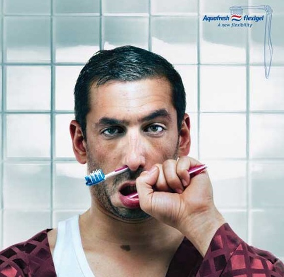
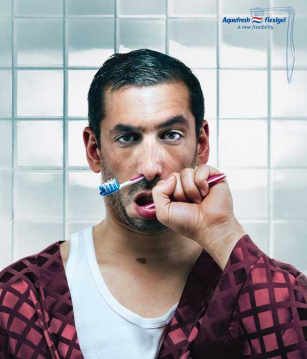
This rather disturbing looking, yet extremely humorous ad from Aquafresh (the oral hygiene brand) was created to advertise their new Flexigel brush. What is the new Flegigel brush? Well, if you take a look at the advert you might just figure it out.
Basically, it’s a new toothbrush that allows for greater flexibility in the mouth. If you’ve ever used a cheap toothbrush, you’ve probably found that reaching those few back teeth and giving them a good clean wasn’t that easy as your toothbrush didn’t provide enough flexibility. Obviously, many toothbrushes aren’t that bad but Aquafresh have taken this to a whole new level with their latest design.
While the toothbrush probably isn’t quite as a flexible as is depicted in the ad (at least I hope it isn’t), you can see the point they’re trying to make and this funny ad is a great way of attracting attention to what is ultimately, a toothbrush.
Conclusion
I hope that these ads will serve as inspiration for your latest creation and I also hope that some of them will show you that even without a huge budget, you can still create an incredibly funny, eye-catching and all-round brilliant banner ad.
Just get a pen and paper and get to work brainstorming, you’ll soon come up with a great idea for your latest product/service, I just know it.
Author Bio: Joshua is a lover of all things creative and has a particular interest in advertising. He works in the marketing department for the UK based banner printing brand www.discountbannerprinting.co.uk


Nice Post. Hyundai Car Banner ad had a dog is Really funny.