From the perspective of the average online shopper, what’s the difference between browsing without buying, versus making a purchase? In some cases, it could be a well-designed ecommerce website. Sure, a lot of people will buy something online simply because they found a good deal, or because they need it and you’re the retailer that came up first in the search results. However, there are plenty of things that can influence these decisions, and most of them are more subtle than offering a good price or a responsive website.
If your WordPress website looks out-of-date or sloppily put together, that could prevent potential customers from fully trusting your site. At the very least they won’t be able to identify with your brand, which is almost as bad.
How can you make sure your ecommerce site is getting people invested, though? For many people, the answer is to hire WordPress website maintenance services like WebCitz. Not only can you get the glitches ironed out as soon as they appear, but this type of service can also make sure your site gets regular facelifts to keep it feeling relevant for users.
Why WordPress, though? While it’s popular among people with personal sites or portfolios, you’d be surprised at how many businesses use WordPress too. Not only does it offer countless themes with which to customize a site, but it also works well with various widgets and plugins, such as the ones needed for ecommerce.
With that introduction, let’s explore a few WordPress ecommerce sites that stand out because of their web design.
-
Björk
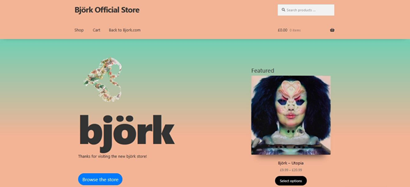
Can you expect something associated with Björk to be mainstream? Not if you know anything about her. The official website uses a less-is-more approach. There isn’t anything extraordinary about the layout; you could actually call it minimalist. What makes it stand out is the color scheme, and the use of a gradient effect to blend the two colors together. Anyone who wants to check out her products will only have to peruse one page, as everything’s listed together.
-
Offerman Wood Shop
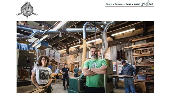
Here’s another celebrity website, but this time it may be a bit of a surprise to fans – Nick Offerman has a site where he sells handmade custom furniture. The site fits both the founder’s image, and the aesthetic of the furniture – it’s bold, confident, and solid. The grid layout uses large photos for more of an impact; you don’t miss any of the details. Even better, most of the furniture is photographed as if it’s already found a place in someone’s home, so you can easily imagine how it would look in yours.
-
Lost Dog Café
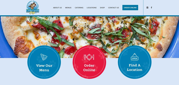
You’ll see a lot of minimalist design elements in WordPress sites these days, but Lost Dog Café’s website is unapologetically bohemian. Between the bright colors, the slightly in-your-face photos, and a font that’s almost wacky, this is an ecommerce site that’s just fun. You can place food orders online, check out their merchandise, or even explore the beers that are on tap at any given location.
-
Flwr
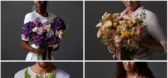
When even the spelling of the name is minimalist, you should expect a fairly elemental web design – and that’s exactly what you’ll get with Flwr, a florist based in New Zealand. The floral arrangements are anything but minimalist, though; they’re bountiful and full of color. Even so, the overall look of the site is far from fussy. Even though their product photos use models, you hardly even notice the person standing in the background; the most impactful aspect of each picture is the light-colored clothing contrasting with the gray background, which contrasts with the flowers. You don’t even have to click on the product photos to get more details; just move the pointer across any image for the product information.
-
All-Taxidermy
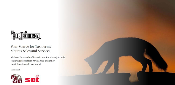
What should a taxidermy website look like? According to All-Taxidermy, there needs to be more than just examples of their work; they also remind potential clients of what their taxidermy work embodies. Naturally, you can scroll down and see examples of their most popular types of taxidermy work, but the site is more than just a way to sell products; it also reminds users that taxidermy is a way to preserve the triumphs of the past.
-
House of Whisky Scotland
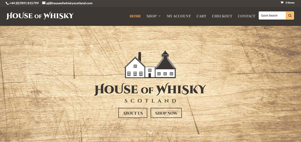
Instead of filling their landing page with glamour shots of whisky bottles, House of Whisky Scotland has opted for the minimalist approach with a simple wood-grain background. Even though it doesn’t necessarily scream “we sell whisky”, it doesn’t have to; instead, it creates a feeling of history and authenticity. Of course, when you get to the products page, you can see all the whisky you want. You can even shop by year, which is a great feature for anyone who’s looking for birthday or anniversary gifts.
-
Shop Catalog
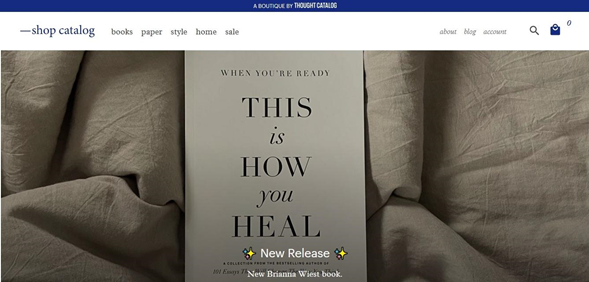
Rather than being a standalone WordPress ecommerce site, Shop Catalog is connected to Thought Catalog, a youth culture website. Even though a lot of the products deal with rather heavy subjects, the overall feel of the site is pretty light-hearted. For example, a few strategic emojis make the layout more fun, and they offer a nice contrast to the neutral background.
-
Airstream
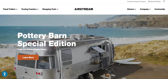
There’s a certain kind of feeling that outdoor and travel retailers try to inspire in their customers. They don’t just present accurate, well-lit photographs of their products; from camping cookware to off-terrain vehicles, they show you how it looks when it’s right in the middle of an adventure. That’s exactly what Airstream does on their site. Not only are their gleaming coaches and trailers shown off in sun-drenched photographs, but the scenic backgrounds are calculated to make you think “I wish that was my life”.
Even with their unique designs, there’s something these WordPress sites have in common.
Regardless of their product or aesthetic, all of these sites have been able to match the message of their brand with the design of their website. If you can make the same thing happen on your ecommerce site, you’ve learned the lesson well!

