10 Examples of Most Engaging & Perfect Ending Website Footer Design
Posted by David Watson . on February 11, 2018

The role & demand of Internet is very common today and generally, used by many people every day, but if you ask randomly about footer design from any random person, then he would probably remote his eyes. The fact is that web designer & footer designer get least appreciation by the most online visitors. I think that because of this reason footer is located at the bottom of web page. Nevertheless, we have seen a lot of beautiful footer designs over many websites. Thus, we decide to show you an amazing collection and hopefully, you will like it.
Web designers think that visitors focus only on the upper part of the website, like navigation, sidebar, menu bar, etc. But, it is not a truth. Well! We agree visitors most likely to give attention on above the fold part of site. However, a creative footer design can be used as a “call to action” to showcase the portfolio goodies. The customized footer can increase chances to gain interest of visitors and engage for a long time.
Mecannical

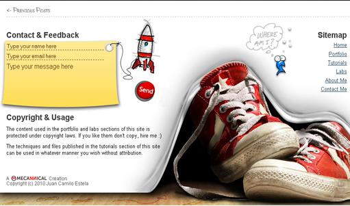
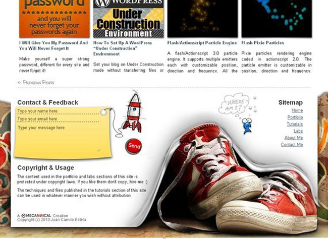
Mechannical is probably one of the best websites, which has stunning footer design online and beautifully ending web page with stylish look. As per my opinion, it draws heavily social interaction between visitors as well as site owners. The feedback section is also given for visitors to rely their suggestions and questions regarding offered services.
CSSChopper

There are some websites that opt a place, where they mention achievements, important links, satisfaction and money back guarantees, contact address and number, etc. And, CSSChopper is one of them that maintains everything with slider effects and navigations, which is required from the users’ point of views.
Duirwaigh Studios

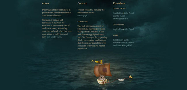
This website utilizes the footer with the profile of company as well as contact information and social media accounts. They also place a link, where visitors directly can reach to the company. Without navigation & animation, an inspirational image is adjusted with few links. The background color of footer is contrast from the rest of the page.
HTMLPanda

There is a fashion of using dark background color in footer design that mostly fascinate the attention of visitors. HTMLPanda implements this concept very well in its footer with contrast color and hover effect. You can see an option to enter your Email and subscribe to receive the newsletter of this site.
The Midnighter’s Club

The Midnighter’s Club contains a beautifully designed web footer that draws simplicity and elegance of the design. The very cute illustrations desperate visitors to know more about the site. This design uses a clear-cut approach to convey a message without losing the purpose of site.
No-refresh

The simple, yet interesting footer design that provides all the relevant links to complete your search. This site showcases that how can we make attractive footer design without having animations and multimedia effects. A simple and professional look with contact details, list of products, sitemap, etc.
Bimbi Sicuramente

The footer design of Bimbi Sicuramente’s website features simplicity and showcasing the highly-visual appearance with the splashes of vibrant colors and beautifully crafted images, which closely relate with the main theme of the site. This site comprises only one page design at the home page.
Sparx IT Solutions

Sparx IT Solutions is a development company that includes the symbol or logo of their branded clients. Contact details, services and social networking link for twitter are places beautifully without dark and bright color, which shows simplicity.
Northern Classics

Northern Classics is a Dutch website that contains really a cool footer design and possess the use of images and multimedia related to the features’ topic that website aims to represent. It goes beyond the traditional standard layout by moving up with illustration & navigation that helps make the visitors more fascinated with it.
LogoDesignsStudio

Another simple footer design with dark background color can be seen at LogoDesignsStudio that creatively manages links, sliders and images with embedded link, which redirect to the contact page, once you click on the image.
Conclusion
About Author: Garry Smith is a professional website designer as well a versatile writer of CSSChopper, who has covered a wide array of topics related to designing a website. He is passionate blogger and 5+ years experienced in web designing.
About Author
Founder
David Watson is the founder of DesignDrizzle and is a professional website designer for over 10 years. He has competence in creating visually appealing and user-friendly websites for all the clients. He likes to explore new and creative ideas for designing, photography effects and other inspirational subjects
