As an online merchant, you might have tried and tested a wide array of design trends for revamping the look and feel of your e-commerce store. If you’ve chosen to power your e-store using Magento, then you’ve indeed made the right choice. Magento is undoubtedly one of the most sought after e-commerce solutions all over the world. Now that we have entered 2015, there’s no point looking back to the e-commerce web design trends which created a buzz in 2014. My aim behind writing this post is to make you familiar with 8 such outstanding E-commerce web design trends which will remain the hottest topics of discussions in 2015 and will be embraced thoroughly by the Magento community.
1. Flat Design will continue to remain in power
Quite similar to 2014, even this year, flat design will continue to remain a vital aspect of the web design world, with e-commerce websites being no exception to this. To put in simple words, designers will continue focusing more on usability and less on the site’s appearance. Plus, they will also be ensuring that the website navigation is kept simple and crisp. Additionally, the designers would ditch the usage of real-life pictures of objects such as calendars, phonebooks etc, rather they’ll opt for images which resemble icons.

2. Mobile E-commerce will take new leaps
If you’re an online merchant offering mobile shopping platform to your customers then mobile e-commerce will prove utmost beneficial for you. With more and more customers switching to usage of mobile devices for making regular purchases, it is predicted that designing e-stores keeping mobile users in mind will turn to be absolutely rewarding, allowing you to fetch maximum number of customers from different parts of the world.
3. Using images for creating tiled navigation
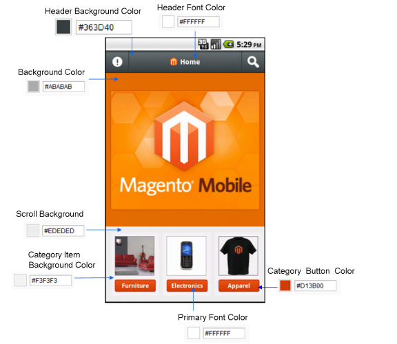
User experience is the sole concern of every e-commerce store designer. In order to ensure better user experience for a site, it is recommended to pay special attention to its navigation. Your visitors must be able to comprehend the navigation and find it absolutely comfortable to navigate from one page to another. Nowadays, a large number of e-store designers are using images for creating tiled navigation for the sites. That means, the chosen image tiles up with the graphics available for different elements within the website. This ensures that the site visitors are able to navigate across the site without getting lost.
4. Clicking will be dumped for ‘Scrolling’
Since the last coupled of years, scrolling has become one of the most favorable options for designing e-stores that need to target the mobile audience. Consuming a lesser page loading time, scrolling has definitely served as a great add-on for an e-commerce website. Eliminating all the frustration associated with clicking through tons of web pages, scrolling allows for enhanced dynamic user interactions.

5. Card design will serve as an effective e-commerce web design tool
In 2015 as well, internet usage via smartphone and smart tablets will continue to rise. This will lead to the need for designing e-stores which are fully responsive and can load and work smoothly on all hand-held devices. It is here that card design will be treated as an amazing e-commerce website design tool. Offering you the ultimate convenience of organizing and arranging things in an order, the card design technique will allow your customers to browse through a large amount of information, prompting them to make multiple purchases.

6. Flashcards
Wooing your e-store visitors is something that can’t be done without putting in the right kind of efforts. This year, you can witness an increased usage of flashcards for unveiling special assets of products available within the e-store database. This flashcard carries the name of product, its description, some special social media sharing buttons, the product price and a “Buy Now” call-to-action button- everything that’s essential for prompting the customer to make a purchase.
7. A stronger emphasis on typography
Content is the King. With this saying maintaining its significance in the year 2015 as well, e-store designers will be paying more attention to the typography used on different web pages. This year, there will be an increased usage of simple and bold elements along with a large image. Plus, responsive typography will become a prime source of concern for every e-commerce site designer. Additionally, designers will now have handy web kits dissimilar to the wide collection of traditional Google fonts.

8. Minimalist Buttons
With the growing use of large background images, e-store designers will now opt for designing buttons using a minimalist design. These buttons will suggest call-to-action and sustain the beauty of images used in the background. If your e-store needs to have a call-to-action within the main slide, then a minimalist button will do the job.
Summing Up
With the e-commerce world evolving at a rapid pace, I’m sure the design trends covered above would help you in getting your way through to reach out customers who’re interested in purchasing products and services similar to the ones offered by your e-store.
Author Bio:
Isabella Morris is currently employed with a renowned custom Magento development company and is also engaged in writing informative articles on best tools and tricks for Magento development. Her write-ups have proved beneficial for a wider group of Magento developers across the globe

Thank you for the in depth review of Magento! in your post.
It helped me a lot however in the end I decided to go with Magento for my e-commerce website.