
Starting a winery out of the home or as a small operation comes with enough obstacles without unintentional branding sabotage before someone even tastes the wine. But that’s what happens when branding decisions are made in haste or ignored. The wine itself could be remarkable, but if the branding looks like it’s a DIY project made over a weekend, no one will give it the time of day. Even worse, retailers won’t stock it; it remains in the farmer’s market stage of development instead of becoming the operation it could be.
Most small producers focus on wine production and don’t even consider branding decisions. This makes sense; they want to perfect their craft. But once that’s accomplished, they’ve oversimplified efforts to make something that looks “good enough” without realizing how small mistakes create an overall impression of poor quality. The difference between amateur and professional appearance comes down to branding decisions, some glaring and some less so but just as harmful.
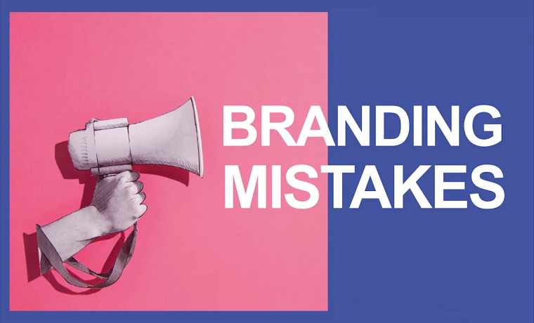
Branding mistakes are usually fixable, but only when someone points them out first. These ten consistently crop up with small wineries, and they don’t take a ton of money to fix; they just take awareness of what’s needed and what doesn’t.
Inconsistent Logos or Styles Across the Board
This is more common than it should be. Wineries will launch with a specific label design; their second vintage or varietal will somehow have something entirely different. Either they got bored with the first style, a different person created the second go, or there was no logical through line established from the beginning.
The issue with this branding element is that a customer cannot facilitate recognition when the product looks different every time. A customer might pick something off a shelf and not correlate it to the one they enjoyed last week as they walk past it. Everything looks like a different project by different producers.
This is not to say that every label needs to look exactly the same. Still, elements need to resonate across brands, color schemes, placement of logos, typography styles, design aesthetics. Big brands get this naturally; small brands rarely do.
Every Label Is Treated as One Off
Related to mistake one but slightly different, too many small producers treat every new label design as a stand-alone art project without regard for a larger inclusive identity. They’ll use different designers for different wines, or they’ll utilize ideas for their other labels based on a gut feeling.
However, this yields a hodgepodge portfolio that looks random. There’s no sense of being part of the same family, even if there’s an unspoken visual language through previous decisions. Each wine may look appealing on its own merit; next to one another, they appear as creations that attempt an angle but ultimately fall flat.
Professional wine label design considers the brand as a whole from the beginning instead of how each part can stand alone. It develops rules and templates that shift for different wines while maintaining identity standards. That’s how recognition occurs.
Cheap Design
Small operations often don’t have budgets for this, but trying to cut corners by making labels themselves or settling for cheap options inevitably ends up costing more over time in lost sales and missed opportunities.
There’s nothing worse than seeing generic templates from an office supply chain or someone’s amateur designs in whatever program they had access to looking cheap. Paying for a label to be printed with no regard for painting industry standards also achieves lackluster results.
The difference between professional and amateur logos is not always clear to those who make the wine from a branding standpoint; however, it’s glaringly obvious to anyone browsing wines looking to purchase them. Typography considerations, color cohesiveness, gradient options, elements of hierarchy, we all know what brands look legit and what don’t.
Disregarding Industry Visual Standards
The wine industry and its customers have an unspoken visual language: certain visual appeals lend themselves to price ranges, others advance serious approaches versus accessible ones, color use and imagery signal whether a varietal is old school or new school.
Small producers sometimes ignore these all together because they don’t know any better or want to position themselves as “different.” Unfortunately, different just for the sake of being different becomes confusing. If consumers don’t understand what the product is supposed to be, they won’t purchase it.
Not every wine needs to look like every other product in a store nor be held to strict guidelines of aesthetics; however, one must acknowledge visual associations within the industry context, and choose allies or enemies effectively instead of randomly throwing things onto paper that don’t work.
Overcomplicating the Design
Where some elements attempt to do too little on a label, others try to do too much: intricate drawings, font hopping, detailed stories of origins, accolades received, suggested pairings, notes on tasting, all result in cluttered attempts that look desperate.
This comes down to clarity. A clean aesthetic wins out every time. Buyers are making decisions at lightning speed; they don’t want to read novels printed on the side of a label nor try to dissect heavy layouts. Instead, they need clear-cut impressionable takeaways about why they should buy this wine.
Professional designers help with this process because they know how to cut back on ideas that bog down a project; great ideas often come through asking questions about what’s essential information versus excess detail. Amateurs tend toward the “more is more” route instead of “less is more”..
Using Flimsy Material
There’s nothing worse than a beautifully designed label ruined by flimsy paper stock, or paper stock that’s thin and lacks the proper finish needed for branding positioning, or smudged when touched, or peeling off after being allowed to cool at room temperature.
Material counts just as much as design choices render quality levels. Premium paper stock options combined with well-applied adhesives help create positivity around quality; failing to deliver minimum standards ruins what else could have gone so right.
Even when minimal differences from dollars exist between cheap and premium options at low production levels, the perceived difference is monumental. Bottles that feel well-made and heavy create trust; those that feel cheap send warning signs.
Forgetting Shelf Impact
Designing through computer screens doesn’t consider how products appear on actual shelves next to competitors selling similar varietals. Colors that looked good digitally might not pop in store lighting. Text that seemed readable on screen might be too small from three feet away. Design elements that felt bold might disappear next to bolder neighbors.
Small wineries often skip the step of testing their labels in realistic retail environments before committing to large print runs. Then they’re stuck with labels that don’t perform well in the actual context where sales happen.
Getting physical proofs and testing them in stores (even just holding them up in the wine aisle) reveals problems that are invisible otherwise. Shelf presence matters enormously for wines sold through retail, and it’s impossible to judge without seeing real world conditions.
Inconsistent Bottle Selection
Branding isn’t just labels. The bottles themselves communicate a lot about the brand. Some small producers use whatever bottles are cheap or available without thinking about how they fit the overall brand identity.
Mixing bottle shapes and colors across different wines looks inconsistent and confused. Using heavy, expensive looking bottles with cheap labels creates weird contradictions. Using cheap bottles with premium labels does the same thing in reverse.
Everything needs to work together: bottle selection, label design, closure choices, capsule or wax treatment. These elements should reinforce the same brand message, not contradict each other. When they’re mismatched, customers notice even if they can’t articulate why something feels off.
Neglecting the Back Label
Many small wineries put all their effort into the front label and treat the back as an afterthought. They’ll have a gorgeous front design and then slap a plain white back label with minimal information in whatever font was easiest.
The back label is valuable real estate. It’s where customers look for more information after the front label catches their attention. It’s an opportunity to reinforce brand identity, share the story, provide useful details, and maintain visual quality.
Professional brands treat both sides of the bottle as part of the complete package. The back label doesn’t need to be as bold as the front, but it should feel like it belongs to the same brand. Same design language, same quality standards, same attention to detail.
Changing Branding Too Often
Some small wineries rebrand every few years, either because they’re never quite satisfied or because they think starting fresh will solve other business problems. Each time they change, they lose whatever brand recognition they’d built and have to start over.
Customers who enjoyed the wine before might not recognize it with new packaging. Retailers who finally learned to identify the brand now have to relearn it. All the marketing and word of mouth that mentioned the old look becomes less effective or confusing.
Good branding should have staying power. It might need minor refreshes over time, but constantly overhauling everything signals instability. It makes the business look like it doesn’t know what it’s doing or can’t commit to a direction.
Why These Mistakes Matter More Than Most Realize
The cumulative effect of branding mistakes is brutal. Each one individually might seem minor, just small oversights or budget compromises. But together they create an impression that the operation isn’t professional, isn’t serious, isn’t worth trusting with someone’s money and time.
That perception is especially damaging for small wineries trying to grow. They’re already fighting uphill against established brands with bigger budgets and stronger distribution. Amateur branding hands competitors an easy advantage that has nothing to do with wine quality.
The frustrating part is how fixable most of these issues are. They don’t require massive investments or complete overhauls. They require recognizing what’s wrong, understanding why it matters, and making intentional choices about how to present the brand.
Small wineries that get branding right, that look and feel professional from the first customer interaction, give themselves a real fighting chance. They get into better retail locations, command higher prices, build customer loyalty faster. The wine still needs to deliver, but at least it gets the opportunity to prove itself rather than being dismissed before anyone tries it.
About Author
Eyden Haze
Eyden Haze is a digital marketer, a web designer and technology fanatic from Sydney, Australia. With over 7 years of experience in web industry, he has helped his clients to launch their marketing campaigns successfully. He also likes to explore various online tools and share that knowledge by writing useful blog posts.