
For years, the digital storefronts of tech startups and high-growth service providers followed a predictable playbook. Success was measured by visual bravado – cinematic video backgrounds, avant-garde layouts, and complex interactive animations that looked like they belonged in a modern art museum. If a website looked breathtaking, it was assumed to be working.
However, a fundamental shift is happening across the Auckland digital landscape. Local graphic designers and agency partners are moving away from designing purely for beauty pageants. As acquisition costs rise and market competition intensifies, visual flair is no longer enough to sustain scale. Today, Auckland website designers are pivoting to a conversion first web design methodology to ensure every creative choice directly impacts the bottom line. Today, Auckland’s top creative talents are pivoting to a conversion-first methodology. This doesn’t mean aesthetics are dead; rather, design is being re-engineered to serve user experience (UX) and drive measurable revenue.
Here is why conversion-first design has become the ultimate competitive advantage for scaling companies, and how local agencies are executing this shift.
The Friction Between Pure Beauty and Functionality
The temptation to build a website that prioritizes pure aesthetics is understandable. A striking visual impression builds instant brand authority. Yet, when visual design exists in a vacuum separate from UX principles, it often creates hidden friction points.
Overly complex animations drag down page load speeds. Hidden or non-standard navigation menus confuse users. Low-contrast typography might look sleek, but it alienates visitors who struggle to read it. When a tech startup spends thousands of dollars driving targeted traffic to a beautiful but confusing landing page, the result is inevitably a high bounce rate.
A conversion-first pivot addresses this gap. It treats a website not as a digital canvas, but as a dynamic sales funnel. The objective is to merge graphic design principles with user psychology, transforming aesthetic elements into behavioral cues that guide visitors toward a single conclusion: taking action.
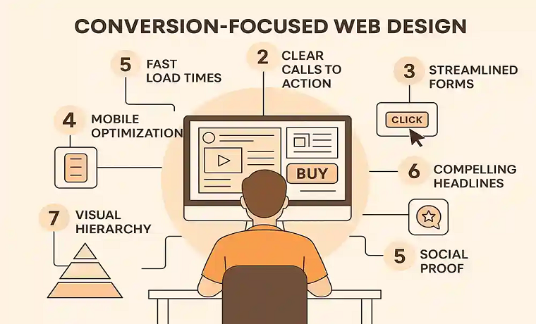
The Architecture of Conversion-First Design
To successfully optimize a digital storefront for scale, Auckland designers rely on three core pillars that balance visual identity with flawless functionality.
1. Harnessing Visual Hierarchy to Direct the Eye
In a conversion-first framework, graphic design functions as an invisible tour guide. Designers use visual hierarchy – the strategic arrangement of elements by size, color, contrast, and spacing—to dictate exactly what a visitor notices first, second, and last.
For a SaaS platform or a premium B2B service company, this means the value proposition must be immediately clear without forcing the user to scroll. Designers use contrasting background blocks, deliberate whitespace, and scaling typography to ensure the eye moves naturally from a compelling headline directly down to the primary offering. By eliminating visual clutter, the layout reduces cognitive overload, allowing users to process information faster and make decisions with confidence.
2. The Science of Strategic Call-to-Action (CTA) Placement
A common pitfall of purely aesthetic web design is the “invisible” CTA button – one that blends so seamlessly into the brand’s color palette that users look right past it. Conversion-first design treats the CTA as the most critical asset on the screen.
Local agencies are using data-driven psychology to dictate the color, scale, and placement of action steps. By pairing complementary or high-contrast accent colors against a clean backdrop, the CTA commands attention instantly. Furthermore, placement is no longer restricted to the traditional top-right corner. Designers map out the user’s reading flow, embedding sticky navigation headers and placing contextual buttons at the precise moments when a user has absorbed enough information to take the next step.
3. Embracing Lightweight, Clean Layout Choices
Speed is an critical component of modern user experience. A gorgeous website that takes five seconds to load is a failing website. Because modern search engines and users prioritize rapid performance, Auckland web designers are adopting clean, lightweight layouts built for speed.
This means replacing bulky, unoptimized code and massive media files with clean CSS layouts, SVG graphics, and optimized web-safe typography. A clean design structure ensures that mobile users—who make up the majority of web traffic—experience instant rendering. When a site loads seamlessly, user frustration drops, browsing time increases, and conversion rates naturally climb.
Designing for Scale: The ROI of Conversion-First Web Design

For tech startups and service-based companies looking to scale, web design should never be viewed as a static expense. It is an ongoing growth strategy.
When you align your brand’s unique visual identity with conversion-optimized UX principles, your digital storefront becomes a predictable engine for customer acquisition. Every layout adjustment, color choice, and font pairing works toward reducing friction, building user trust, and maximizing the return on your marketing spend.
The future of digital growth in Auckland belongs to businesses that understand this balance. By partnering with designers who prioritize conversion-first principles, your business gains a website that doesn’t just look spectacular, but works relentlessly to grow your bottom line.
About Author
Founder
David Watson is the founder of DesignDrizzle and is a professional website designer for over 10 years. He has competence in creating visually appealing and user-friendly websites for all the clients. He likes to explore new and creative ideas for designing, photography effects and other inspirational subjects