Though large background images in websites are gaining popularity for quite a few years now, one more variant of this large background images trend is getting popular nowadays is the large blurred background image. In recent times, it has been noticed that many designs have been introduced containing blurred images for full-size background. In some cases, complete background is blurred, and in some designs, selective focus is used on a specific object or individual
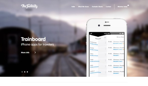
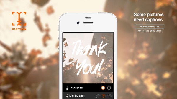
Many websites use different type of blurred image approach, but the best designs have been observed in mobile apps. In this post, I will present examples of those eye-catching websites using large-sized blurred images for their backgrounds. Check out how other web designers are using blurred background images creatively in their web designs and may be, these creative examples will spark some artistic ideas that you can implement in your own design work.






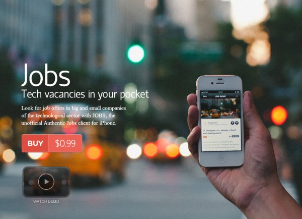




You have added some really cool blurred background websites. Jobs and Spendee are the coolest among all
Wow! I agree large background images are gaining popularity in web designs, even I have used such backgrounds in some of my client projects.
Spendee is the collest among all. It should be at the top