‘The world is a global village’ is a clichéd phrase that you might have heard a million times. However, never has it been truer than now. Thanks, to the wide reach of the internet and the close competition of every other kind of media, the world really does seem to have shrunk. Global brands are also waking up to this reality and have thus begun localizing their corporate website to reach out to a wider audience. Due to this rising trend, the website design companies find more and more brand approaching them to customize their websites for the global market.
The thought of being localized across the world might seem incredibly daunting and you might be trying to count in your heads just how many countries there are in this world! Well, the truth is, the localization process need not be so frightening. Even though there are nearly 2.3 billion web users worldwide, the statistics say, with just 13 languages, you can reach nearly 90% of those users.
Despite the heartening statistics, the localization process is far from easy. A lot of thought needs to be put into the web design part of the process. Here are some tips that can help you make some headway.
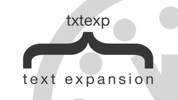
Expanding Text
One common problem when dealing with foreign texts is that they tend to wreak havoc on the existing page templates. The text tends to extend or contract, depending on the language and that disrupts some of the design features. For example, compared to English, Asian languages tend to contract while the French and German languages tend to expand.

This might not seem like much of a problem if you consider the body text, but when it comes to page menus, and drop down boxes, this can be quite troublesome. The result may be awkwardly long words in the drop menus or super short ones that do not quite fill up the designated space. Both might look untidy. An easy option is to reduce or increase the font size or using responsive design template. However, it is always better to provide a maximum character count to your designated translator before the translation begins.
Universal Unicode
It is always advisable to deal in Unicode format when trying to establish a multilingual project. This ensures that there is a consistent common platform with your varied translation agencies. It also helps to upload the multilingual content in content management systems like WordPress or Drupal as they all support Unicode.

UTF-8 is one of the most common Unicode formats, especially useful for multilingual projects. This format offers a variety of characters making it easier to adopt various country specific symbols and expressions and incorporate them in the design.
Use of Images
A highly pictorial site is always more difficult to customize according to different countries. Images might not convey a lot of information, but they play a powerful role in setting the tone of the website. The viewer needs to identify with the images and they need to be relevant to the culture of the specific country. Sometimes it is a good idea to keep the images to a minimum when creating a multilingual site. However, if you are willing to go through the trouble of sourcing relevant images for every country-specific site, you might reach out to the psyche of the community much better.
Google rose exponentially in the early 2000s due to two primary reasons. One, it was offering multilingual content in over 60 languages as compared to the 10 languages the competitors were offering. Secondly, the lack of images and the simple interface reached out to a much wider multitude of people.
Author Bio
Michael Evans is a blogger and social media analyst. He is currently promoting MotoCMS design templates that help small business organizations bolster their online presence.

