Floating Action Button (FAB) is the next big thing launched in material design. It floats on user interface in a circular shape with specific action. With special motion behaviours, these icons float above the UI and perform actions such as launching, and morphing. They come in two different sizes that include mini and default.
Floating Action Button is an elegant, dynamic, lightweight and consistent design element that offers quick and efficient navigation and enhances UX. As per rules and guidelines it being positioned on the right side, it makes the program versatile and extends its functionality. According to Google specifications, the FAB should possess constructive tone, providing quick access to important instruments.
1. Coloring UI
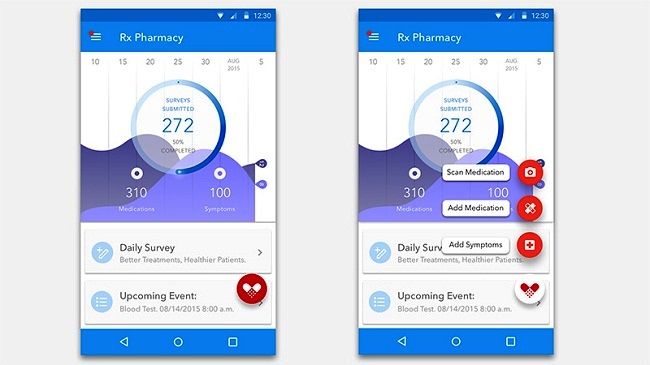
Although the User Interface can be felt a quite content heavy, an excellent work is done by Lois Yang by choosing an attractive color palette. Solid red background with a delicate shadowy effect makes the icon distinguishing among the content and grabs user attention.
2. Add Media by Eric Azares
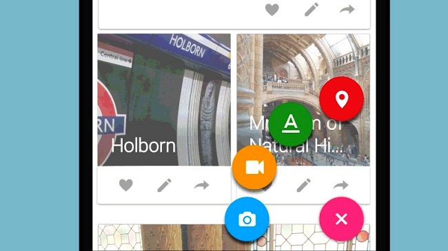
Rests at the bottom of the screen, the o-shaped button is surrounded by four other quickly accessible CTAs (Call to action), arranged in a circular shape. Each of the four buttons is displayed in brighter colors with a quick logical glyph and comparatively enormous size.
3. PSD Template
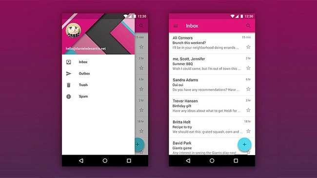
PSD template UI, designed by Daniel De Santis serves a great example of efficient Floating Action Button. The FAB brings out a big panel that covers up the entire screen. In addition, freeware for this feature is also available. So, just download and enjoy!
4. UX Exploration
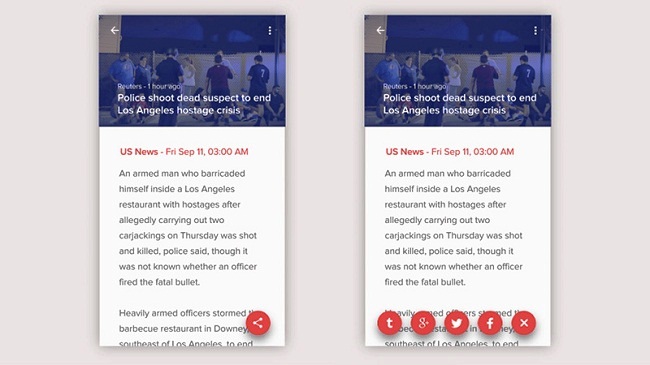
Being sophisticated, FAB represents a series of Call to Action buttons in a row. Demonstrated in the lower section of the screen, these buttons are placed from side to side in a horizontal manner.
5. Magic Button
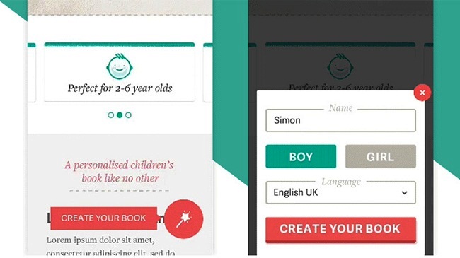
Floating Magic button developed by Lee Giles is exceptionally minimalist in terms of functionality. Quick access is provided to the users to the work panel for creating their books. The design is highly compatible to the Material stands and congregate with the app.
6. Thumb UI
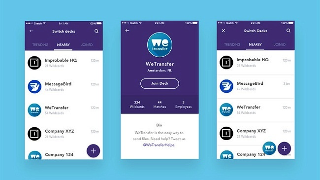
User Interface for the Thumb designed by Jochem Van Der Veer is positioned at the right side with a straightforward appearance and eye-catching design that is highly functional. It sometimes placed with the mini version of the app logo.
7. Alternacare
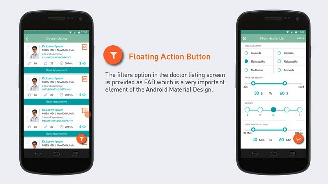
Alternacare designed by MayurKarodia allows user to sort out redundant information and achieve goals within seconds. The audacious look and vivid color theme of the Floating Action Button makes it stands apart from rest of the content while grabbing user attention.
8. Liquid FAB
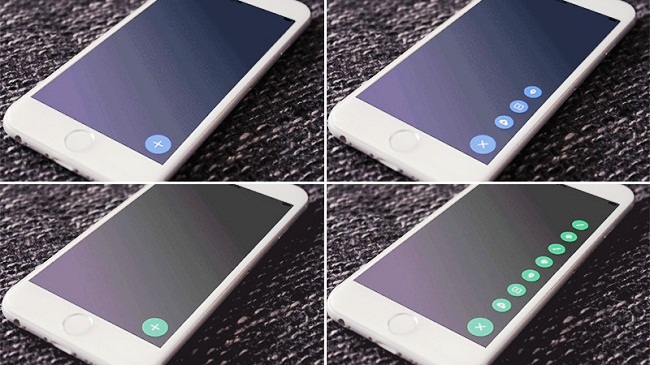
FAB by Shu Makino is an animated GIF with a standard workflow. Powered by a consistent transition, it incorporates seven different items that become visible one after another and rests at the right side of the screen.
9. Score Android
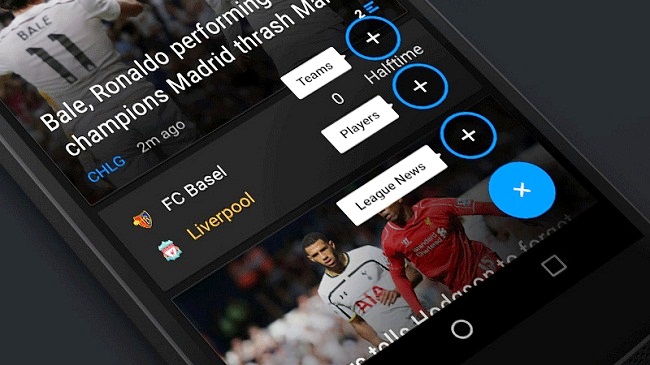
This Floating Action Button by Matt Legaspi looks just well-designed, refined and sophisticated with Call to Action. It is paired with attractive double tone color theme and achieves excellent aesthetics while converting actions into focal points.
10. Swipii App Concept
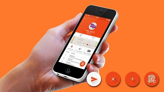
The concept by Sarah Ahmad is uniquely formulated on a number of fresh solutions. It functions so well and makes the accessibility easier. Adheres to the right side on each page of the app, it displays a pop-up page with a QR (Quick Response) code that helps collecting points in a quick manner.
Conclusion
Floating Action Button not only makes User Interface attractive and efficient, but contributes to User Experience as well. They have become a must have element as they adhere straight forward functionality and makes the app more user centric and productive too.

Eyden, a big “HOWDY MATE” from Dallas, TX.
First of all, I visited Sysney Australia at the end of January 2017 and was there for Australia Day. It is a beautiful city and had a great time!
Read your article at https://designdrizzle.com/floating-action-button-for-ux-a-forthcoming-design-trend/
All of the examples given in this article where for native apps. Have you come across any examples of FABs used in mobile website navigation menus? If so, i would be interested in knowing the URL names.
The reason why I am interested is that I am a MOBILE FIRST website designer and developer. From my perspective, Floating Action Buttons and Mobile First Navigation Menu Interfaces are made for each other like “Hands And Gloves”.
I have taken the liberty of linking to your article to my website. You are welcomed to view my MOBILE FIRST website design example and tutorial there.
If you are ever in the Dallas, TX area, give me a call or send me an email. Would love to meet you in person.
Looking forward to hearing from you!
Sincerely
Raul Gonzalez
972-372-4237
http://www.raulgonzalez.com