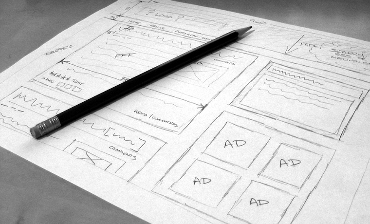
Every web development project involves a highly challenging task of designing wireframes and prototyping. If you are in a perplexed state as an individual or a creative agency, trying to save time and money while developing a web app, wireframing your designs is an essential job to be ticked on your to-do list.
“Good design must necessarily, in my opinion, have an impact on people’s lives, no matter how seemingly small. Good design changes things.” – Garr Reynolds
Brand damage seemingly affects the costs of marketing communication. A poorly functioning website and an exasperating user experience could be hard to deal with but web prototyping is one of the ways to escape the cage in no time. Redesigning expensive sites is a measure taken against those very problems. To further extinguish user frustration and brand attrition, a wireframe could be created followed by the testing of a prototype.
This method is so effective that even if all the pages of your website follow different templates, due to the few common elements the pages share the designer would not be obligated to reinvent the wheel with every new wireframe diagram.
The common elements must be present in the website, with the absence of which the visitors are susceptible to frustration and antipathy towards the website which may stay put after getting exposed to other sites; negative brand impression, something that we don’t wish to happen.
Every site has its own business goals and a negative brand impression certainly hinders the accomplishment of these goals. Take for example a well-labelled navigation pane; it eases the pain of going back to the home page by simply providing access to the site-visitor to jump to the desired section or page instantly.
What is a Wireframe?
The basic layout of a webpage is represented by a wireframe diagram. Different elements such as content, functional or navigational ones take form of different shapes (boxes, ovals and diamonds) to display their placement on the page. It is the job of an HTML coder to use these diagrams to “wire” or chain each page, while connecting links and attaching content.

Visual designers to decipher the hierarchical importance use Wireframes and location of the elements deprived of distracting design treatments.
Simple shapes allow the designer to concentrate on the information design first facilitating the users’ and then move on and add illustrative pictures. For a site in effect, fresh content, functional and navigational elements could be sketched in by extracting wireframes from screenshots.
Difference between Wireframe And Visual Design
It’s a typical situation if the client demands for a sample of the visual designs during the web development process. You are recommended to stand up and excuse yourself if possible but in any case, try to avoid the temptation of responding to this request. It might occur to you why this would be a necessary step instead of coming clean.
Well, mainly, to save money. Also this saves up some time since you would be willing to complete the information design first before you move on to work on the graphics part. For instance, if you get exposed to emotional responses from the client regarding colours, fonts and artistic treatments of logos or other graphical elements, the “I hate pink” and “I love a lighter shade of that blue” could distract you from focussing on information design of the page, which is a crucial task.
Principally, a wireframe diagram helps in determining the significance of every element on each page and its positioning. Designers clearly understand what goes where and why it is placed there. This is handy in achieving the overall structure of the page and balance between its respective elements. With the help of an illustration application or a hand-drawn paper, the sketch could be set up in the computer.
As you work on the wireframe diagrams, the information design will naturally evolve, making it a point to reflect improved results from the usability test, matching the needs of the users. At this stage, you may consider keeping the information design flexible, in order to enhance the brand experience positively over time; avoid your audience developing a narrow-view of your website in their mind.
Note for Visual Designers
Interact with your clients and understand their visual preferences and brand elements by conducting meetings. Primarily, complete the setting up of wireframes before you demonstrate any visual design treatments of the pages to the client.
Note for Clients
If you intend on getting a view of the visuals before the initialization, ask the visual designers for mock-up pages touching upon the possible colours, depictions, trendy styles and appearance. These mock-ups must reflect the view of the final design. Under any circumstances, this must be the last resort in case the client strictly insists on getting addressed concerning the visuals.
Focus only on wireframes. This helps you to overcome the bizarre expectations of the clients if they are too choosy. Maximum flexibility is what the site requires the most, apart from the look and feel of the site, to reproduce impeccable information design.


Such a very helpful post and this website is very helpful and I got a lot information form here. Thanks for all informative post.