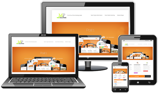
Technological advances lend to a never-ending cycle of obsolescence. Just as consumers become accustomed to one form of gadgetry, something better comes on the scene that has been in the works for many years prior to the present unveiling invention or upgrade. One such progression is the onset of responsive web design. The average consumer is unaware or takes for granted what this form of web design means to everyday life. The widespread use of smartphones and tablets along with the constant fast pace of new model releases and advancements, lends to the development of web design that compensates for the varieties of models, screen types, and sizes along with other disparities of smartphones or other devices on the market.
Now with the prevalence of mobile devices, there is the need for the adaptation of websites to operate with functionality and ease for the consumer to view and purchase products and services using their device.Hyper Text Markup Language known to most people as HTML, does not work well on mobile devices such as smartphones and tablets. Therefore, HTML5 as well as CSS coding enables responsive web design that allows websites to function properly on these smaller devices. With it, you can access, view,and navigate all the pages on a website. You have the capability to view in the portrait or landscape format, due to screen rotation, as well as zoom and scroll comparable to a regular website on your computer. There is really no need to switch to the mobile view with responsive web design.
Elements of Flexibility for Responsive Web Design
Some of the key elements of responsive web design will offer a better understanding for non-techies.Flexible elements address the different characteristics of smartphones such as the different screen sizes, specifications, default browsers, and operating systems for the various devices.
- Images on smaller screens are viewed the same as on your desktop, without the need to scroll left or right to see the image on the small screen with this type of web design.
- Textdoes not need pinching or zooming to read it. With responsive web design, whether you view text on an iPhone, tablet, Android, or a desktop computer text and content is readable.
- Layout versatility with responsive web design allows for the difference in screen sizes throughout the array of various devices. On larger screens the layout may contain four columns, whereas, on smaller screens one to two columns will work best.

Responsive Web design allows for the display of essential content to help websites on smaller screens run more efficiently as it allows you to hide or show various contents on your device according to your needs.
- Desktops display all the content for a site, but with responsive web design, non-essential content provides the option to hide or show content.
- Sometimes in checking your email or viewing files, you may only want to view the first essential line of the message or file list.
Touchscreens, which are the norm now, operate using the optimal functionality of responsive web design.
- There is an intuitive aspect to touchscreens, which permits usability no matter the individual size of a person’s thumb.
- Tap ability is essential on the smaller screens to make sure that button and link accessibility is easier for navigating the web from your small screen device. At times, when you hold your thumb over a link or button,it activates.
Businesses have used websites for years as a point of sale or promotion for their products or services. Some tout responsive web design as a cost-effective replacement for mobile applications. However, this design method is not a panacea, and applications are still essential. A dedicated website reaches more consumers, while an application may offer a better solution of getting the word out about your product or service. Your need is the determining factor as to which is better for your business purposes. Both concepts will serve the business community well from a mobile marketing perspective. Responsive web design will definitely increase profits for businesses as it allows for purchases on the go without the need to wait until you get home to visit a website or risk going to the site at work.
About Author: Vince Wicks is an avid web design and web development blogger. He’s confident that combining your user intent with awesome design features can work wonders. He’s currently with webdesign.org

