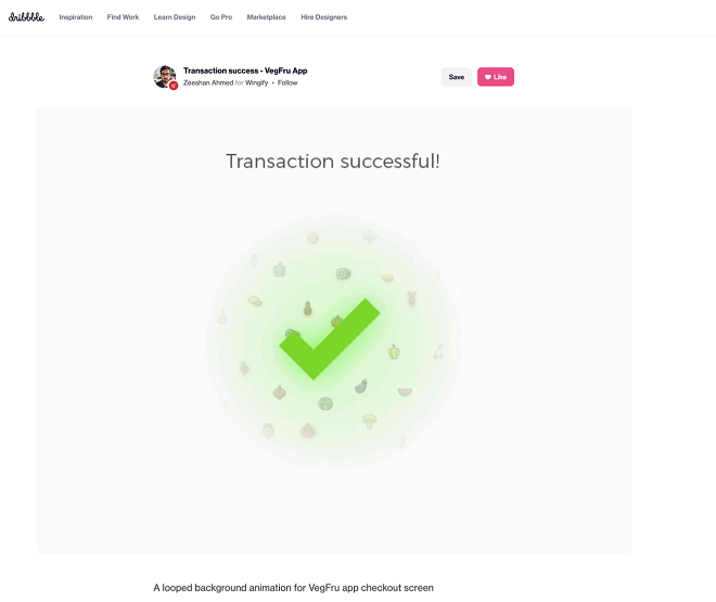
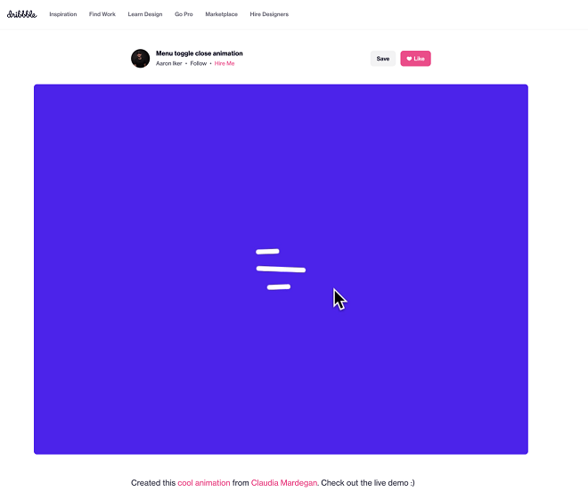
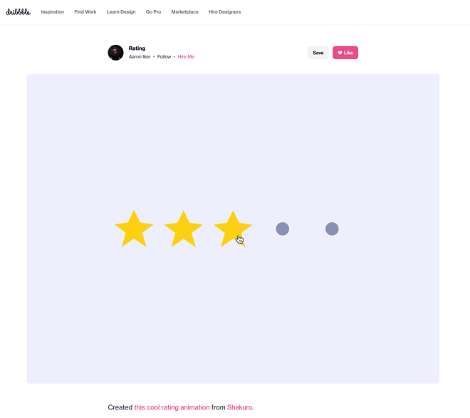
Micro-interactions communicate brand identity and ethos with effect while improving ties with the customer. These create a fun and seamless user experience as habit-forming tools. Two such examples are, Facebook’s ‘likes’ and Tinder’s ‘swipes’. The origination of micro-interactions happened with the need to guide customers who had hit a snag when they were using a service or a product. From washing machines to coffee maker, micro-interactions are employed by everything nowadays.
How Micro-Interactions Work
The four structural elements to a simple micro-interaction are : triggers, rules, feedback, and loops.
Triggers
Micro-interactions of both the user-initiated (prompted by user) and system-initiated (driven by the system) kind are a part of the feature. For example, the common triggers that users carry out are a click, scroll, tap and pull. Even while making a payment, booking a cab, and clicking or tapping on the hamburger menu all fall under this category. On the other side, the user’s alert prompt upon entering a wrong password is a classic system-generated trigger.
Rules
It determines what happens after the user sets a prompt into motion through tapping, clicking, scrolling, or swiping. Apps decide the triggers that users employ, which are referred as rules and Tinder’s ‘swipe’ feature illustrates proves point. They gradually become an action which seems like habit-forming and users get accustomed to them while regularly engaging with an app.

Feedback
In this process stage, the system uses auditory, visual and haptic cues to inform the users. Users engage and are encouraged to proceed further in their process. For example, the progress bar of download, or the visual, aural, and tactile indication upon the payment success or failure, a click, are a part of the feedback system.
Loop/Modes
This last stage constitutes tiny meta-rules of the process and frequency and duration are determined by it. The best example would be from an ecommerce app. The ‘Buy Now’ is transformed to ‘Buy Another’. The app typically uses such a loop to get them to re-engage with the app before the user loses interest in it.

Advantages of Using Micro-Interactions
Brand communication
A brand which is successful ensures that the transmission to the buyer is engaging, positive, and hassle-free. Micro-interactions by showing a process status clearly, creates and reinforces a positive image for the brand.
Higher user engagement
Micro-interactions engage users better as said by the experts. The urge is created subconsciously by the elements to keep interacting with your app. For example, each push or nudge notification redirects the customers back to your app.
Enhanced user experience
There is always an app for everything, from shopping to banking to traveling to learning to staying healthy. The overall user experience is elevated by a wide range of activities and the user stays ahead in the game.
Prompt feedback
Without knowing what is happening behind the blank screen is frustrating to not know, especially during a purchase. A pleasant user experience with sound, notification through instant feedback is always favorable.
Visual harmony
With a tap, swipe, typing, or scrolling micro-interactions are initiated and are all a part of the UX design’s overall appeal. The interface elements should be in perfect sync with the app’s visual features.
Micro-Interaction Best Practices
A few basic principles that should be followed when you introduce a micro-interaction to the user experience are:
Keep It Simple, Stupid (Kiss) Nudge
KISS, a design principle that is even more important in the case of micro-interactions. To make the user journey delightful and not be a distraction is the goal.
Keep It Short
‘Micro’ in the name itself is present. But micro-interactions aren’t supposed to be show stars. A lengthy micro-interaction only distracts the user.
Pick the Right Place
The options should be carefully considered before choosing the spot for any micro-interaction. The user-interaction designs are widely used for a reason. They are safe to continue as many people have approved of them.
The placement of whether a micro-interaction is reaching your ideal customer or not, should also be considered. Also, look into whether you need a micro-interaction to begin with.
Final Words
As UX designers the overall design of sites and apps, the user’s journey, their interactions with our product/service, their connection with the brand, and the ease of doing a transaction can be impacted by us profoundly.


