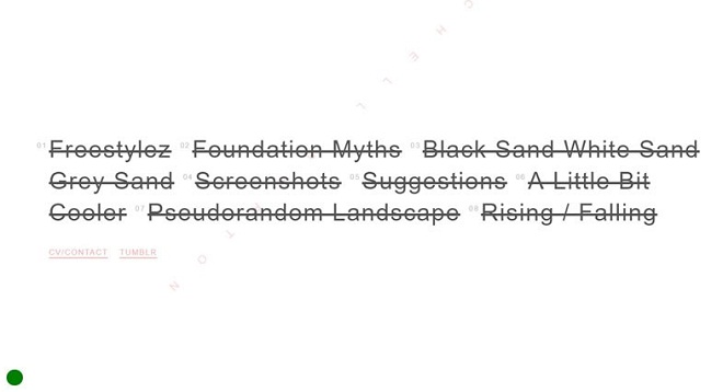
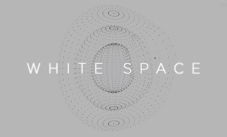
Whitespace is a completely balanced space between the elements of any layout, which can be observed in material, flat and minimal design and is constantly coupled with attractive typography.
It is the space between the letter-spacing and margins etc. Although it is called whitespace but it doesn’t have to be white. The blank space can be of any texture, color or even it can be any image.
As whitespace is competent of highlighting any specific element of a layout, it is one of the most effectual ways of guiding your visitors through a website.
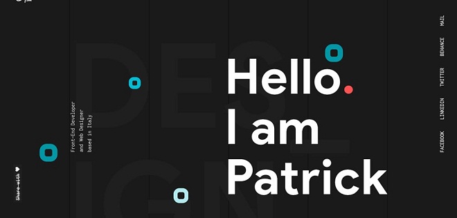
Patrick David
Volta Footwear

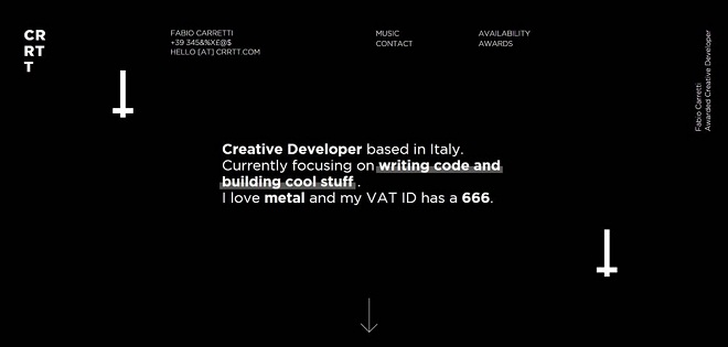
CRRTT.com
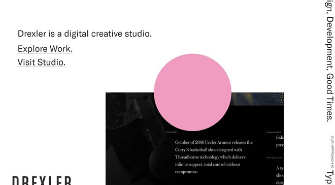
Drexler.com
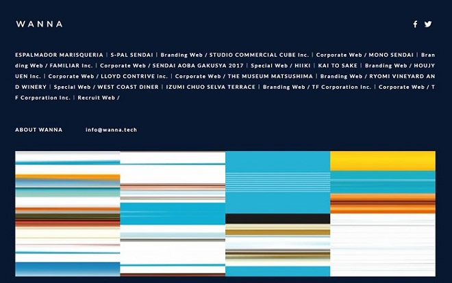
WANNA.tech
Grana.cc

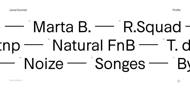
Lionel Durimel
Moze.com

Fell Swoop

Big Horror Athens
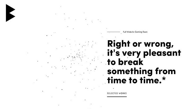
Basic Agency

Flarin.com

Mitchell Barton
