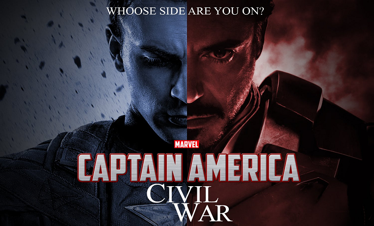
From the iconic Grease car logo to the ironic mix of familiar fonts in the satire Terms and Conditions May Apply, typography plays a significant part in movie posters. It creates instant recognition and establishes a brand that can be rolled out as part of your extended marketing and merchandising. But often, it does so much more than this, offering an insight into the film and its characters.
1. La La Land
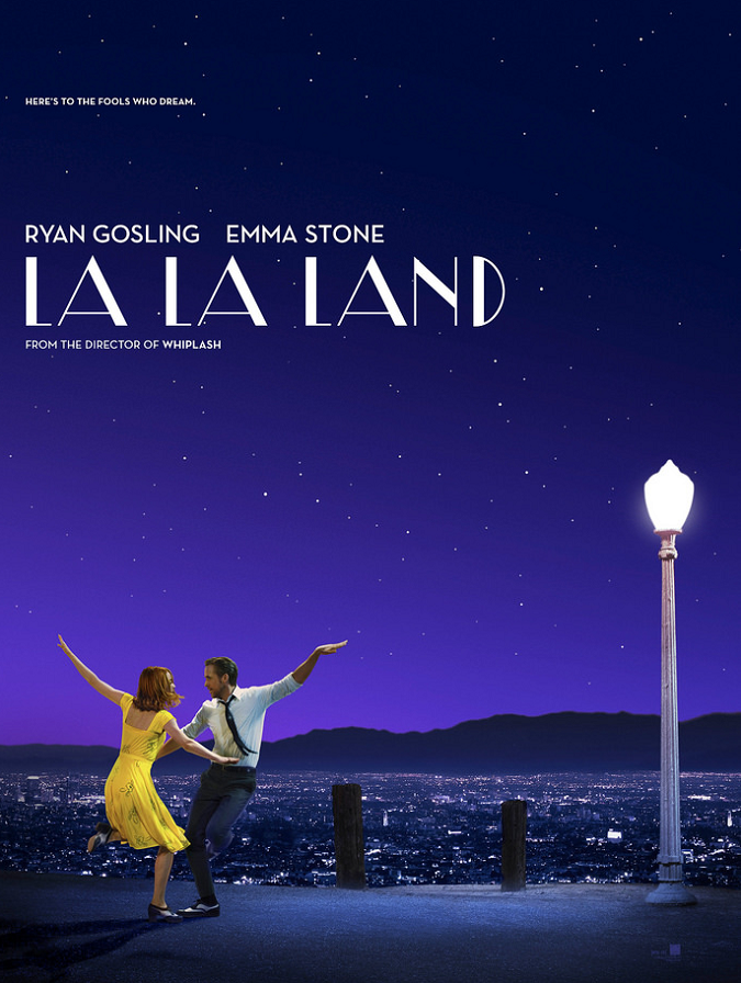
The retro art deco font of the La La Land poster left many people expecting a period piece. In fact, the branding was so powerful that many people who saw the film were still convinced that it was set, nostalgically, sometime in the golden days of the silver screen. In truth, the film was set in the present day, but since it was aiming to evoke the classic Hollywood musical, the font was perfect.
2. E.T. the Extra-Terrestrial
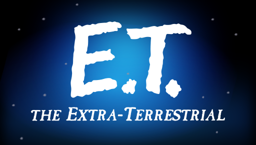
The beautiful simplicity of the E.T. typeface also perfectly captures the essence of the film. With all its science fiction and spaceships, it would have been tempting to go with something with a futuristic feel. Yet E.T. is about childhood innocence, and the chalkboard styling of the main title is the ideal choice to get this over quickly and unequivocally.
3. Moonrise Kingdom
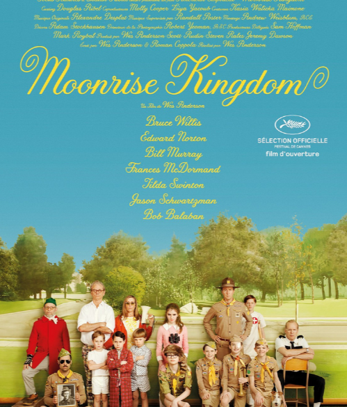
Inevitably, being directed by Wes Anderson makes a film somewhat quirky, but Moonrise Kingdom also has a fairy-tale innocence about it that is whimsical, even for Wes. The light, cursive font captures the sense of childhood at the heart of the film, with the flourishes on either end showing the determined style and ambition of Kara Hayward’s lead character.
4. Lady Bird

Greta Gerwig’s Oscar-nominated slice of life, Lady Bird, also uses typeface as a window into the personality of the protagonist. Although the film is set in small-town Sacramento, Saoirse Ronan has grand plans for a future at an East Coast college, and this is perfectly reflected in the grandiose, calligraphic gothic typeface used to show her adopted name.
5. West Side Story
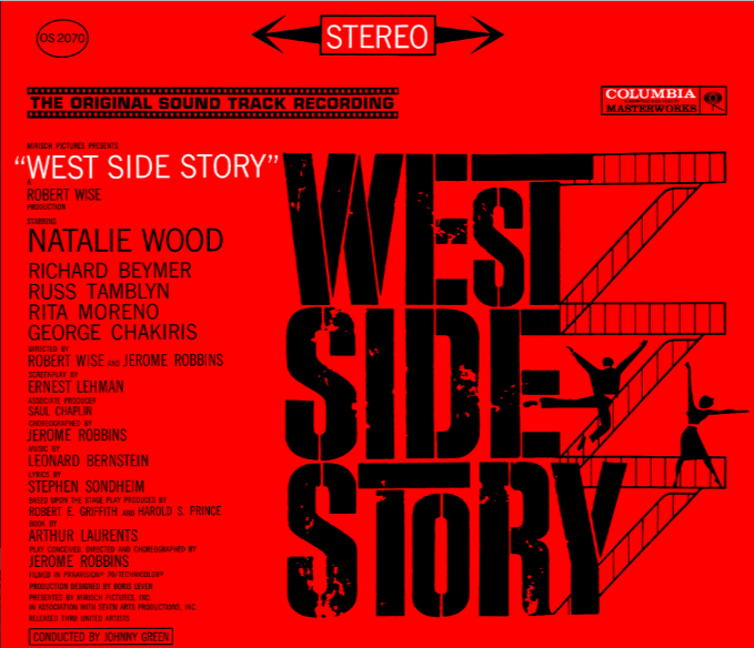
In some movie posters, it is not the typeface that tells the story, so much as what is going on around it. The stacked blocks of the words West Side Story, connected by the fire escape staircases where our star-crossed lovers meet, echoes the New York apartment blocks where the story is set.
6. The Godfather
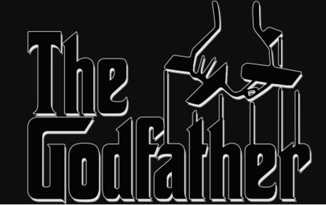
Perhaps the classic action-around-the-title movie poster is The Godfather. The sinister manipulation of every aspect of life by the Mafia bosses is cleverly represented by a puppeteer’s hand pulling the strings above the movie title. The font of the title is original and unusual, but it is this subtle addition that makes it work and tells the viewer what sort of story to expect.
7. Casino Royale
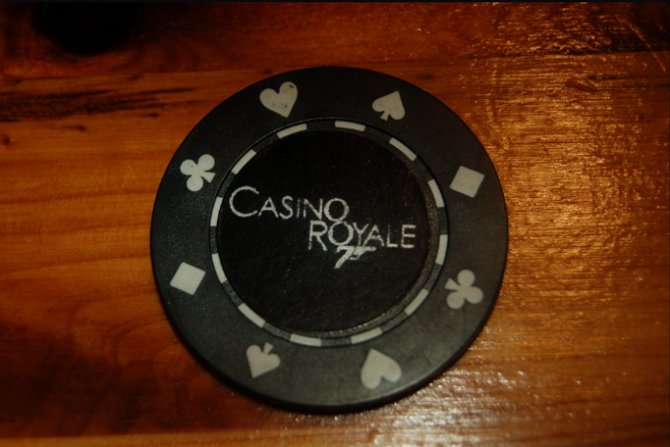
Sometimes, it’s not the typeface that draws the eye to a movie, but what is hidden within it. Casino Royale, one of the top gambling movies of all time, plays on the fact that both words contain an “O,” to create the iconic 007 logo within the title.
8. A Bug’s Life
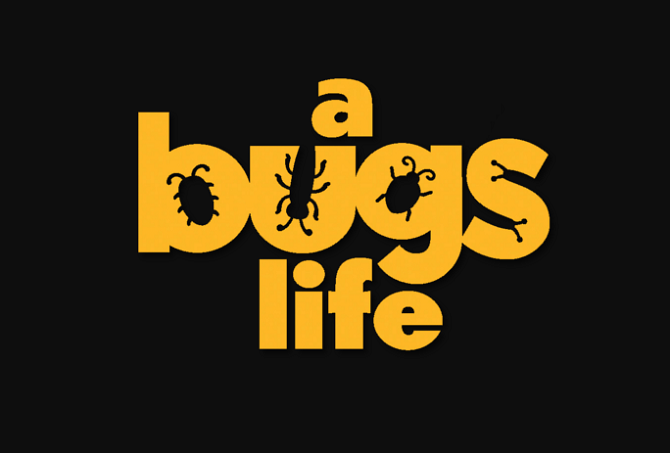
Kids films are especially good at incorporating ideas about the film into otherwise ordinary typefaces. The insect outlines of A Bug’s Life and the radiator badge styling of the Cars logo are just two examples of how to create a logo that is interesting and engaging while using otherwise ordinary type.
9. Back to the Future
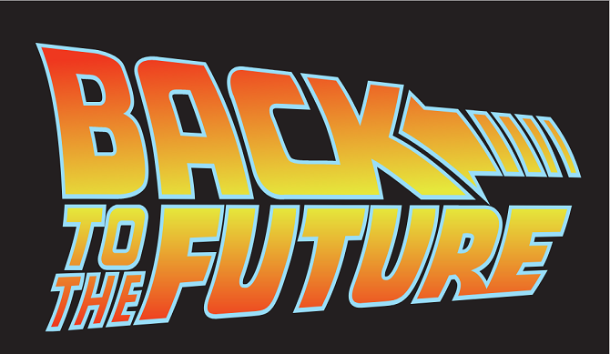
Few movie logos contain quite as much energy and action as the Back to the Future series. Combining a quirky, futuristic typeface with a dynamic, rippling arrow, it perfectly sums up the temporal troubles of the film. The pronounced outward curve of the logo adds to this sense of energy and movement.
10. Star Wars
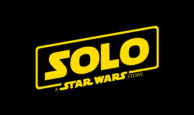
Of all the iconic movie typefaces around, few have the instant recognition or prompt fierce fan loyalty quite like the Star Wars logo. With little more than a few simple letter extensions, the Star Wars design team have created a brand that has stretched over 40 years and is still going strong in the latest installment. As a case study in simplicity and style, there are few if any movie logos that even come close.

