App design trends go through a constant change. While some disappear over the years, the others become a rage and are adopted by a larger mass. Of all these, the majority are admirable, since these have a touch of innovation in them. The modern trends are nothing more than an advanced version of those in the past.
When it comes to a cool and perfect UI design, it features high effectiveness and simplicity. Here, the main focus of designers remains on achieving functionality. They make their best efforts to make the navigation extremely intuitive, so much so that users can hardly notice it.
Nevertheless, if users find it perplexing to perform any actions, it indicates failure of the UI design.
Why is it that design trends encounter change so frequently? Though, it does not have a particular answer to it, various factors together are responsible for this change. For an instance, the change seen in 2015 was due to hardware transformation and increasing responsiveness of portable devices.
A number of mobile apps came into the picture, which brought such amazing features that got converted into requirements. Also, around 90% of the total youngster population in the world now uses their phone for performing basic operations. The other factors that trigger such change include branding transformation, culture, tradition, and some particular features of different mobile devices.
So, here is what all we can hope for in 2017.
Invisible Menus
However, the discovery of invisible menus is not new, but these are something designers have been working on in secret. The secret project is now set to be released to meet public’s expectations.

Sometimes, you may get confused or deceived by large screens. But, rest assured that small screens i.e. mobile apps are a mini-equivalent of desktops. If the functionality doesn’t show in these, it is only to adjust space for viewers.
For this job, a lot of tools are there in the market. The modern ones come out as navigation drawers, which can be used only when needed. When you don’t need them, these go invisible. Various online menus are on the verge of reduction, which will only carry options for a particular task necessary at the time.
Touch ID Dominates
Touch ID was initially used to unlock devices. But, very soon, it was considered a future tool. For example, Apple introduced its ground-breaking Apple Pay mobile wallet in 2015, which indicated something more advanced.

As the year came to an end, IOS8 was released, which allowed third party apps like Amazon to accept thumbprint access method of Touch ID.
Today, online authentication is more valuable, easier, and safer as compared to entering a password manually.
Material Design
In 2014, Google announced a young, visual language, that is, material design. The announcement was revolutionary and spread online quickly.
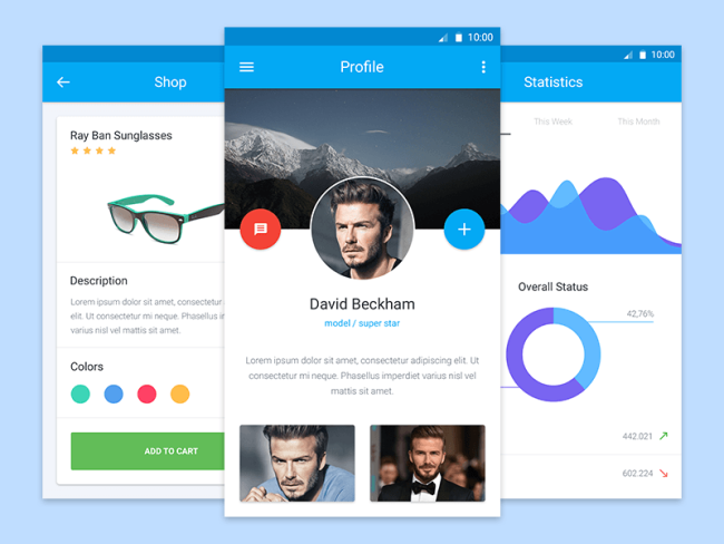
Now, various amazing apps or websites are out in the market, which use material design due to its streamlined effects such as proper layering, well-executed animation, and clear gradients. Material design and card design are closely related, and so, this is expected to last very long.
Card Design Is the New Fad
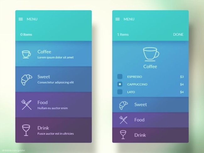
Mobile-friendly websites are finding card design as an effective tool. This is so because these help divide content, while putting it in appropriate parts, and linking with relevant information. Cards allow users to pick actions, which shows that designers keep in mind users’ needs.
With cards, users can easily upload multimedia and ensure higher website traffic.
Refined Color Palettes
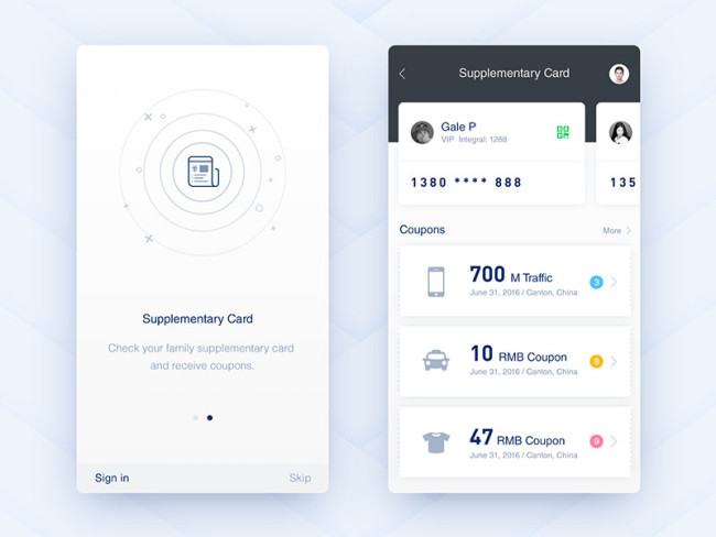
“Less is more”. The concept applies beautifully in almost every field. Thus, simplicity prevails in the design world till date. This is particularly justified in case of working with color. Some of the most well-known and good-looking apps have had a simple approach for color integration.
Gaudy colors do not impress people very much. Modesty still prevails. This means that you keep your brand colors intact, while giving them a professional touch.
No Blurry Background Images
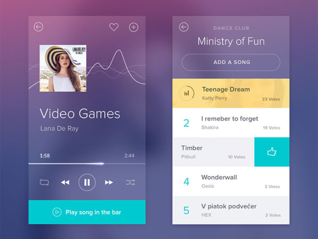
Small screens do not limit designers in any way. Rather, they still grab attention by integrating lively imagery and making more readable content. Such content helps increase conversions.
So, move on with applying all these UI design trends in your applications, if you have already not.

