Being a graphic designer and a person involved into visual field, it is imperative to understand the significance of color and its impact on the overall design of the website. Colors play a crucial role in setting the mood, right tone, and psychology behind your website. They help you create the right ambiance, elegance and appeal within your website, thus enabling you to convey the right message in a very playful way.
The color in design is a very subjective process. Colors which you select for your website can tell a lot about your website. Therefore, it is essential for website designers understand that the type of colors they use on a particular website can have significant impact on the psychology of their customers. So, getting the ideal mix of different colors can mean a lot to differentiate between repeat and one-time visitors. Here, at this point, the Colour Theory takes the center stage.
Colour Theory is a science in itself. The theory features practical guidelines and principals that keep designers informed about how colours are perceived by different people and how they evoke reaction or feelings from them. It takes into consideration a variety of aspects such as cultural differences- mean that something exciting and joyful in one country can be extremely gloomy and depressing in another. Secondly, reactions and influences- what is evoked by one person can be completely differently taken by the another. And a lot more.
In this post, we are going to explain you about the basics of Color Theory and the multiple aspects related to it so that designers can use colors consciously to create spectacular results.
The Basic Idea Behind Colors
The primary objective of using colors is to ensure a satisfying and delightful experience to the user. It’s not like websites could not be designed using black and white format, but then there would be a lack of information, emotions, and tone. In fact there are a plethora of black and white websites out there but most of them are minimalist and overly simple.
Deprived of colors, a website looks boring, dull, and sapped of energy.
Getting The Grips of Color Wheel
In order to use colors effectively in your design, it is essential for you to know and understand some color concepts and terminologies and Color Wheel is one of them.
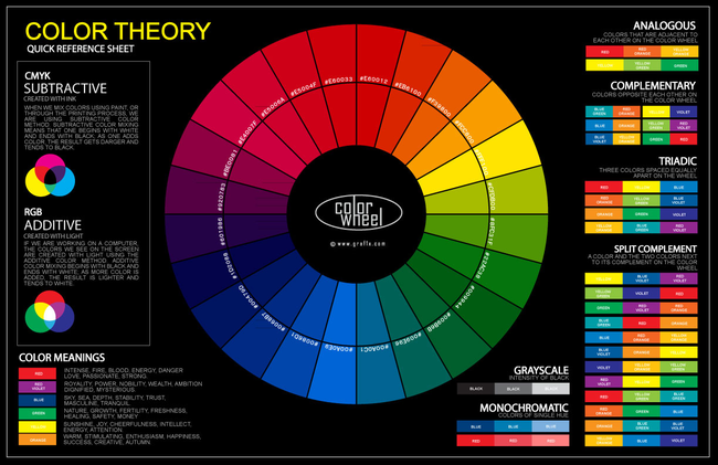
The color wheel or color circle is nothing but a basic tool used for combining various colors. The first circular design was created in 1666 by Sir Isaac Newton. The structure of the color design is developed in such a way that whatever the combination to pick it will look good together. Over the years, there have been so many improvements introduced within its structure, but the most sought-after version is a wheel of 12 colors based on RYB color model.

Color Wheel is By Far One of the Most Effective Ways to Combine Colors
Traditionally, color wheel consists of:
- Primary Colors- Red, Blue, and Yellow. It includes typically those colors which cannot be made from combining other colors.
- Secondary Colors- Green, Orange, and Purple. Can be creating by blending two primary colors.
- Tertiary colors- Color hues which you get by combining a primary color with secondary color. These typically include blue-green, red-violate, yellow-orange.
But why do we use it?
The reason being- it helps designers quickly grasp the way colors can be related to each other and which combination works best through color wheel combinations.
Describing Colors Using Various Models
Color models or standards are used to describe colors better. These models make playing around colors easy and intuitively.
The RGB Model
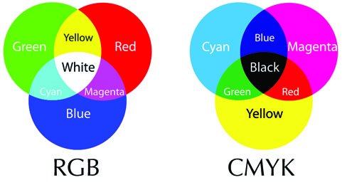
The RGB Model is by far the most popular color model. Each color in this model is described as set of Red, Green and Blue values on the scale ranging from 0-255.
The HSV Model
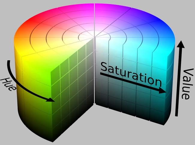
HSB ( Hue, Saturation, and Value Scale) is an another popular model best suited for artists and designers. Here, each color is described using the combination of Hue, Saturation, and Value Scale which allow designers act smart when it comes to exploring color choices.

To understand the model better, let me give you a brief explanation of all the terms:
- Hue: basically describes the color of an object. The hues designers use convey key messages to your visitors.
- Saturation: refers how hue appears under a given lighting condition. Saturations can be termed as weak, strong, and pale.
- Value: also be called as “lightness”. The Value describes how light or dark a particular color is. Light colors generally have high values as compared to dark colors.
The CMYK Model
CMYK is basically a standard, printing color model. Here, every color is represented by a corresponding value
Colors Come in Harmonies
How many times you have come across a website and feel truly impressed with the way the designer has utilized the colors? It’s likely that they have logically implemented color harmonies and the rules related to it.

Harmonies are created by selecting colors from the color wheel as per the predefined schemes and rules. There are basically three combinations which are used quite commonly by the designers- analogous, complementary or tetradic colors. All of them are described below:
- Complementary colors: Located at the extreme opposite of the color wheel and produce a high level of contrast.
- Analogous colors: Located at right next to each other in color wheel. Contrasting level is low. Ideal for designing banners, textures and backgrounds.
- Tridiac colors: Represent three separate colors located at an equal distance of each other. One color is more dominant than the another.
- Tetradic colors: Quite tricky to harmonize. These colors are known for their well-balanced approach. Use two pairs of complementary colors with different specifications.
Color Theory is all about how different colors and their related combinations can be used to achieve a well-balanced website. It explains how colors work and influence your users perception about your design.
About The Author:
Celin Smith is Java developer and blogger at Xicom who loves to write about web & mobile apps. Xicom Technologies Ltd. is a one of the leading .Net Development Outsourcing Company which provides different array of genuine software solutions like Custom Software Development, IT Outsourcing Services, Web application development services to its clients globally.


Fantastic article!
Nice article Ever…