It’s official! WordPress 4.0 is coming soon. And the recent announcement of the first release candidate (RC) of this new version has confirmed the news further. Having said that, everyone in the development community is eager to know what does WordPress 4.0 has in store for them. Among all the speculations and excitement, we unveil the range of new features which the latest version WP will have to offer.
Embedding Content into Posts Just Became Simpler
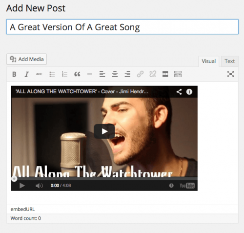
Let’s admit it. The visual editor in WordPress wasn’t visual enough. Addressing this qualm, which almost every user would have had once, team WP took matter in hands and now the entire process is much nicer. The grumpy grey box which once showed up in place of gallery or other media files is now gone. Instead, now that you paste a YouTube URL in the text box, a visual mode of the video shows up. Now that’s called an improvement!
Improvised Post Editing
The height of the post editor has been finally increased and the screen is now being utilized judiciously. The video below explains this change just the right way.
WordPress Goes International
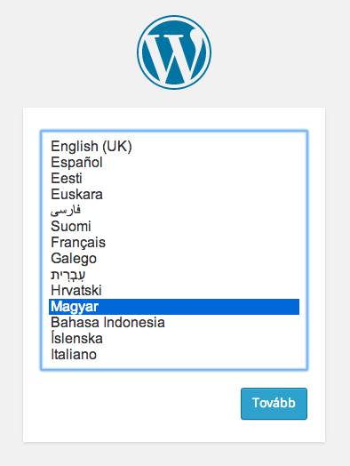
Well, it isn’t that WordPress didn’t have a multi-lingual support before, but with version 4.0 it has become even better. Realizing that a major part of WordPress installations use languages other than English, 29% to be precise, WordPress 4.0 has been designed to speak your language. In fact, as you begin the installation process, you are prompted to select your native language on the very first screen. Bingo!
Media Section Grid
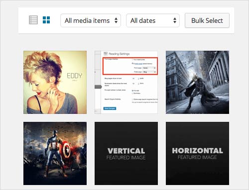
If we speak about UI improvements, the first thing which caught our attention was the changed layout of the Media section. It will appear in grid view by default. This small yet significant change provides a better overview of the files stored in the media section as compared to the old-school list view. Though this isn’t a big-time coding achievement but it definitely introduces a sleeker user interface. This can be a hint of all the developments that might be coming up in the near future.
Improved User Interface for Widget Customization
Good news – the theme customizer now includes widgets. In the latest version of WordPress – WordPress 4.0, the widgets are placed under the customization screen as a new sub-section. This means now you can minimize the widgets which you don’t need. It’s definitely a welcome change from UI perspective.
Plugin Discovery and Installation
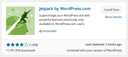
The plugin “Add New” page finally got the much awaited and much needed makeover. The navigation bar on the top of the page in WordPress 4.0 looks less or more like its bro in the Media section. (Shhh… This could be yet another hint that a modern interface can be revealed anytime soon) Further, plugins look more presentable arranged in a list view format. Shout out to all developers – it’s time you start making some thumbnails!
Conclusion
WordPress 4.0 might not be as big as WordPress 3.0 but this isn’t an issue, we suspect. Instead of piling up the CMS with new features, the team is trying to fix the existing features and improve them, and all this to render a better user experience.
The improvements listed above will indeed have a positive impact on how we use WordPress on a day to day basis. And that counts.

