
Responsive web designing is much more than just making sure that a website looks same in different screen sizes. Folks have been speaking about and debating responsive web designing though, everybody is still looking out to figure out a cool and preeminent approach to build a responsive website. Cheers to the quick contribution in technology, a lot of tools are being presented every now and then in order to streamline things. Now, we have limitless tools and selecting the best ones out might be a problem for you. Today, in this post we will be discussing a few but beneficial responsive design testing tools. Let us take a look at these 10 great tools and optimistically, these will make your testing life much simpler.
Viewport Resizer
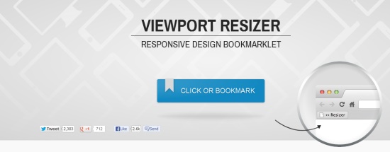
Viewport resizer is principally a bookmarklet and some have acknowledged it as one of the best responsive design tools. Cheers to Viewport resizer, you will not have to yourself re-size your browser windows. You can organize it rendering to your personal needs.
Responsive Web Design Testing Tool
This tool will aid you in testing your responsive websites while designing and developing it. Though, in order to take advantage from it, it is vital that you host the testing tool on your website’s personal hosting.
Resizer
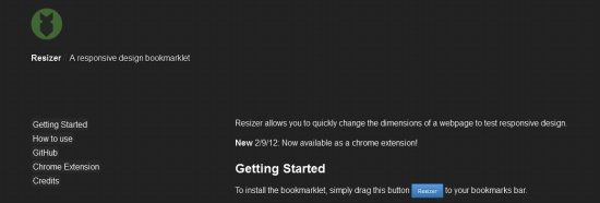
This is one of the greatest tools since it permits you to adjust the measurements of your webpage on prompt basis. Once put in, it can be used effortlessly. All you want to do is visit the website you need to test and use it on this tool.
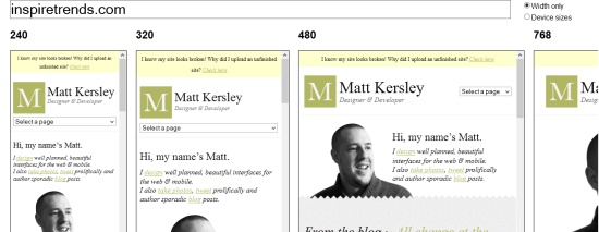
Screenqueri.es
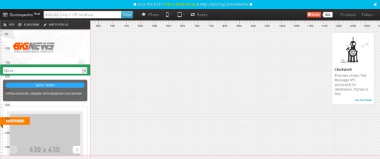
This specific tool is there to aid you with the pixels of your site. Over again, one of the finest tools this is. It aids you in examining your website on more than 30 diverse resolutions. You can even re-size the window and test the pixels with different resolution.
Responsive Design Bookmarklet
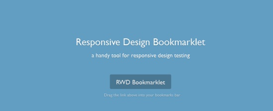
Yet again an amazing tool and if you need to understand how it functions, all you require is to make sure to visit any responsive website and then click on the RWD Bookmarklet link. You can then choose any resolution for your view-ability.
Edge Reflow
This tool is being used by a lot of designers to build a native web design having CSS layout. With this specific app, designers are capable to make resizable blueprints. These blueprints will then fuel the whole design of your website for mobile phones and desktop.
CyberCrab
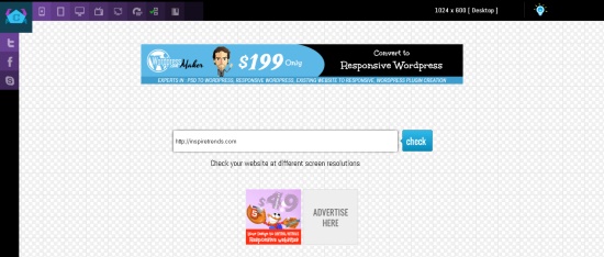
If you need to test your website at diverse screen resolutions, this tool is the right choice for you. This is fundamentally an online tool that offers you with the capability to test your responsive site.
BrowserStack
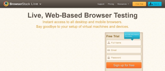
BrowserStack is fundamentally an online cross-browser testing tool and was introduced a few years back. It offers testers, developers and designers with a cloud platform in order to check their web apps. BrowserStack has been helping more than 200,000 listed users across the world.
Ish

I loved the name really because of the perception after it. Perceived about small-ish, medium-ish, large-ish? Yes, this is precisely how this name was chosen. The greatest thing about this tool is that there are no limitations. You can make use of it on any screens’ resolution.
StudioPress Responsive Testing Tool
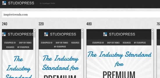
This tool is yet again very beneficial for developers and designers. On a solitary screen, this tool will display you how your website looks on several devices. It will display you your website’s design on tabs, mobiles, and other related gadgets.
About Author
Founder
David Watson is the founder of DesignDrizzle and is a professional website designer for over 10 years. He has competence in creating visually appealing and user-friendly websites for all the clients. He likes to explore new and creative ideas for designing, photography effects and other inspirational subjects