
The themes below are all designed and implemented to be responsive and to give mobile users a great experience. Please check the demos to ensure the responsive design fits your needs and that the required dimensions look good. One way to do this fast simply is to make the browser window smaller. Best solution however is to test on a tablet and smartphone before making the final decision. Keep in mind that responsive WordPress templates required a lot of effort to design, implement and that maintenance may be quite a job as well. You see, every screen size with a unique layout and this require some extra design and implementation why many are WordPress themes with a simple and minimal design, without too many elements to manage.
Lucid WordPress Responsive Theme MORE INFO / DEMO

Elegant Themes really did a great job with the design of Lucid. It features a modern magazine layout that allows you to have a busy website with lots of content. The layout is responsive, clean and minimalistic.
Angular – Responsive WordPress Portfolio Template MORE INFO / DEMO

Angular is a responsive WordPress theme with a design that works wonders is you plan to showcase you work on a portfolio website. With angular you get a theme that have been built on top of the mature Avia Framework and the theme also features support for the cool bbPress forum solution for WordPress.
Trim Theme MORE INFO / DEMO

The Trim theme from Elegant Themes was created with a clean minimal design. It features a unique slider layout and a professional front page layout that will fit most business websites well. Trim is fully responsive and have a mobile friendly design that adapts to your user’s variable screen size.
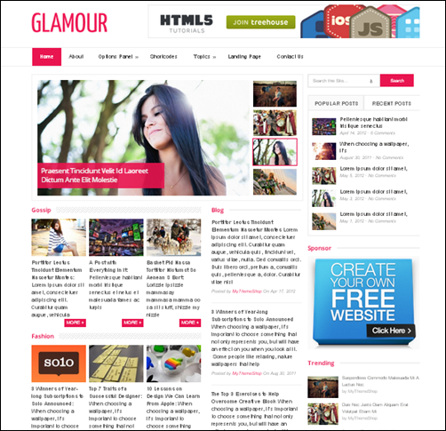
Glamour Fully Responsive Magazine Layout – MORE INFO | DEMO

Glamour is a responsive magazine theme for WordPress that adapts nicely to different view port sizes. The theme takes minimalism for complex magazine websites to the next level, but a splash of color. Glamour offers a multiple column post display and gives you great ability to customize the look and feel. I think it is a great choice for bloggers who want flexibility, speed and elegant minimalism.
Quare – Responsive Multi-Purpose Theme – MORE INFO / DEMO

Quare is a clean and minimal WordPress theme with a responsive layout. It is well suited for business websites but it also works well for creating a portfolio website. Quare theme is built with Kodde Framework V2 with a lot of new options and Page Builder V2 that offers drag and drop and resizable blocks. This makes it possible and quite simple for you to set up the individual pages as you like.
Deadline Responsive Magazine Theme MORE INFO / DEMO

Deadline defines what a minimal responsive magazine layout should look like. It is a professionally designed WordPress news or magazine theme that both bloggers and large scale online magazines can benefit from. It comes many custom options and useful widgets helping you along the way to control the look and feel of your website.
Easy Responsive WordPress Theme MORE INFO | DEMO

Easy is a responsive WordPress theme for setting up magazine websites. It offers a clean design and will work well for most bloggers as well. Easy also comes with a easy to use theme admin panel and with use of widgets it enable you to take control over your content, manage your advertisement, show your latest tweet, video, photos and much more.
Boxline – MORE INFO |DEMO

Boxline is an elegant responsive blog and magazine theme for WordPress. It is minimal and clean with a combination of subtle, soft grays, light textures and a few bright colors.
Inovado – Retina Responsive Multi-Purpose Theme – MORE INFO / DEMO

With Inovado you get a clean minimalistic, retina-ready and responsive WordPress Theme with a light and user friendly business website design. The theme offers a great set of customization settings that helps you transform Inovado into your own business website look and feel.
Aegaeus – Ultimate Responsive Business WP Theme MORE INFO / DEMO

Aegaeus is a cool Responsive Business WordPress theme with a modern and really awesome slider system. It’s fresh & modern look with friendly features will make your website a standout. It’s both fun and easy to work with this theme. Creating fully working pages, that look awesome, now takes only a couple of minutes.
SimplePress – Corporate WordPress Photo Theme MORE INFO | DEMO

SimplePress is a simple and clean page-based corporate WordPress theme. It is great for anyone looking to give their website professional look and feel. The theme features a business style homepage with a beautiful well integrated JavaScript slider and clear hierarchy, as well as fully functional Blog and Gallery sections.
Flexible Responsive WordPress Portfolio Theme MORE INFO / DEMO

Flexible is a sleek and minimal portfolio theme packed full of some awesome features. The theme puts your work first, keeping the design elements to a minimum while still maintaining a definitive modern style. With its filterable, ajax-powered multi-media gallery, Flexible is perhaps our most feature-rich gallery theme yet. Even on smallest devices this responsive theme looks great.
Blox: Bold WordPress Portfolio Theme MORE INFO / DEMO

A big, bold, beautiful, portfolio theme for creatives. Designed to put your work in the forefront, Blox is all about showcasing your talent. Each portfolio is its own “block” of creative awesome which can feature your designs, demo reels, or audio tracks. Or all three.
DeepFocus MORE INFO / DEMO

With Deep Focus you can turn your WordPress business website into a responsive business website and online photo gallery. Along with the gallery layout, DeepFocus comes with a robust blog and CMS-style homepage as well, making it an amazing solution for artists/photographers looking to build an online presence. This is a great pick among the many Simple WordPress Themes available. Elegant Themes also have a huge set of other good looking and among best WordPress themes. Their gallery is worth checking out if you are looking for a new theme – you can get all 76 themes for $39.
Resizable responsive theme MORE INFO / DEMO

Theme Junkie is showing off their skills with this first responsive WordPress template. It is a cool magazine / news theme layout and the responsive design is pretty cool, especially with the sub menu moving to the left as the viewport gets smaller. The Resizable theme works great on any resolution on desktop and mobile devices such as iPad, iPhone, Android, and Blackberry.
Avada | Responsive Multi-Purpose Theme MORE INFO / DEMO

The Avada theme is so clean, super flexible and has a fully responsive design (try resizing your browser). Built with HTML5 and CSS3 . A lot of thought and care were put into Avada making it a pleasure to use. Avada is loaded with options, and has powerful customization options. The clean, modern design can be used for any type of website; business, corporate, portfolio, products, etc.
Expression Photography Responsive WordPress Theme MORE INFO / DEMO

Expression is a cool responsive WordPress photo theme, best suited for photographers and creatives who use portfolios to effectively present their work. Expression theme is powered by the advanced Pexeto Panel, which provides tons of options to manage and modify any aspect of the theme. With all the styling options provided you can easily customize the appearance of the theme and build you own custom skin.
DailyJournal Responsive Blog WordPress Theme MORE INFO / DEMO

DailyJournal is a fully responsive personal blog. It is the first blog theme from ElegantThemes that will automatically adapt to the screen’s size, insuring that your content is always displayed beautifully no matter what device visitors are using. Check the varius layouts (media queries) below or test the theme demo yourself.
Maxx – Responsive Creative WordPress Theme MORE INFO / DEMO

Maxx WP is a Modern Clean & Creative theme suitable for any corporate business or portfolio,It’s created by using the latest techniques : HTML5 and CSS3 . With a extremely responsive design That means it will fit any device (Desktop, tablet, smartphone…), completely optimized for your touchable device. Maxx has everything you’ll want for your business website.
AREA53 – A Responsive HTML5 WordPress Theme MORE INFO / DEMO

AREA53 is a Responsive (full) HTML5 with a cool responsive slider. It’s full featured with the Content Composer to create professional pages in minutes, filterable portfolio and much more.
Shepard – Premium responsive corporate theme MORE INFO / DEMO

Shepard Premium responsive corporate theme is exactly what you need! Enjoy a great variety of possibilities to adjust your own site to be totally awesome: admin panel, slider manager, form builder and others. Let the graceful design and convenient functionality represent yourself or your company!
Modernize – Flexibility of WordPress MORE INFO / DEMO

Modernize is extremely well designed and will make most business website rock. But it is not just looking good, it is fully responsive and comes with a very powerful page layout builder. Without any coding you can easily put together a new layout for a any page. Only thing I was missing when testing this theme was the possibility to add widgets as a layout element. Some layout builders support this e.g. Pioneer above and Visual Composer (WP plugin that add layout building capabilities to any theme)
Sterling – Responsive WordPress Theme MORE INFO / DEMO

Sterling is a fully Responsive WordPress Theme built on a theme framework. It’s a great theme for everyone in need of a professional online presence. The design is light and clean and fits very well for business websites.
Apollo – Responsive WordPress Theme MORE INFO / DEMO

Apollo is a sharp, responsive WordPress theme perfect for any business, portfolio or blog.
Gigawatt – Responsive WordPress Video Theme MORE INFO / DEMO

Gigawatt is a video blogging theme designed by the ever so talented team of Trent Walton and Reagan Ray from Paravel. As with any of our themes the brief was simple, design to your strengths but make sure that it’s as usable as can be. The end result is a gorgeous, vintage looking WordPress Video theme which manages to balance a grunge look with a minimal and flexible layout.
SmartStart WP – Responsive HTML5 Theme MORE INFO / DEMO

SmartStart WP is a simple and clean but still professional WordPress theme suitable for any business or portfolio, and it’s created by using the latest HTML5 and CSS3 techniques. With a responsive design it is easily usable with any device (Desktop, tablet, mobile phone…), without removing any content!
Aware MORE INFO / DEMO

Aware is an interactive, responsive portfolio theme perfect for freelancers, web designers, photographers and videographers alike. Its user interactive interface delightfully enhances your most loved portfolio pieces. Now, you can take your portfolio with you, in your pocket.
SevenWonders MORE INFO / DEMO

SevenWonders is a clean and modern wordpress theme that Fully Responsive, which mean the layout will adapt depending on the device screen size.
Slick Responsive Portfolio WordPress Theme MORE INFO / DEMO

Slick is a full Responsive Portfolio theme for WordPress. It’s designed for agencies, creative professionals, web designer, it simply fits for any kind of business. Slick comes with a really amazing responsive fluid layout which allow to display your website on every device. It comes with filterable and animated Portfolio, fluid Homepage Slider, integrated Twitter plugin, Latest Work widget, Latest Blog Post widget, social media buttons and contact form, shortcodes etc… The options panel makes it easy to customize various aspects of the theme including layout, colors, portfolio, blog and other settings.
Good Minimal MORE INFO / DEMO

Good Minimal is a responsive HTML5 & CSS3 , clean and minimalist style theme that is good for portfolio, blogs and businesses. This theme is flexible and is used media queries to adapt screen sizes, whether it is iPhone, iPad and wide screens.
Entrée MORE INFO / DEMO

Entrée is a powerful WordPress theme for the Agencies & Business companies, there are no limits. Entrée is a fully responsive theme for WordPress, which adapting display to all devices (screen, widescreen, iPhone, iPad, Android … correct displaying in each device, really) – try to resize your browser window. Entrée offers easy creation of a portfolio with an unlimited number of items.
Rime – Responsive Portfolio for WordPress MORE INFO / DEMO
 R
R
ime is a powerful theme for Creative Professionals. Variety of portfolio showcases can be generated using the theme such as ajax based sortable showcases capable of displaying images,videos and slideshows with client information. The theme is packed with showcase solutions including shortcode thumbnail generations that supports multiple image drag and drop capability. The blog post use audio,video,image,quote,aside note,links and slideshow postformats.
Flare – Responsive Business & Portfolio WP Theme MORE INFO / DEMO

Flare is a Responsive WordPress Theme with Unlimited colors made for your Business/Corporate website, Portfolio, or Blog. It’s flexible, you can customize it with the powerful admin panel, which gives total control over many major aspects of your website.
Yoko MORE INFO /DEMO

Yoko is a flexible HTML5/CSS3 WordPress theme. With the responsive layout based on CSS3 media queries, the theme adjusts to different screen sizes. The design is optimized for big desktop screens, tablets and small smartphone screens.
Constellation MORE INFO / DEMO

Highly optimised WordPress framework rewritten from the ground up using HTML5, Media queries for several devices / screen resolutions with default styles included, Custom 2, 6, 9 & 12 column grids for each device, A solid 32px vertical rhythm which scales in tandem with the screen resolution.
Renova MORE INFO / DEMO

Renova, a new single column theme for wordpress.The main design of renova is concentrated on a minimal style dedicated to those writers who need a simple layout without any kind of useless stuff. Renova was designed to perform well on the principal touch mobile device and tablets.
Blaskan MORE INFO / DEMO

Blaskan is a responsive and accessible WordPress theme that’s built for many kinds of screens.
Responsive Twenty Ten MORE INFO /DEMO

Responsive Twenty Ten is a child theme of the default WordPress theme. This theme has been based on Todd Halfpenny’s Responsive Twenty Ten with the addition of some special touches such as flexible images, nice margins, and some mobile image rules.
Artboard MORE INFO / DEMO

No gimmicks, no feature bloat, just rock solid standards compliant coding and straight forward design that makes your work shine, whether it be photography, graphic design, illustration, or even video.
Reaction MORE INFO / DEMO

Reaction is more than a WordPress theme, it’s a comprehensive HTML5 framework and it includes a full templating system as well; A collection of several incredibly powerful scripts and CSS structures that’s been tied together into a kit that’s perfect as a jumping off point of your next project.
Knead MORE INFO / DEMO

Knead is a neat little Portfolio WordPress theme called Knead and not only will you be able to list your amazing work but also detail all your services too.
Kraken Business & Portfolio WordPress Theme MORE INFO / DEMO

Kraken is a clean and modern Business & Portfolio WordPress theme that’s perfect for showcasing your work in a minimalistic fashion. With custom post types, a modular homepage via drag-and-drop sections, image sliders built-in, unlimited portfolio items, 3 different portfolio styles, a regular blog section and modern jQuery/CSS3 enhancements, 2 pre-made color schemes and unlimited color options, Kraken is the perfect solution for all your projects.
Good Space – Responsive Minimal WP Theme MORE INFO / DEMO

Good Space Good Space is a WordPress theme especially for creative agency. It’s very clean, minimal with modern design. This theme is also has a responsive ability. Moreover, it comes with tons of features. Including our page items that can be managed very easily via our awesome tool, ‘Page Builder’. Admin panel in this theme is a real feature rich. You can also create unlimited sidebar, choosing over 450 fonts or if you want to use your own, we provide a cufon uploader. You can also translate each elements to your language via this admin panel.
PixelPower MORE INFO / DEMO

This is a clean, modern, powerful WordPress tumblog-style theme designed for a wide variety of uses from bloggers to design portfolios. The responsive web design adapts from large to mobile screens, just resize the browser window to test it out, no additional setup required!
Coraline Ajax And Responsive WordPress Theme MORE INFO / DEMO

Coraline is a great theme for the creative agency, freelancer or general business. Has a lot of modules are ready for homepage, it’s simple-to-use, customize and install.
Lucky Times MORE INFO / DEMO

Responsive theme for Portfolios, Blogs and Magazines with a really unique and different look and feel!.
Super Skeleton WP MORE INFO / DEMO

SuperSkeleton for WordPress is responsive (try resizing your browser)… that means that it’ll flex to fit massive screens, or itty bitty iPhone screens (and everything in between).Touch gestures even work on the slider!
Whitelight MORE INFO / DEMO

Whitelight features a clean and responsive design, customized modular homepage, portfolio functionality. Further it offers integration with WooCommerce (child theme) for e-commerce features.
iTheme2 MORE INFO / DEMO

iTheme2 is a revamp of iTheme that was originally released by Nick La. Now with the Themify framework, it is even better and have more options. It is the perfect theme for technology & Mac related blogs. It uses media queries to target different displays such as desktop, notebook, iPhone, iPad, and other mobile devices.
XO – Responsive Creative WordPress Theme MORE INFO / DEMO

XO is a responsive WordPress theme for creative people building an online portfolio.
MayaShop – A Flexible Responsive e-Commerce Theme MORE INFO / DEMO

Why not consider a responsive layout for your next online shop project. This will prepare the buisness for people shopping on the move! MayaShop is a fresh WordPress theme that utilises the powerful JigoShop and Woo Commerce plugins to create a versatile WordPress powered shop, with unlimited layout options and unlimited skins.
Jigsaw – Responsive WordPress Theme MORE INFO | DEMO

Jigsaw is a theme that looks great and performed really well on mobile and tablet devices. It is built on an extensible and flexible responsive framework, and has been tested on as many platforms and devices as possible. Thus whether it’s visited by an iPad, iPhone, iPod touch, Android device, laptop or desktop, the theme still looks pretty amazing.
Sentence – Responsive Blog and Portfolio MORE INFO / DEMO

Sentence is a responsive Blog and Portfolio Theme (try resizing your browser), suited for users who want to run a professional or personal blog and in addition to that want to showcase their work on a neat portfolio site.
The Theme is built on top of the Avia Framework and comes with a plethora of options so you can modify layout, styling, colors and fonts directly from within the backend. 15 predefined skins (which are easy to modify from your backend), font and color options will help you create the Website you need in no time.
The Arcadian Responsive WordPress Theme MORE INFO / DEMO

The Arcadian is a new portfolio theme designed to look beyond the typical corporate mold and give you the ultimate in WordPress creativity.
Swagger MORE INFO / DEMO

Swagger is built on top of the all-new version 2 of the Theme Blvd framework. Use the layout builder to accomplish just about anything you could ever think of. Use the slider manager to create as many sliders as you want. Use the widget area manager to create as many widget areas and sidebars as you want. With just the right amount of theme options and flexibility, the power is all in your hands. And with a sleek, responsive HTML5 design, you’ll be sure no one will miss out on your new website built with Swagger.
Innovative MORE INFO / DEMO

innoVative is a powerful minimalistic business/corporate/portfolio & blog responsive premium WordPress theme packet with many cool features – including a front page layout builder.
Instyle MORE INFO / DEMO

Instyle is a responsive HTML5 & CSS3 Portfolio theme with WordPress post format support. Instyle uses Twitter Bootstrap CSS3 / HTML5 framework for easier development.
Modulo MORE INFO / DEMO

Looking responsive solution for your business website? Here it is! 100% flexible, ultra clean and modern theme with cool features.
Passion Reloaded Responsive WordPress Theme MORE INFO / DEMO

This is a really cool business WordPress theme with great responsive layout and page builder to take complete control of the individual pages.
Next – Responsive Business WordPress Theme MORE INFO / DEMO

Next is a professional theme that makes creating a clean, responsive business or portfolio site very easy. Next follows all the latest HTML5 , CSS3, and JS techniques and conventions. The Responsive Design of the theme lets you serve desktop, tablet, and mobile devices all as first-class citizens.
Volumes: Responsive Portfolio WordPress Theme MORE INFO / DEMO

Bold, beautiful, full of character and fully responsive – Volumes is a great asset to any creative freelancer or agency. An attractive showcase for you work packed full of features, a filterable portfolio, custom widgets, custom page templates and more.
Office Responsive Business Theme MORE INFO / DEMO

Office is a cool WordPress theme for any corporate business. Featuring a very professional design, 7 custom post types, drag and drop homepage modules, unlimited highlight color option, optional navigation icons, 3 menu regions, an optional responsive layout…Office has everything you’ll want for your business website.
Trine Responsive WordPress Theme MORE INFO | DEMO

Trine is a Responsive portfolio theme for WordPress. It’s packed with useful elements, functions and shortcodes that respond with the layout.
BonPress MORE INFO / DEMO

BonPress is the perfect personal blog theme. Packed with Post Formats (audio, video) feature and multiple Custom Widgets, like Twitter, Flickr, will offer you a unique experience from blogging.
Zig Zag – Responsive WordPress Template MORE INFO / DEMO

Zig Zag is not just responsive it is also a one page layout. Pretty cool responsive wordpress theme.
Momento MORE INFO / DEMO

Momento, the latest theme out of the Obox factory, is a WordPress Photography Theme with an emphasis on epic design and a scalable layout.
FlexFit – Responsive Business WordPress Theme MORE INFO / DEMO

FlexFit is an responsive & highly customizable WordPress Theme for creative professionals and companies who are looking for a unique and customizable website which looks beautiful on any device.
FlexFit comes with tons of options to modify the overall layout, colors & backgrounds for a unique and custom look directly from your backend. It includes hundreds of built-in responsive Shortcodes (even swipe-enabled) and over 220 Icons to create incredible Pages in no time. FlexFit has a fully responsive layout. That means it will fit your large desktop screen, all the way down to your iPhone – and of course any Tablet or iPad in between.
Fuji – Clean Responsive WordPress Theme MORE INFO / DEMO

Fuji is a premium WordPress theme created by Satori Studio. Our aim was to develop a clean and aesthetically pleasing, yet stable, powerful, and highly customizable theme to use for personal websites/blogs, corporate websites, or creative/portfolio websites. Fuji is a responsive theme, which means it adapts to the screen resolution of the viewing device: your website will be equally usable and good-looking on large monitors, laptops, tablet devices, and smartphones.
Ari MORE INFO / DEMO

Ari is a minimalistic, flexible three-column blog theme. The theme uses CSS3 media queries for its responsive layout and is therefore optimized for tablet pcs and smart phones (the theme switches to a two-column layout when viewed on a horizontal iPad screen, and to a one-column layout on iPhones). You can also choose a dark color scheme and the backgound-, text- and link-colors can be customized in the theme options page.
Nexus – Responsive Business WordPress Theme MORE INFO / DEMO

Nexus is a deeply responsive, business WordPress theme. Using the built in Skin & Color Options you can completely change the look of your site in no time. Nexus also integrate with the Google Font Directory allowing you to use any of the hundreds of fonts offered by the Google Font Directory to tailor your typography for a unique, custom look.
The theme comes with three fully responsive sliders. You can create sliders with any type of content you like and spice it up with a whole library of slide element animations. These sliders will be sure to create a great initial impact on your site visitors. The resource loading of the sliders has been engineered to allow for superior load times and smooth loading on all devices.
Scherzo MORE INFO /DEMO

Scherzo is a clean, readable theme that boasts a mobile first design, which means it displays perfectly on all mobile phones as well as desktop monitors. It requires version 3 or higher of WordPress and makes use of HTML5 structural tags, the hatom microformat and ARIA landmark roles. In plain language that means search engines will be able to interpret your content easily while screen readers will be able to navigate it with no problems
Responsive WordPress Theme Frameworks
Versatile HTML5 Responsive WordPress Framework MORE INFO / DEMO

Reverie Framework is an extremely versatile HTML5 WordPress framework based on ZURB’s Foundation, a powerful tool for building prototypes on any kind of devices. Reverie follows HTML5 Boilerplate standard and is hNews microformat ready. It is optimized for Search Engine while at the same time improve readability. This is an interesting tool if you are building your own responsive WordPress themes.
Whiteboard Framework MORE INFO / DEMO

Whiteboard framework for WordPress was developed to speed up the development of WordPress themes. Whiteboard does so by eliminating the time spent on code common to all WordPress themes and includes non-intrusive code that improves the overall WordPress theme in many ways – including SEO, speed, usability, mobile support, and multi-lingual support. Whiteboard remains a true WordPress Framework. Whiteboard includes only the core WordPress structure and does not get fancy with unnecessary functions. While Whiteboard does include Less Framework and a minimal theme, these can be easily removed with the exclusion of a line of HTML each.
This post originally appeared on TripWireMagazine.com.
About Author
Founder
David Watson is the founder of DesignDrizzle and is a professional website designer for over 10 years. He has competence in creating visually appealing and user-friendly websites for all the clients. He likes to explore new and creative ideas for designing, photography effects and other inspirational subjects
Your list of best WordPress responsive themes are fabulous. And, I am going to use some of them for my website. Thanks for sharing the best themes with us.