
Almost everyone must have possibly come across typography of some kind or the other in visiting different websites. But, did you really pay attention? Most of the web designs of modern fashion contain large typographic text in a shared space with either a video, or an image, or other elements.
It is certainly not a piece of cake to achieve such a design, though it is not rocket science and can make your design all the more appealing.
One of the major concerns associated with designing a website with shared spaces is the readability factor, however; you have also other things to pay attention to, including animating one element and not the other or animating two different elements differently.
We have a list of top 10 examples of typography in a shared space.
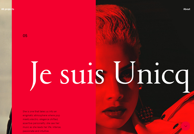
Benjamin Geudj
As you scroll horizontally on the site, you are able to see text and images on the projects already handled by the designer. The headline appears in a shared space with a solid colored panel, which contains a descriptive text at times.
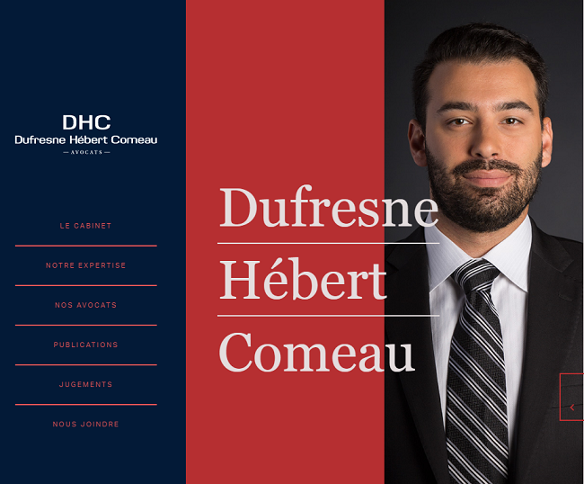
Dufresne Hebert Comeau
Dufresne Hebert Comeau is a Canadian website using a slideshow, which shows different staff members and their short bio with each slide. The left-hand panel showing the name of the company remains static while sharing a little space with the sliding images.
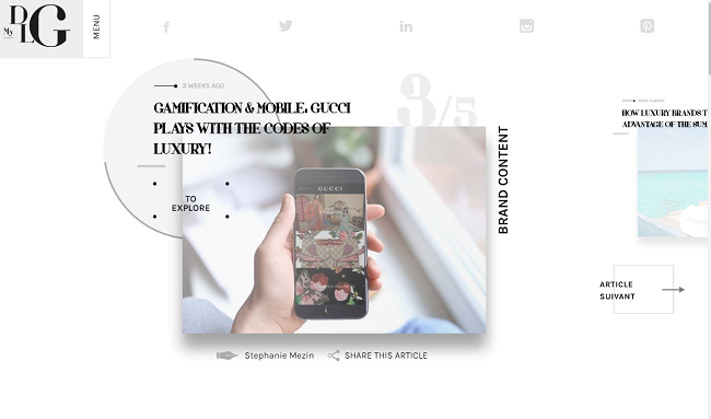
My Digital Luxury Galaxy
The website seems extremely simple in design, and yet, surprisingly, remains extremely crowded. The attractive feature in its design is its landing, which has a slideshow. The image that is in sharing space with the headline tends to slide in with the circle lying behind each image containing a loading bar, which runs about its circumference.
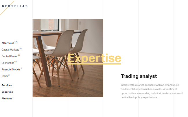
Kekselias
With the pastel color scheme making the site design eye-catching, each text piece slides up the screen as you scroll your cursor down the page. Accordingly, the headline comes into sharing space with the complementing image.
Authentic Form & Function
This is a different sort of a design where typography shares space with an image in such a way that the image has a dominating place over the type. Typography is almost secondary in this design.
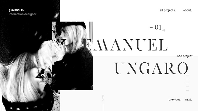
Giovanni Xu
At the very first look, this kind of typography may seem very customary but as you hover over the same, the smaller image, with which the headline is in a sharing space, animates a little.
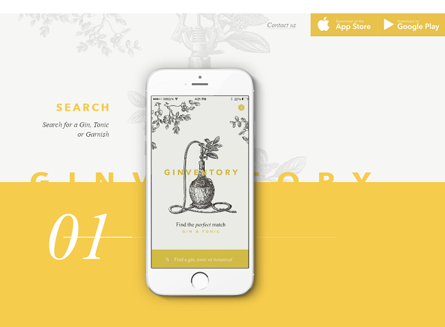
Ginventory
Scrolling animations on this site make the solid yellow panel keep rotating to either reach the top or the bottom of the web page. Also, it always covers half the name of the company.
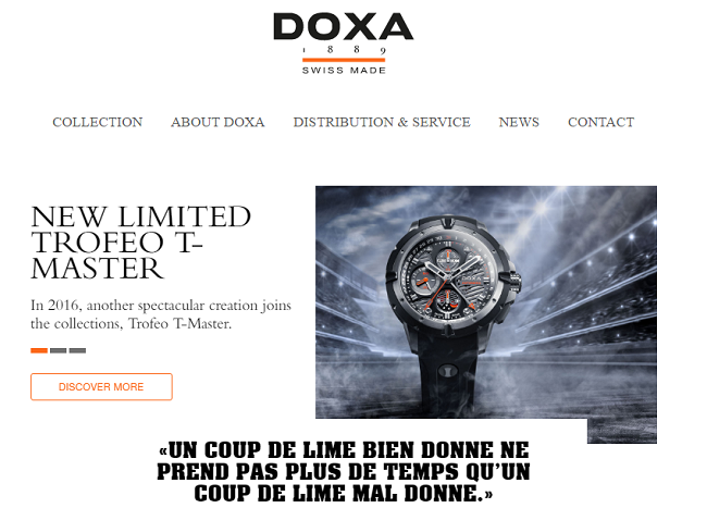
Doxa
Doxa – the Swiss watch manufacturer uses white typography labels which take the form of images when you start scrolling in the downward direction.
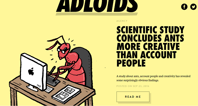
Adloids
Unlike any other design, this design has a typography that takes a leap out of the boundaries. Strange enough?
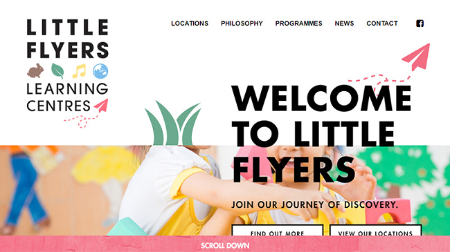
Little Flyers Learning Centres
This is a simple design with the large headline text and the colorful image sharing space with one another.
A Final Take
With time, it might come out as all the possible techniques and ideas for web design have already been implemented. But, no worries! The designers and developers are very well aware of how to best put forward an illustration of their creative bent and add a surprise element to the existing trends. Large headlines sharing space with other elements is just one example.
About Author
Eyden Haze
Eyden Haze is a digital marketer, a web designer and technology fanatic from Sydney, Australia. With over 7 years of experience in web industry, he has helped his clients to launch their marketing campaigns successfully. He also likes to explore various online tools and share that knowledge by writing useful blog posts.
Dufresne Hebert Comeau is looking really cool. The designer of this website must be really creative minded. Color pattern used is also very good.
Awesome looking examples. I didn’t know about this and have never noticed this trend. This is new to me and found this amazing.
Nice examples. I didn’t know about this & have never noticed this trend. This is new to me & found this amazing.
Well… though I'd rather have pretty pencils than pretty eainsrgr, I already have colored pencils. Would the deal still be good for some pretty tape?