
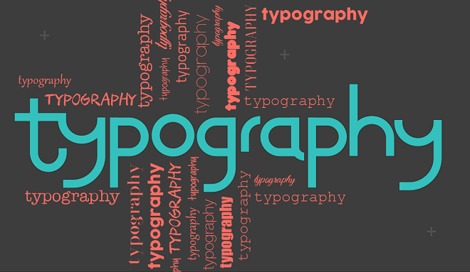
With written content becoming more and more popular amongst SEOs, a solid understanding of typography has become an essential tool for any modern web designer. After all, if someone’s going to be reading 500 words on a website, they won’t want to get a headache whilst doing so! However, working with typography presents some seriously unique challenges. That’s why we’ve put together this piece detailing some useful tips on how to get those words looking great.
Make Sure It Is Readable
Firstly, there’s no more effective way of judging the typography you’ve used than by reading it yourself. Obviously it’s important to come at it with fresh eyes – you’re never going to be able to accurately judge the site having just stared at it for eight hours whilst designing! Come back to it the next day, and read through the text on the page as if you’re a first time visitor. The chances are that within a few minutes you’ll be able to judge whether or not it is comfortable to read, and what changes need to be made.
Use Visually-Appealing Fonts
Create a hierarchy with regards to the text. When a user arrives at the page, they should immediately be drawn to the different text in order of importance. That is, in the order of importance that your design makes clear. Ensure that the main points – the headline, the big two or three sentences and the call to action – are the most emboldened text and the most visually compelling. Beyond that, sub-headings and smaller pieces of text should still be pleasantly readable, if not as substantial as the other areas.
Similarly, for example we can compare a web design with a book cover design. Book cover doesn’t need to look good; it has to look amazing and attractive to draw attention of more readers. A book cover design is one of the most important facets of marketing a book. Books with artistic graphics, attention-grabbing font style and beautiful covers gain more sales. So, you must consider a skilled book designer for designing a book cover. In the same way, you must consider a professional web/ graphics designer for designing a website with amazing fonts and graphics to gain more attention of your visitors.
Use Real Text
Dump that demo text as soon as you possibly can. Whilst that parade of Lorem ipsum demonstration text might help you judge color, the simple fact is that in pure typography terms, it doesn’t help you analyze the readability of the design. Why? Well, because you’re not reading it, of course! Even if it’s just copied and pasted from a free e-book, put text on the page that you can actually read through when designing. Of course, if you can, then get the website copy yourself in advance.

Less Is More
Be careful with the overuse of colors. Just like a classic black and white suit, the contrast of black text on a white background just never stops looking cool. Whilst we’re not suggesting completely removing color from every design – that will just lead to all websites looking the same – overdoing color is a sure-fire way to text being lost in the background. Use vibrant, eye-catching colors sparingly and to more effect.
Strike a Balance
If your site is text heavy elsewhere, then unleash a big image on the main page. One of the keys to an effective front page is the right balance between inspiration and detail. Because of this, it’s become more and more popular for websites that are otherwise text heavy to focus their front page on a single substantial, inspiring image. The technique works in a similar manner to a magazine front cover, and can be extremely effective in helping that initial copy stand out.
About Author
Founder
David Watson is the founder of DesignDrizzle and is a professional website designer for over 10 years. He has competence in creating visually appealing and user-friendly websites for all the clients. He likes to explore new and creative ideas for designing, photography effects and other inspirational subjects