

When it comes to the process of creating a website, you’re can be faced with the decision of whether to go with a single-page layout or to use sections and categories in a multi-page style.
With around 40% of the world’s population using the internet, brands know it’s online where they need to be attracting customers and establishing a reputation. While a single-page design can be effectively used by anyone with only a small amount of content to put on their website, having different sections is crucial for those with a range of products or services. And with almost 5 billion people around the world now using smartphones to access the internet, websites need to not only be compatible with mobile devices, but even simpler to navigate.
For those companies and brands aiming to provide visitors to their website with a maximum amount of usability while reducing bounce rate, getting it right with their website design is essential to staying relevant and increasing engagement with their target market.

Why Do Websites Need Sections?
http://t.co/D9pwMXuZOa recently passed a billion websites by their count….
— Tim Berners-Lee (@timberners_lee) September 16, 2014
At the time of writing, there are almost 1.2 billion sites in total. So it’s obvious internet users have plenty of options when it comes to where to spend their time – highlighting the importance of providing users with the level of usability they can now demand. Rather than having to scroll down a single-page and have all of a website’s information in the same place, sections and categories mean visitors can easily find what they want as well as relevant information, stories or products.
You could have brilliant icon fonts or eye-catching graphics, but if users can’t easily find their way around a website, they won’t stay for long. It’s a similar story with apps – which account for around 85% of the time users spend on their smartphones. Having sections and categories help you find the right product or service instantly.
Categories for Content-Intensive Sites
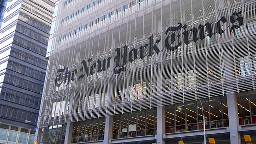
Perhaps even more important than the content of a website is being able to present it clearly to the public, and this is where sections are so essential to a brand’s success online. Certain content-intensive sectors offer such a wealth of categories that they need to devise specific strategies for their navigation design. It is the case with mainstream news outlets aimed at the general public such as the New York Times, which has no fewer than 17 categories, from world news and opinion pieces to sports and business news. On the other hand, First News, which is tailored specifically for a young audience, greets its readers with only 5 sections.
Online casinos are faced with the same dilemma, as providers usually offer a wealth of options from traditional table games to sports betting and live casino options. Bet Way Casino have split their different casino games into more than the usual table, roulette and slots sections.
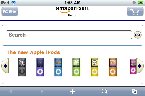
With over 400 different slot games covering a range of genres, they have decided to divide them into four types to appeal to different tastes, from retro to jackpot games. Making this type of decisions is even trickier with e-commerce sites. Amazon started in 1994 as an online bookstore displaying 20 types of products, but now sells everything from garden equipment to gourmet food. However, the landing page has a discreet “All” button which reveals a drop-down list of 44 categories which would never fit on a horizontal menu bar.
Bold Choices?
Traditional travel sites such as Kayak Travel would normally have at least 5 or 6 simple categories including Flights, Hotels, Deals and Car Hire but a site like HolidayPirates.com has gone for a bolder choice by only using two categories on the landing page (All Deals and Search & Book), giving the choice to customers to scroll down the page to see the latest deals or be redirected to a more traditional layout after one click.
As for TechCrunch, they stand out from the crowd by displaying a mere four categories which don’t distinguish between different types of tech on their landing page (News, Videos, Events, Crunchbase), when more traditional sites would use sections such as Computing, Gadgets, Internet, or Security. With 6.5 million unique visitors per month across the US alone and 13 million followers and fans on social media, we can say with confidence that TechCrunch’s bold choice hasn’t made the readers run away.
Online companies have to make stark choices: do they just want to make their customers’ lives easier, or do they want to stand out from the crowd? The answer would normally be: “both!”, and that’s where other design elements come into play. There are many tricks that can be used during web development, from using clean white backgrounds, miniature videos, filters, column layouts, thumbnail sliders or a combination of large and small images to break the monotony of a rigid structure.
About Author
Eyden Haze
Eyden Haze is a digital marketer, a web designer and technology fanatic from Sydney, Australia. With over 7 years of experience in web industry, he has helped his clients to launch their marketing campaigns successfully. He also likes to explore various online tools and share that knowledge by writing useful blog posts.