
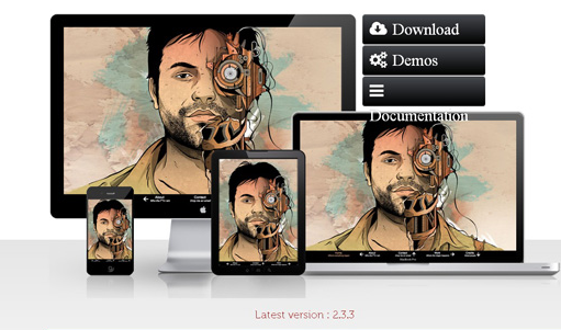
Nowadays, Responsiveness is considered as one of the modern requirements related to web design. Creating responsive websites gives the best possible viewing experience, and easy navigation. It also provides easy reading. Responsive Websites utilizes the layout to the viewing environment by means of proportion-based grids, fluid, CSS3 media queries, and flexible images. In order to prevent flexible images from exhibiting outside their comprising element, these images are sized in relative units. This is necessary when you are attempting to create a Responsive website. It is very easy for all the certified code experts to create a Responsive site. The use of jQuery provides users with numerous responsive design plugins.
This article will allow you to create a responsive website in an easier manner which will help you to attain the required results in a well-organized way. In this article, we will discuss various jQuery Responsive Plugins by means of which you can make your navigation menus, images, sliders, and light-boxes to render responsive across every device. This allows your content to be displayed in a perfect manner. 12 Best jQuery Plugins which are used for creating Responsive Websites are discussed below.
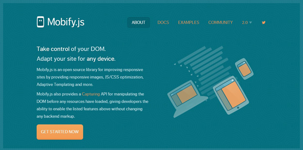
This jQuery plugin is considered an open source library which is used to improve responsive sites. This is done by offering JS/CSS optimization, responsive images, Adaptive Templating, etc. Mobify.js plugin also offers a “Capturing” API which is used for manipulating the DOM before loading any resources.
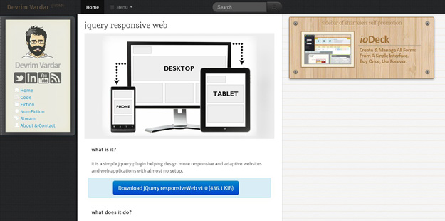
This simple jQuery plugin assists the developer to design more adaptive and responsive websites. It provides web applications with virtually no setup. When resizing the window, the class related to window size is changed automatically. Also, two functions are called, (one on resize, and the other on init) thus making design manipulations.
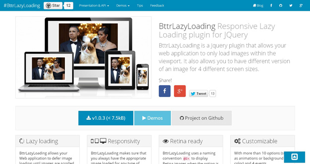
By using this jQuery plugin, you can load images in your web application inside the viewport. The use of this plugin allows you to use different image versions for four different screen sizes. BttrLazyLoading plugin do not perform image loading until images are scrolled to. In this way, the time taken during page loading reduces significantly.

This jQuery plugin provides support to responsive layouts. It consists of useful methods such as “adding more items to the grid” or “filtering them”. Numerous options related to customization exist, for example, the animation, the gutter sizes or delay. Freewall plugin also provides callbacks for events such as gap found, complete, or resize.
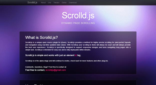
This jQuery plugin is a unique open source which offers a method for extremely precise scrolling in order to obtain pixel-perfect layouts as well as navigation. This is done by making use of real-time updated data values. Scrolld.js plugin is specially designed for supporting responsive designs and turning navigating long pages into an easy task.
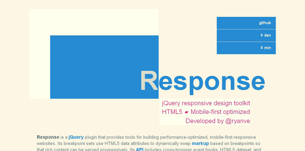
If you want to create a performance-optimized and mobile-first responsive websites, then Response is the best plugin which offers tools for this process. The breakpoint sets of this jQuery plugin make use of HTML5 data attributes in order to dynamically swap markup based on breakpoints. This is done for serving the rich content gradually. An API of Responsive plugin contains HTML5 dataset, cross-browser event hooks, and methods to test responsive properties.
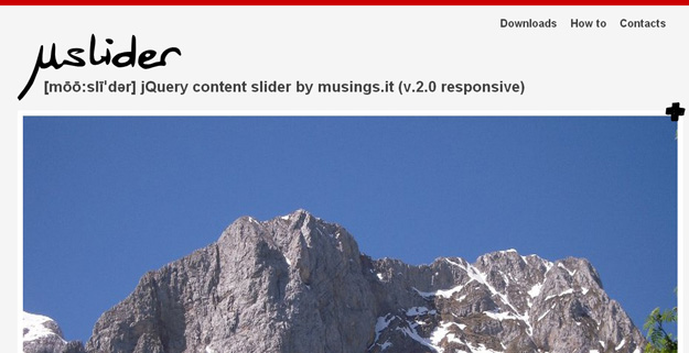
μslider plugin is one of the touch friendly and responsive plugin sliders which include any type of content like text, iframes, images, html5 audio and video, in addition to Vimeo and YouTube videos.
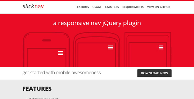
This jQuery plugin is a responsive mobile menu consisting of various features like flexible, supports with multi-level menus, cross-browser compatibility, simple markup, keyboard accessible, etc.
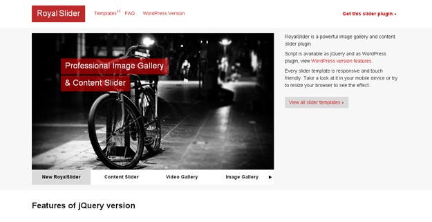
This jQuery plugin is used to display any HTML content (such as videos, images, and text) within a slider interface. Royal Slider consists of tremendous features. This plugin functions in every major browser. Also, the output is responsive down to mobile and works rapidly and the credit goes to CSS3 animations.

This lightweight plugin is used for clean, fast, and easy responsive image replacement. This allows you to decrease the payload for your clients by just allowing them to download the suitable images for their device.
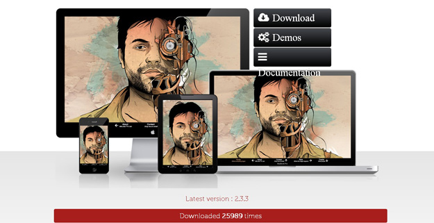
By using this jQuery slider, you can create content/image sliders or full-page sliders of about any type. You can place the contents in a flexible manner, that is, horizontally as well as vertically. Also, this plugin will help in simplifying browsing through them in an easy manner.
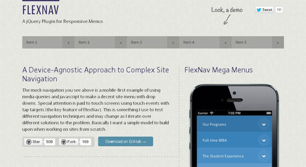
The use of this jQuery plugin allows you to handle the menus in responsive layouts in an easy manner. It is done perfectly for the complex ones also. This plugin provides support to unlimited sub-menus that functions similarly in both mobile layouts as well as desktop.
About Author
Founder
David Watson is the founder of DesignDrizzle and is a professional website designer for over 10 years. He has competence in creating visually appealing and user-friendly websites for all the clients. He likes to explore new and creative ideas for designing, photography effects and other inspirational subjects