

As more and more people use mobile devices to shop or browse online, having a responsive web design is important. Basically, responsive web design encourages simpler layouts and a more streamlined experience. To achieve this, you may consider new layout methods, clear information architecture, and an obsessive focus on details.
Fortunately, there are some ways to create a responsive web design. If your budget allows, it’s always a good idea to hire the best design agency York from a tailored list of agencies that match your needs. But, regardless of your preferences, below are some of the tips and tricks for a responsive web design:
-
Plan Your Design
Before you design your website, it’s wise to plan its layout first. As a matter of fact, many web designers begin by creating a wireframe and the website’s visual design before coding. This doesn’t only help you create the exact feel and look that you want, but it also makes it much easier for you or your design experts to customize your preferred template and integrate it with your brand seamlessly.
To ensure that your end design is responsive, consider creating some prototypes of your website and test each one of them on different screen sizes.
-
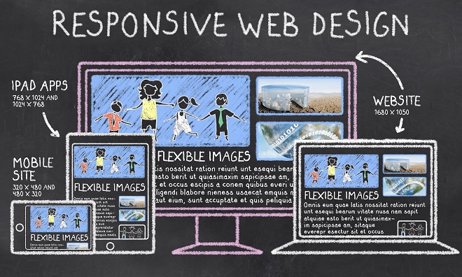
Use Optimized Images
One of the important elements of responsive web design includes images as they make your website visually attractive. Images enable users to visualize the services or products they’re searching for. Therefore, it’s crucial for you to use optimized images to get a satisfactory response from your users.
Such images should have an appropriate format like PNG or JPG for photographic and scenic images. Ensure that your images are well-optimized for various mobile breakpoints, so there won’t be any scaling or bandwidth problems.
-
Apply Simple Navigation
Responsive web design revolves around adapting your design to the smaller dimensions of mobile devices. With this in mind, make sure to reduce your website’s navigation to bare bones via icons, in-age links, and collapsible menus, which make it easier for visitors to find what they like.
The use of hidden navigational elements isn’t a great idea when designing responsive websites. Such are hard to discover and need more time to do tasks. Usually, if you want to make your web design responsible, you should restrict the number of links and eliminate sidebars. Instead, use either a sticky navigation bar or back-to-top button, which you may place either at the bottom or top of your website.
-
Optimize Typography
When it comes to responsive web design, typography matters a lot. So, make sure that you’ve scaled the font size, line height, and width of your website pages, so they’ll fit on various screens.
Keep in mind that if you use big font size, it’ll enhance the readability for the users. If you’re planning to enhance the vital bits of your text, use a legible font because users don’t prefer script fonts in the menu.
-
Think Mobile First
You need to embrace simplicity for a responsive web design. To make your job much easier and efficient, keep mobile-friendliness in mind. It’ll help you reduce functionality and content to what’s necessary. This practice can also improve the user experience of your website.
Thus, if you keep a mobile-first approach in mind, you’ll be able to adapt your design to tablet or desktop screens quickly.
-
Use Finger-Friendly Call-To-Action (CTA) Buttons
Another important component of responsive web design is CTA buttons. It’s essential that the buttons assigned to your CTA are prominent as far as its color and style since they’re also critical for responsive web design.
For instance, when it comes to the size of your CTA buttons, use finger-friendly sizes so your users will find it easy to tap or hit them. For shapes, stick with the familiar shapes like circular or rectangular. Although creativity is great, it’s not a good idea for the shapes of CTA buttons.
-
Add Keyboard Triggers In Your Forms
The forms of your website must adapt to the size and width of the screen. You may take it a step further and ensure that the input fields trigger the right type of keyboard. You may do this by adding an input element to the fields of your forms.
Fields that need text inputs, such as email, name, address, and other details must trigger a textual keyboard and numerical keyboard for fields that require numbers. This can be helpful in improving your website’s overall mobile-friendliness and user experience.
Conclusion
These are just some of the tips and tricks you can do to achieve a responsive web design. You have to take note that quality web design often requires the hand of the most experienced professionals. So, if you don’t know where to get started, look for professionals who can do the above tricks and tips for responsive web design to enjoy more sales, leads, and better conversions.
About Author
Founder
David Watson is the founder of DesignDrizzle and is a professional website designer for over 10 years. He has competence in creating visually appealing and user-friendly websites for all the clients. He likes to explore new and creative ideas for designing, photography effects and other inspirational subjects