
When you think of improving your website, you could either work with the content or the whole design itself. But when you think redesigning is the only way to make your website better, these are the practices you need to follow.
Redesigning is something that might sound like a great plan. It feels good, but you might completely get it wrong if you don’t get your priorities straight.
All the design should have a clear goal you’ve set or a problem to solve first, especially if your website looks old. Also, if your conversion rate is at its all-time low or conversions hardly ever happened, this is a valid issue you could solve by redesigning.
It is a reasonably easy task to hire a web designer or developer to craft a delightful user experience – but in reality, it’s an art form. However, the designing interface is an entirely different matter, and the market has fewer number of these kinds who could help you reach your ultimate goal with UI development.
The key features of a good User Interface design need to be kept in mind when creating a graphical UI. The best practices for UI design do not require any great artistic talent – they are mostly based on the same essential elements of design that anyone can learn.
In the exact terms, the building requires solid foundations for the architectural design to work; user interface design practices need a perfect foundation that can support all its functions.
Best way to start while improving your User Interface should always begin withdrawing or tools that can be used to create from designing.
These preliminary designs should establish the relative importance between various elements and confirm precisely what controls need to feature on the user interface. This sort of upfront planning will make a big difference to the end project and its usability.
Before we start discussion you might also find this interesting on how you can increase your website traffic to 50% more by following these simple design trends?
Here are some of the best practices in crafting a great UI, which could make conversions for you.
Make it Simple and Consistent
One of the most critical and essential elements of a website is its simplicity. This will help your visitors use and know more about your website and your business without figuring out how things work on the website.
It would help if you made your website quite familiar like the button and options should be in a place where they are visible, avoid making it a treasure hunt. Especially if your website is an ecommerce website, you need to make sure that the user knows what to do next on your website before getting irritated and bails out, abandoning the cart.
Make the website more usable, even if you are trying out a new design, try to use similar symbols and buttons to help your visitors navigate.
Internet is not just for youngsters anymore; there is a wide range of audiences, including differently-abled people, so making a website UI accessible to everyone is something you must aim.
This means as few buttons and other navigational options as possible. If your website is more complex and you need to put in more information and pages, you need to present a link for advanced options, this allows users to get the basics down, and they may not want to go any further. For others, the advanced options will provide the interfaces they want to move onto.
Why do you need consistency?
Because it just removes “confusion” from the app. Colour, font, buttons, and icons should all be familiar and comfortable for the user. It doesn’t mean you use the same theme from the previous version of your website but use new color schemes and be consistent with them.
I have seen some websites where you go to the next page and wonder if you are on the same site. That is not acceptable, find a great theme and be consistent with it. Use colors that are soothing if your audience is universal, you could go crazy with colors if your audience has some age restriction, and they don’t mind.
Read more on how you can use consistency in your website.
Understanding Your Audience
This is probably the first and foremost thing you need to figure out because it’s much easier to make critical decisions once you know your audience.
To understand the target demographics of a website or even an app, you could use simple tools to give out all the information. But the importance of understanding your audience is something you should prioritize.
The more a UI developer knows about the target audience, the better clarity and goals could be achieved through redesigning. It helps the developer visualize the theme that should be implemented—the theme includes color schemes, buttons, placement of options, and navigation procedure.
Use Visual Hierarchy

There are some elements and features of an app that are more important than others, which need to stand out.
You can identify your hierarchies with your targeted audience and demographics; this will help you identify essential and what isn’t.
While consistency is also an essential factor to be taken care of, those things that should command attention from a user perspective must stand out through color, size, typography, etc.
Another way to effectively use visual hierarchies would be to create many white spaces around the call-to-action buttons to grab users’ attention immediately.
Making use of Typography
Typography is the part where the target audience must be evaluated strictly, especially when your website is for people of all age groups.
I would repeat this, maybe, never confuse and create chaos for your user. It’s recommended that app developers shouldn’t use more than two types of fonts.
Your website’s nature should dictate the selection of fonts; your font must suggest if your website is something serious, or fun or something inspirational or something else. Make your font talk to the user.
The nature of the user demographic should also play into this selection. A younger user will tolerate more contemporary and playful fonts while an older, more demographic severe will no find them comfortable.
You could also use different sizes and color variations of the same font to create a visual hierarchy. Background colors play an essential role in your text and provide many variations to the same font. So, if you’re planning on colors, make sure everything goes in sync.
Colors
Designers come up with so many options that may confuse you or either disappoint you at the same time. So be sure that this is discussed at length. There is a whole other research on color psychology.
Short and easy for you, look at the image below.
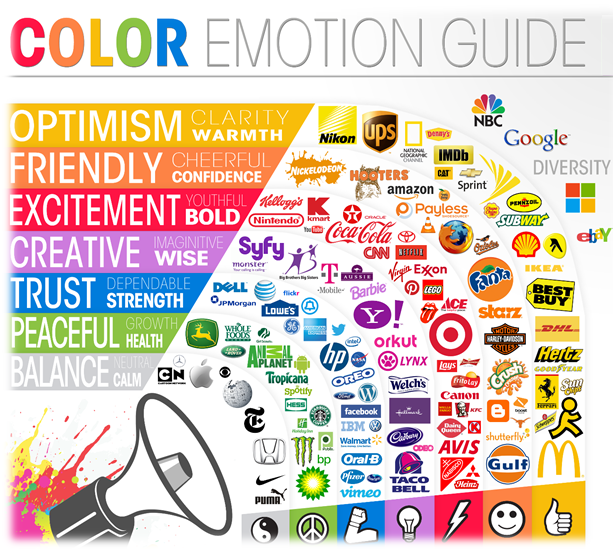
This picture pretty much explains a lot about the colors; it may be just about logos, but it indeed explains what color has what kind of impact on your users; you could create combinations with white and black’s and get a kickass color scheme which projects what you want to project through your website.
There are reasons why the top businesses are successful with their logos, and why they stick to them like the Coca-Cola has been using its red and white theme since forever, there is a reason why Rolex uses blacks, silvers, and grays on their products as well as their website. One of the reasons for color consistency is that it gives your customers a comfort level and recognition.
There is certainly something else to be said for contrasting colors for certain elements to stand out and draw users’ attention. Everything in moderation, however. If you use the concept of contrasting colors too much, users become irritated.
Well, as said earlier, your colors need to be comfortable enough and also attractive at the same time for your target audience. If you don’t impress your target audience there, your purpose ofredesigning is never complete.
Technically, black and white aren’t colors because black is the absence of color, and white is the combination of colors. Ok, don’t try this at home for god’s sake!
But if you use them together, it makes one hell of a color scheme or even as a logo, black and white are timeless like most of the logos in the above picture.
With the colors taken care of, we need to move ahead to fix a couple of design aspects on your website.
Forms Must Be Simple
Forms may not be something you consider essential while designing, because it’s just a form. But it isn’t just a form; consider the purpose of each form your design.
There should be a minimal number of fields for the user to complete because many of them would be on their mobile phones and scrolling up and down on a phone and errors to be fixed on the phone is a pain. I know it because it happens with me most of the time.
If your conversion is to subscribe to a newsletter or blog updates, you do not need more than a name and email address.
But for payments, you will need the credit/debit card information if the billing and shipping address are the same. You could provide a simple checkbox that minimizes the efforts of your customer.
You must keep in mind that you need to make things simple for your customer.
Talking about making it simple, you could use the cache data and let your users log in through social media and take the information. I have always loved this feature, and I’msure many do.
Interface design is a complex task, and it can be somewhat intimidating if you have experience with UX design.
It would help if you stuck to the basics because your audience isn’t experts, not all of them. It would be best to make sure the ease of use, simplicity of navigation, understanding the website, consistency, and compatible typography, and all the small things must go with the forms.
Use Feedbacks Effectively

There is no denying that feedbacks are critical, but when it comes to testing interfaces, this has been one of the best arguments.
Because you have no other way of knowing how the users may mess up as they navigate and use your features because while you design, you know how things work and you may test it with a couple of users, but the audience out there is vastly filled with different kinds of mentalities.
They will find ways to mess up[ and complain, however – count on it. To determine where they may get off course, you will need to test and test actual users from the audience demographic.
Once you have identified those points at which errors will occur and where the user has been facing difficulties in navigation, it is easy for you to design and feedback messages is the place where you get all this information. You could know where things are going wrong and find a solution to it.
There are times when users fill in forms or make payments; there will be a necessary pause while information is being processed. Don’t leave your user “in the darkness.” Please give them a signal that things are processing, so they do not duplicate. And give them another signal when information has been processed. Keeping this transparency will give out information that your website would be back and with improvements.
Call to action buttons
Call to action buttons are the ones that make those conversions for you; you need to use them in a good number and at great places, but also make sure that they don’t make it a challenging experience for the user.
Make them available when the user needs it or make the user feel the need to use it. Call to actions are the essential part of the design, which does the conversions you are looking for.
You could do it both ways, either make them blend in and use it in good numbers, or make them stand out and use them in less number. If you choose to make, they stand out and put them in more numbers to completely ruin the way your website looks.
Content (Use Proper Videos and Images)
While you design your website, using great images and videos is essential, and you know it. But instead of using colors as a background, you could go for a Video background.
But wait, that does affect your website’s loading time, which results in users finding an alternate website that gives the same services. You can achieve this by putting up a short video explaining what your website is all about and make sure the video doesn’t slow down the loading time of your website.

Suppose you are placing a video link on the website, something like a testimonial or a tutorial or something you want to promote. Please keep it in a place where people could notice and explain what the video is all about so that people don’t waste their time going through it and not finding it useful.
Talking about the images, images must be of high quality. Enough quality to show what your product or services are about. Again, the loading time is significant, so you need to have the minimum quality to make sure the product looks better.
While pictures and text are a great way to communicate and teach your users about your products or your website, a video can be an even better alternative if you have the resources to produce it.
As you know, Videos are much more popular than images and texts because they are more exciting, and not all the visitors are readers; well, most of them are not. Videos are generally used on marketing websites as a kind of screencast to show off a product’s features: but this isn’t the only way to use a video. No matter what your intention is to make a video, it always adds interest to your audience and makes them stay on your website for a while.
Conclusion
Redesigning your website and improving the UI is something you need to consider more seriously than just changing your website’s theme.
Yes, the theme is also important and plays an integral part. Still, other aspects of UI like understanding your audience, the fonts or the typography, call to action buttons, videos and images used and their placement, and a lot more, which we have discussed above.
All these factors contribute to making a website that could do the conversions you expect by redesigning your website. And most importantly, try to know your audience and their feedback; this is something which will help you redesign your website and gives you an idea where, to begin with.
About a decade ago, not many of us thought the terms UX and UI would play a vital role in websites.
Author’s Bio
Mohit Maheshwari is Chief Strategist at NMG Technologies, a full service IT Company offering Ecommerce Development, Designing and Ecommerce Mobile App Development services. He has been in the industry since 2000 and focuses on long-term strategies, intuitive user experience and successful customer acquisition.
About Author
Founder
David Watson is the founder of DesignDrizzle and is a professional website designer for over 10 years. He has competence in creating visually appealing and user-friendly websites for all the clients. He likes to explore new and creative ideas for designing, photography effects and other inspirational subjects