
Your web design holds cardinal value in influencing your visitor conversion. If your website’s interface is not conducive to users’ needs despite stellar marketing tactics and advertisements, your site visitors are not going to bother with further exploration of the site.
Moreover, all that money and effort invested in your online advertisements and SEO is going to end up with meager returns since the place where you have been trying to shuffle your users to, is cluttered, unappealing, cumbersome, and requires labor even in the smallest of navigation.
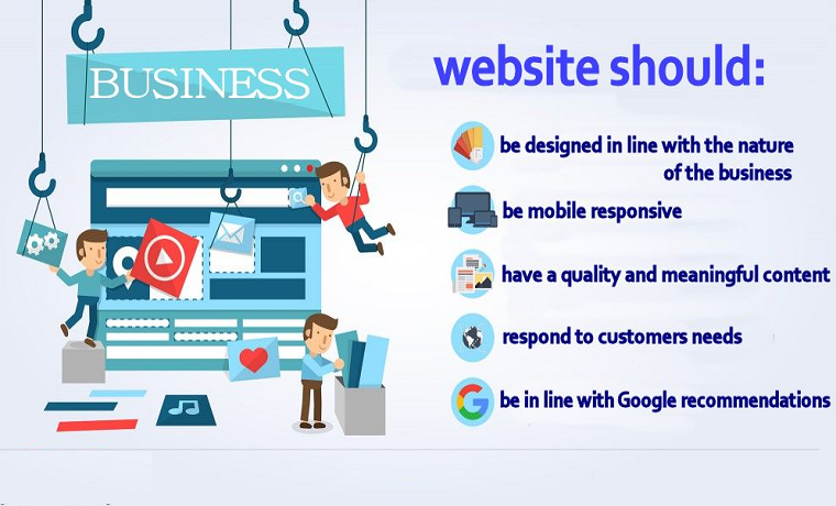
So consider these details while designing in order to avoid disappointing your visitors:
-
See From the User’s Eye
A combination of garish colors might be your favorite, but not everyone is fond of those. You’re developing that website for your users, not yourself. It’s important that you look at your website from their perspective.
Identify who your audience is via analytics; determine their gender, age, lifestyle, or geo-location. What they find appealing varies as per their demographic and psychographic. For example, teenagers don’t like to read much, have trouble grasping complicated terms and despise tiny fonts, so Nielsen recommends content difficulty of 6th-grade reading level to cater to a broad audience.
Moreover, females perceive colors differently than males, even sharp corners are not recommended on a female-oriented website.
Also, pay attention to what your customers are saying in their reviews, comments, and forums about the problems they encounter while on your site, and act accordingly.
-
Minimalism Sells
Minimalist websites are more visually appealing and rated more trustworthy than cluttered ones. With the free reign of the website, you cannot resist adding as many sales elements as you can that will persuade your visitors to convert. However, people dislike it when they realize that you’re attempting to actively sell them something.
It doesn’t mean that you should do away with colors, fancy fonts, images, videos, homepage content, etc. Rather utilize all these elements frugally and in a manner that focuses on important information.
Highlight your conversion items such as download, subscribe, add to cart, discover more, etc. amid the dominant white background so as to not distract them with redundant tidbits.
Jenny Packham has her site’s significant elements on the main page, including an example of her fashion expertise. Nevertheless, she manages to highlight it all with understated elegance.
-
Include a FAQ Section
If you’re offering diverse products/services with complex pricing plans or if your product/service is rather technical, include the FAQ section at the bottom of your page or dedicate a separate page to it.
You may have included great content on your website with all the technicalities mentioned and even a ‘chat now’ or ‘contact’ button that will enable visitors to obtain more information from the agent.
But your customer doesn’t have the time to read or chat and understand the rigmarole of your services. It’s likely, all that barrage of information bewilders them away.
They’d want a straightforward and concise answer to their simple question and FAQs are going to achieve that. In fact, you’ll find that most of your visitors are converted on your FAQ page, so up your FAQ game.
BuyTVinternetphone has nailed down their FAQ game by offering an FAQ section at the bottom of each of their provider’s page. They may have informative and detailed content regarding their services, but these simple and frank questions/answers on their Spectrum Phone Number page draws the most visitors.
-
Be Strategic About Call-to-Action Buttons
Not all your website visitors come with the intention of purchasing. Some want to browse, subscribe to your newsletter, etc. so you’d want to place different CTAs for each of them on a page where they’re most likely going to spend their time.
The purpose of a CTA is to grab attention, build connection, incite interest, develop suspense, or spur a purchase. For that purpose, your CTA needs to stand out among all the info provided on your page, so visitors don’t have to flick their eyes here and there to search for it.
Therefore, utilize a color that stands out (not gray, white, and black); something contrasting the rest of your site’s color scheme yet it doesn’t clash with it. Experiment with different colors of your CTA button and compare their conversion rate.
Moreover, attempting to make it prominent doesn’t mean you have to equip it with frills and fancies. In fact, Midas Media discovered that simple CTAs tend to perform better than elaborate ones.
Final Word
Whether you have got a blog or an eCommerce site, your user interface and experience matters. Even the slightest of hurdles can put off users. How you design your website is intertwined with your brand identity as well, but there are certain aforementioned universal principles regarding designing, which you need to incorporate. Experiment with your designing elements, gauge your analytics and find out what works best for you or rather your audience.
About Author
Founder
David Watson is the founder of DesignDrizzle and is a professional website designer for over 10 years. He has competence in creating visually appealing and user-friendly websites for all the clients. He likes to explore new and creative ideas for designing, photography effects and other inspirational subjects