
For decades, digital layout relied on predictable ocular tracks: the F-pattern and the Z-pattern. These were static frameworks built for static desktop screens. Today, the widespread adoption of AI-assisted browsing and spatial computing has completely broken those old habits.
We are no longer building layouts for a passive reader. We are building fluid environments for an active scanner-interactor – a user who expects the page to adapt to their intent in real time.
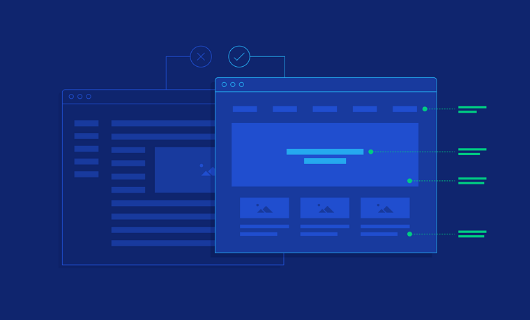
The Breakdown of the Linear Eye-Track
Eye-tracking research used to be straightforward: strap a participant into a chair, load a webpage on a monitor, and map where their gaze lingered. But modern web pages aren’t flat documents anymore.
When people land on a page today, they ignore traditional “hero” sections and high-level marketing copy. Instead, they hunt for functional anchors. Because AI-driven browsers often handle the initial discovery, users arrive with a highly specific objective already in mind. Their eyes instinctively skip ahead to dynamic UI elements that respond directly to the query that brought them there.
First impressions still happen in a 50-millisecond window, but that initial judgment now hinges on layout clarity and “liquid glass” transparency. If a site feels rigid or indifferent to the user’s presence, they bounce instantly. Hierarchy is no longer dictated by what you want to show; it is defined by what the user is already searching for.
3 New Visual Behavior Patterns
1. Layered Spatial Scanning (The Z-Axis)
As mixed-reality headsets and smart glasses move into the mainstream, browsing has moved into three dimensions. Users are no longer just looking left-to-right and top-to-bottom ($X$ and $Y$ coordinates); they are looking through translucent UI planes along the $Z$-axis.
In this environment, “above the fold” is a dead concept. Importance is signaled by depth, proximity, and focus states. Elements that react immediately to a user’s gaze – whether through a subtle glow or a change in refraction – instantly become the focal point of the page.
2. The Sifting Pattern (AI Summaries First)
The biggest disruption to traditional reading habits is the agentic overlay. Frequently, a visitor doesn’t see your raw website first. Instead, their browser generates a concise text summary at the top of the screen.
This has created the “sifting pattern.” Users skim the automated summary to find a specific data point, price, or credential. They only drop down into your actual webpage to verify that specific source material. To design for this, headers can no longer be vague or clever. They must be assertive, factual declarations that validate the AI’s summary at a glance.
3. The Pinball Scan (Interactive Chaos)
On highly functional, data-heavy sites, eye movement looks less like a neat path and more like a pinball machine. Users bounce erratically between interactive tools like 3D product configurations, sliders, or ROI calculators and brief snippets of nearby text.
Because the eye flies toward motion and utility, your core message cannot live in isolation. It must be positioned directly alongside or inside the interactive components where the user’s focus is already locked.
The Blueprint for Modern Visual Hierarchy
Achieving clarity in a fluid environment requires a distinct set of visual tools:
| Design Element | Functional Purpose |
| Refractive Depth | Utilizing realistic layering and transparency to show which information sits closest to the user. |
| Gaze-Responsive Micro-Interactions | Subtle UI shifts or highlights that trigger the moment a user looks at a specific section. |
| Semantic Headlines | Replacing creative or hype-filled titles with direct, data-driven summaries. |
| Predictive Layout Shifts | Interfaces that quietly rearrange or surface tools based on user session length and apparent intent. |
| Deliberate Latency | Introducing tiny, calculated pauses in transitions to give the software a grounded, intentional feel. |
Designing “Alive” Systems
Static layouts are a relic of the past; modern interfaces function much more like an active dialogue. Users don’t want to go on a treasure hunt to find where a designer chose to hide a piece of information. They scan a page to see if the system is listening to them.
By prioritizing contextual relevance, spatial depth, and instant responsiveness, you can guide users naturally toward their goals. The most effective digital hierarchy isn’t one that forces a user down a rigid path – it’s the one that moves with them.
About Author
Founder
David Watson is the founder of DesignDrizzle and is a professional website designer for over 10 years. He has competence in creating visually appealing and user-friendly websites for all the clients. He likes to explore new and creative ideas for designing, photography effects and other inspirational subjects