
Business presentations can be difficult to digest if it is full of text. It even becomes more challenging for reports that have numbers. Visual cues, such as charts and graphs, can help audiences understand the information better. Visualization also helps with the interpretation of otherwise complex data.
The process is, however, not that simple. You must use the best practices in data visualization to pass the message across. Our article will show you some of the best for businesses in 2021.
Data Visualization Best Practices
When thinking about data visualization, your aim is to communicate. You break down complex data into easy to understand information. You must also allow the audience to engage with the information within a short time.
1. Start By Understanding Who You Are Presenting To
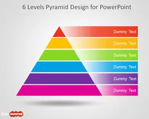
Understanding your audience is the first step to data visualization. It allows for better application of techniques. The way you present to marketers, for example, will be different from how you present to students. The latter group may benefit more from pyramid templates.
Such visual cues present information in an easy-to-read manner. You can also customize them to be more attractive. It helps grab and keep attention, especially if you’re tackling challenging topics.
The dashboard you use for your visual presentation is also dependent on the audience.
- Strategic dashboards are great for comprehensive analysis. They work well for executives and department heads
- Analytical dashboards work well for developers and analytics teams
- Operational dashboards are for mid to lower-level management. The team uses them to update the day-to-day operations within the company.
2. Determine the Right Visualisations
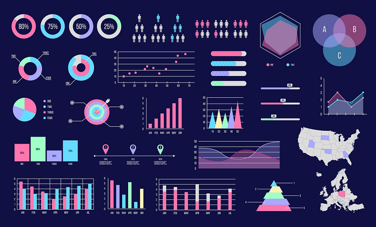
You have the option of so many visual cues you can use. Such include:-
- Tables that use rows and columns. They allow you to present your data in a structured manner. They can, however, be challenging to interpret depending on the amount of information available.
- Line charts are easy to read. They are best for showing trends over time. You will also use them to show variable relationships.
- Pyramid diagrams allow you to present broad to specific data through the funnel-like format
- Bar charts allow for comparisons of different amounts
- Scatter plots and bubble charts show relations between variables.
- Pie and doughnut charts show comparisons among different variables, to name a few.
With a good understanding of the target audience, it will be easy to identify the right methods to use. You must also take into consideration the type of information you want to present.
3. Focus on Simplicity
Visual cues allow you to simplify complex data. You will need to spend some time cleaning up your information. It allows you to filter out unnecessary or inaccurate content. You break down large chunks of data into digestible bits.
Data interpretation becomes easier because you get access to only what you need. Use the necessary computation tools to ensure the accuracy of the information.
You will achieve optimal impact if your visualizations are easy to understand. The audiences can also pick out what is relevant to them without finding the information overwhelming.
4. Always Apply the Less-is-More Technique
When working on your business presentations, the less-is-more technique works. It allows for better focus and engagement with your audiences. Some tips that can help with these include:-
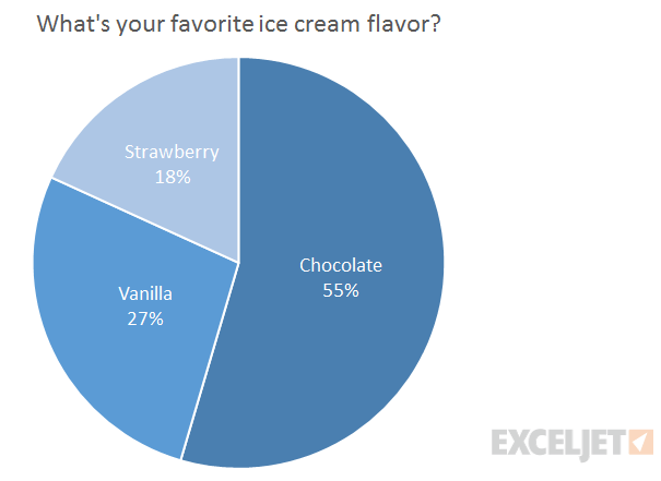
- Do not go overboard with the use of colors. It can be distracting and takes away from the professional look you may be going for in a business presentation. The pie chart above, for example, is visually attractive. The color palette is unobtrusive. You can also see a clear distinction in the variables easily. There isn’t a lot of information, making it easy to digest the data.
- Incorporate some design elements, but do it in moderation
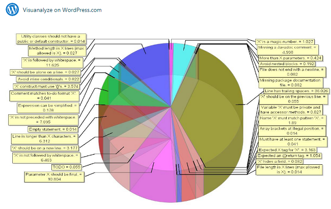
Take a look at the pie chart above. It is an excellent example of data overload. Even looking at it is confusing. Now, imagine trying to interpret the data. How likely are you to come out with anything from such a presentation? As the presenter, what is the probability of your audience engaging with your content?
5. Allow Your Audiences to Engage with the Presentation
Present your data with visual cues that allow for better engagement from the audiences. Give them an opportunity to get the overview and more specific information if they need it.
It is a delicate balancing act because you must know what to include or exclude. Your design should not take away from the key message.
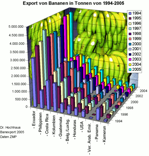
Take a minute and try to interpret the chart above. Your audience will probably end up focusing on the bananas in the background. The engagement will be there, but not for the right thing.
Use subtle cues to lead your audiences to what you want them to engage with. You could highlight specific sections that are especially critical. Color-coding can also work, especially for comparison purposes.
6. Incorporate the Use of Captions and Labels
Visualization allows for the elimination of text. You must, however, incorporate the use of captions and labels. Audiences will need to have a reference point for the different variables you are talking about. You will also need them to explain things you cannot input in the charts or graphs. It also allows for the presentation of significant numerical values. Use text sparingly so that your audiences do not focus too much on them.
Final Thoughts
We have shared with you the top 6 best practices in data visualization for businesses in 2021. It starts by understanding your audience as well. It will help you determine the best kind of visualization cues to use.
The presentation must focus on simplicity. Getting audience engagement is critical. They should be able to get the information you are trying to present easily. Take advantage of the free PowerPoint templates available to make the process easier for you.
About Author
Founder
David Watson is the founder of DesignDrizzle and is a professional website designer for over 10 years. He has competence in creating visually appealing and user-friendly websites for all the clients. He likes to explore new and creative ideas for designing, photography effects and other inspirational subjects