
Online retailers make mistakes every single day. Fortunately, most of them can be avoided with proper planning. However, you can only avoid mistakes in the event that you know what they are. This is why we should highlight some very common errors that are made right now by people running a multivendor marketplace.
No Detailed Product Information
The big advantage of shopping from brick-and-mortar shops is that you get to see the products. You can pick them up, smell them, look at them, or whatever else you want to do. This interaction does not exist on the internet. In eCommerce, it is really important that you properly present the products that you want to sell or it will be impossible to make sales. With this in mind, make sure that product information pages are always as detailed as they need to be. This particularly includes information like dimensions, weight, materials, and sizes.
Hiding Direct Contact Information
Every single person that will want to make a purchase will want to know exactly who the people behind the business are. This is especially the case when credit card information is handed over. When a potential customer sees that contact information is very hard to get to or simply does not exist, it is normal to not feel safe about the purchase.
Always put contact information in an area that is very easy to be seen by every single visitor. It needs to be seen on all pages. The obvious place is definitely the header of the website. When you create the contact page, try to include as many contact options as possible, like email, phone, and social media.
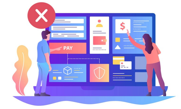
A Very Confusing Or Long Checkout Process
This is an incredibly damaging mistake that you should never make. Nowadays, online shopping is all about speed. This practically means that people want to buy things online as fast as they possibly can. When this does not happen because of the fact that the checkout process is too confusing or very long, people just leave and go shopping from somewhere else.
An ideal checkout process should just include one page for the consumers to check orders and also enter shipping and billing information. Then, only one confirmation page should be present before an order is submitted. When you do more than that, the checkout process is too complex.
The Need To Order With An Account
When the customer has to sign up and get an account before an order is placed, the buying process is too difficult. For the business, it is far more important to get the order than to capture customer information. If you only try to capture data, you might end up losing a lot of customers.
The good news is that this is a problem that you can easily fix by simply making the process not require having an account. Basically, the account should be created after an order is made. This makes it much easier to land a sale in a world built around speed.
About Author
Founder
David Watson is the founder of DesignDrizzle and is a professional website designer for over 10 years. He has competence in creating visually appealing and user-friendly websites for all the clients. He likes to explore new and creative ideas for designing, photography effects and other inspirational subjects